- New to JMP? Let the Data Analysis Director guide you through selecting an analysis task, an analysis goal, and a data type. Available now in the JMP Marketplace!
- See how to install JMP Marketplace extensions to customize and enhance JMP.
- Subscribe to RSS Feed
- Mark Topic as New
- Mark Topic as Read
- Float this Topic for Current User
- Bookmark
- Subscribe
- Mute
- Printer Friendly Page
Discussions
Solve problems, and share tips and tricks with other JMP users.- JMP User Community
- :
- Discussions
- :
- Scatter plot x and y axis values
- Mark as New
- Bookmark
- Subscribe
- Mute
- Subscribe to RSS Feed
- Get Direct Link
- Report Inappropriate Content
Scatter plot x and y axis values
Hi All,
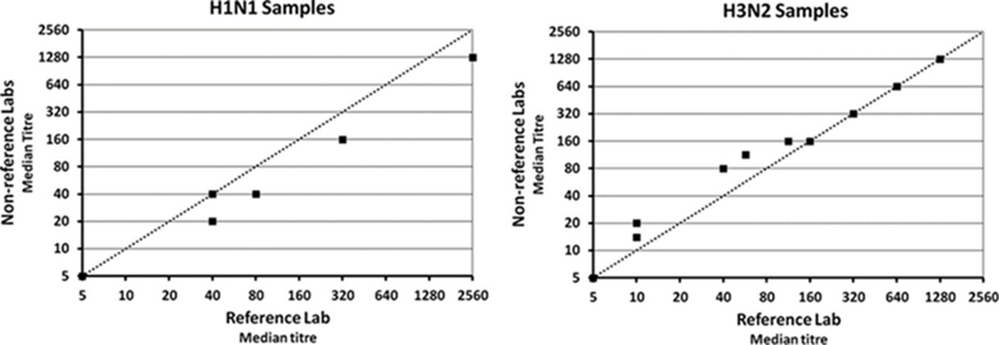
i would like to replicate the following scatter plots in JMP, the problem i am having is when i go to axis setting and request a log scale with a base 2 the scale starts from 1, so the scales is 1,2,4,8,16, 32, 64 etc i would like it to start at 5, 10, 20,40, 80,160,320 etc does anyone have any advice??
Any help would be appreciated.
Thanks
Accepted Solutions
- Mark as New
- Bookmark
- Subscribe
- Mute
- Subscribe to RSS Feed
- Get Direct Link
- Report Inappropriate Content
Re: Scatter plot x and y axis values
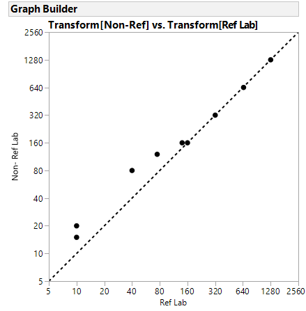
I am not sure why/where the 30 value in the saved script in JMP15 comes from. Note you can drag using the grabber to get 5 th be the minimum on the axes. I didn't look at your plot very closely. The line is the line Y=X and that can be added with right click Customize the FrameBox. The scipt is included below.
If using the same scales you might want to right click in the framebox, select Graph and size and scale isometric. Up to you.
Graph Builder(
	Size( 534, 484 ),
	Show Control Panel( 0 ),
	Show Legend( 0 ),
	Variables(
		X(
			Transform Column(
				"Transform[Ref Lab]",
				Formula( Log( :Ref Lab / 5, 2 ) )
			)
		),
		Y(
			Transform Column(
				"Transform[Non-Ref]",
				Formula( Log( :Name( "Non-Ref" ) / 5, 2 ) )
			)
		)
	),
	Elements( Points( X, Y, Legend( 3 ) ) ),
	SendToReport(
		Dispatch(
			{},
			"Transform[Ref Lab]",
			ScaleBox,
			{Format( "Custom", Formula( 2 ^ value * 5 ), 9 )}
		),
		Dispatch(
			{},
			"Transform[Non-Ref]",
			ScaleBox,
			{Format( "Custom", Formula( 2 ^ value * 5 ), 9 ), Min( 0 ), Max( 9 ),
			Inc( 1 ), Minor Ticks( 0 )}
		),
		Dispatch( {}, "X title", TextEditBox, {Set Text( "Ref Lab" )} ),
		Dispatch( {}, "Y title", TextEditBox, {Set Text( "Non- Ref Lab" )} ),
		Dispatch(
			{},
			"Graph Builder",
			FrameBox,
			{Marker Size( 5 ), Add Graphics Script(
				2,
				Description( "Script" ),
				Pen Color( "black" );
				Pen Size( 2 );
				Line Style( "Dotted" );
				Y Function( x, x );
			), Grid Line Order( 1 ), Reference Line Order( 3 )}
		)
	)
)- Mark as New
- Bookmark
- Subscribe
- Mute
- Subscribe to RSS Feed
- Get Direct Link
- Report Inappropriate Content
Re: Scatter plot x and y axis values
@Mickyboy I cannot reproduce your Problem,
for me it worked, see attached JMP file (JMP15@Win10).
Perhaps you Need to again set the axis range, sometimes many steps at one don't work.
- Mark as New
- Bookmark
- Subscribe
- Mute
- Subscribe to RSS Feed
- Get Direct Link
- Report Inappropriate Content
Re: Scatter plot x and y axis values
Hi Georg,
Thanks for the reply, on checking my post i may not have explained that as well as i could have, l have data but l would like the the axis the same as the picture l supplied, that is a log base 2 increase commencing at 5, so 5,10,20,40,80,160,320,640 etc, which l cant seem to manage, for reference please see the attachment to this post
Thanks
- Mark as New
- Bookmark
- Subscribe
- Mute
- Subscribe to RSS Feed
- Get Direct Link
- Report Inappropriate Content
Re: Scatter plot x and y axis values
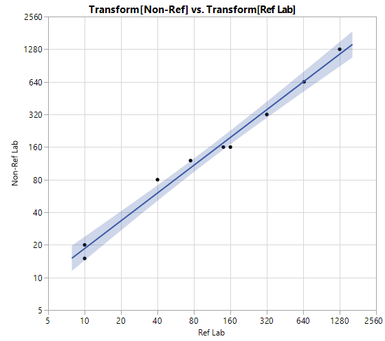
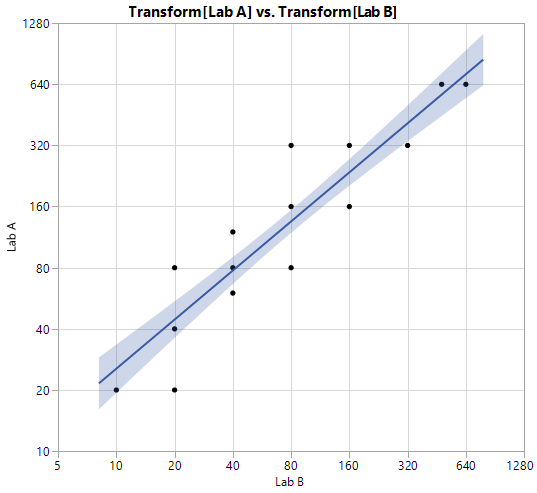
To show you that this is possible here is a GraphBuilder plot of data I guessed from one of your plots. I added the Line of Fit and Major Grid.
The way I did this is to :
- transform the X and Y data,
- use a linear scale
- but customize the format
I did this using the UI, but copied the sccript to the data table whicj is attached.
The script is shown here:
Graph Builder(
	Size( 534, 490 ),
	Show Control Panel( 0 ),
	Show Legend( 0 ),
	Variables(
		X(
			Transform Column(
				"Transform[Ref Lab]",
				Formula( Log( :Ref Lab / 5, 2 ) )
			)
		),
		Y(
			Transform Column(
				"Transform[Non-Ref]",
				Formula( Log( :Name( "Non-Ref" ) / 5, 2 ) )
			)
		)
	),
	Elements(
		Points( X, Y, Legend( 5 ) ),
		Line Of Fit( X, Y, Legend( 7 ), Adapt to Axis Scale( 0 ) )
	),
	SendToReport(
		Dispatch(
			{},
			"Transform[Ref Lab]",
			ScaleBox,
			{Format( "Custom", Formula( 2 ^ value * 5 ), 9, 0 ), Min( 0 ), Max( 9 ),
			Inc( 1 ), Minor Ticks( 0 ), Label Row( Show Major Grid( 1 ) )}
		),
		Dispatch(
			{},
			"Transform[Non-Ref]",
			ScaleBox,
			{Format( "Custom", Formula( 2 ^ value * 5 ), 30 ),
			Label Row( Show Major Grid( 1 ) )}
		),
		Dispatch( {}, "X title", TextEditBox, {Set Text( "Ref Lab" )} ),
		Dispatch( {}, "Y title", TextEditBox, {Set Text( "Non-Ref Lab" )} )
	)
)
- Mark as New
- Bookmark
- Subscribe
- Mute
- Subscribe to RSS Feed
- Get Direct Link
- Report Inappropriate Content
Re: Scatter plot x and y axis values
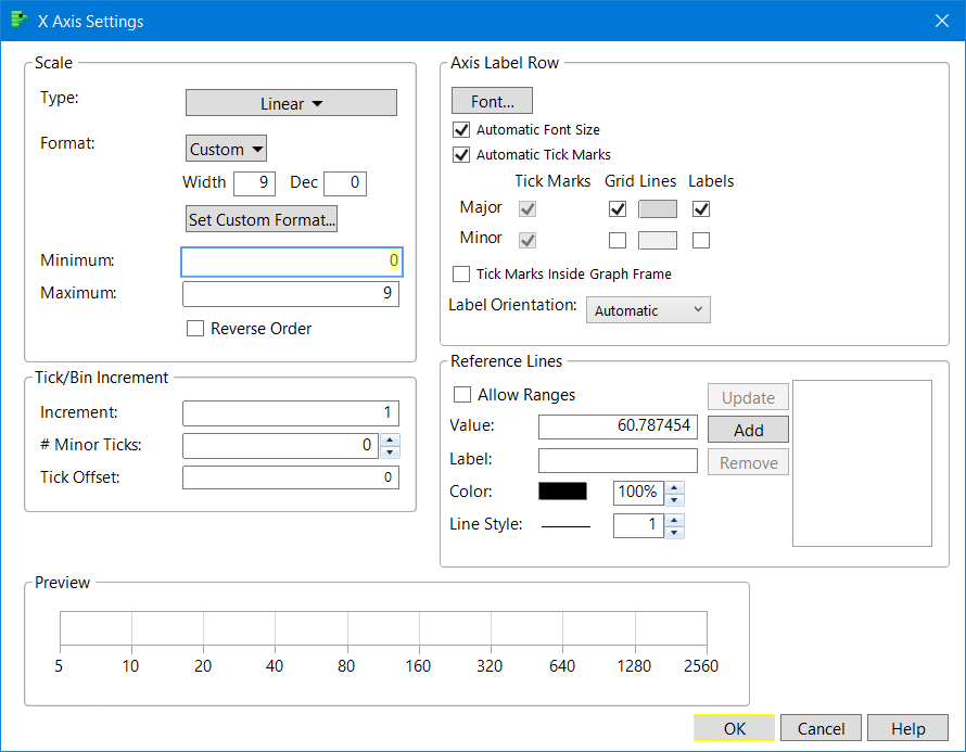
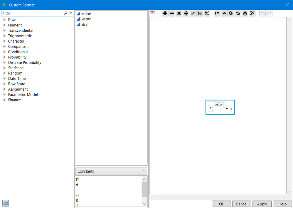
oh, since this is the first time I used this feature, I thought it might be useful to show the axis settings
Here is the Custom Format screenshot, the window that pops up when you press the Custom button
- Mark as New
- Bookmark
- Subscribe
- Mute
- Subscribe to RSS Feed
- Get Direct Link
- Report Inappropriate Content
Re: Scatter plot x and y axis values
Hi gzmorgan0,
Thanks for coming to my aid again, and thanks very much for your solution, its brillant, a couple of problems i have in getting the presentation l am after, and i dont know if its possible. Unfortunately l am still stuck with JMP 14 and dont have the custom area in axis setting's.
l can't get the y axis to start at 5, i have tried including the Min () and Max() into the script but to no avail
Graph Builder(
	Size( 534, 490 ),
	Show Control Panel( 0 ),
	Show Legend( 0 ),
	Variables(
		X(
			Transform Column(
				"Transform[Lab B]",
				Formula( Log( :Lab B / 5, 2 ) )
			)
		),
		Y(
			Transform Column(
				"Transform[Lab A]",
				Formula( Log( :Name( "Lab A" ) / 5, 2 ) )
			)
		)
	),
	Elements(
		Points( X, Y, Legend( 5 ) ),
		Line Of Fit( X, Y, Legend( 7 ), Adapt to Axis Scale( 0 ) )
	),
	SendToReport(
		Dispatch(
			{},
			"Transform[Lab B]",
			ScaleBox,
			{Format( "Custom", Formula( 2 ^ value * 5 ), 30 ),
			Label Row( Show Major Grid( 1 ) )}
		),
		Dispatch(
			{},
			"Transform[Lab A]",
			ScaleBox,
			{Format( "Custom", Formula( 2 ^ value * 5 ), 30 ),
			Label Row( Show Major Grid( 1 ) )}
		),
		Dispatch( {}, "X title", TextEditBox, {Set Text( "Lab B" )} ),
		Dispatch( {}, "Y title", TextEditBox, {Set Text( "Lab A" )} )
	)
)
Also is it possible to have the reference line run though the graph as per the response variable in the attached data file??? l would like the line to represent where the expected titers should lie.
Again thanks very much for your help, its greatly appreciated.
- Mark as New
- Bookmark
- Subscribe
- Mute
- Subscribe to RSS Feed
- Get Direct Link
- Report Inappropriate Content
Re: Scatter plot x and y axis values
I am not sure why/where the 30 value in the saved script in JMP15 comes from. Note you can drag using the grabber to get 5 th be the minimum on the axes. I didn't look at your plot very closely. The line is the line Y=X and that can be added with right click Customize the FrameBox. The scipt is included below.
If using the same scales you might want to right click in the framebox, select Graph and size and scale isometric. Up to you.
Graph Builder(
	Size( 534, 484 ),
	Show Control Panel( 0 ),
	Show Legend( 0 ),
	Variables(
		X(
			Transform Column(
				"Transform[Ref Lab]",
				Formula( Log( :Ref Lab / 5, 2 ) )
			)
		),
		Y(
			Transform Column(
				"Transform[Non-Ref]",
				Formula( Log( :Name( "Non-Ref" ) / 5, 2 ) )
			)
		)
	),
	Elements( Points( X, Y, Legend( 3 ) ) ),
	SendToReport(
		Dispatch(
			{},
			"Transform[Ref Lab]",
			ScaleBox,
			{Format( "Custom", Formula( 2 ^ value * 5 ), 9 )}
		),
		Dispatch(
			{},
			"Transform[Non-Ref]",
			ScaleBox,
			{Format( "Custom", Formula( 2 ^ value * 5 ), 9 ), Min( 0 ), Max( 9 ),
			Inc( 1 ), Minor Ticks( 0 )}
		),
		Dispatch( {}, "X title", TextEditBox, {Set Text( "Ref Lab" )} ),
		Dispatch( {}, "Y title", TextEditBox, {Set Text( "Non- Ref Lab" )} ),
		Dispatch(
			{},
			"Graph Builder",
			FrameBox,
			{Marker Size( 5 ), Add Graphics Script(
				2,
				Description( "Script" ),
				Pen Color( "black" );
				Pen Size( 2 );
				Line Style( "Dotted" );
				Y Function( x, x );
			), Grid Line Order( 1 ), Reference Line Order( 3 )}
		)
	)
)- Mark as New
- Bookmark
- Subscribe
- Mute
- Subscribe to RSS Feed
- Get Direct Link
- Report Inappropriate Content
Re: Scatter plot x and y axis values
oops forgot to add that the above graph and script is from JMP 14
- Mark as New
- Bookmark
- Subscribe
- Mute
- Subscribe to RSS Feed
- Get Direct Link
- Report Inappropriate Content
Re: Scatter plot x and y axis values
Hi gzmorgan0,
l completely forgot about the grabber, the 30 in my syntax must have been a leftover from somethings l was trying, have fixed both graphs now and am very gratefull for your help, interestingly when i use the pull down menu's for graph bulider l dont get the custom button, but when i run the syntax and click on the axis for axis settings l can see the box.
Again thanks very much for your help and guidance.
- Mark as New
- Bookmark
- Subscribe
- Mute
- Subscribe to RSS Feed
- Get Direct Link
- Report Inappropriate Content
Re: Scatter plot x and y axis values
Hi gzmorgan0,
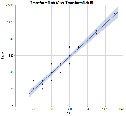
Something interesting happened when l ran the same syntax over another similar dataset with higher titers
l dont' know why but now the scaling is slight awry on both axis with 10 and 10,240 missing.
Thanks
Recommended Articles
- © 2026 JMP Statistical Discovery LLC. All Rights Reserved.
- Terms of Use
- Privacy Statement
- Contact Us
