- New to JMP? Let the Data Analysis Director guide you through selecting an analysis task, an analysis goal, and a data type. Available now in the JMP Marketplace!
- See how to install JMP Marketplace extensions to customize and enhance JMP.
- Subscribe to RSS Feed
- Mark Topic as New
- Mark Topic as Read
- Float this Topic for Current User
- Bookmark
- Subscribe
- Mute
- Printer Friendly Page
Discussions
Solve problems, and share tips and tricks with other JMP users.- JMP User Community
- :
- Discussions
- :
- Re: Plot only the filtered data from a given column on a dashboard
- Mark as New
- Bookmark
- Subscribe
- Mute
- Subscribe to RSS Feed
- Get Direct Link
- Report Inappropriate Content
Plot only the filtered data from a given column on a dashboard
Hi,
I am trying to build a dash board that will plot relevant graphs.
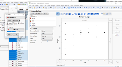
My current issue is that it plots the entire data on one graph, highlights the filtered data and the rest is grayed out.
I want to graph to be build only with the data of the relevant rows of the given column.
For example, if I want to plot height as a function of age, and I have a column for "sex" which holds 'M' and 'F', so I have the filtering option
for "sex", if I choose 'F', the 'M' data will be grayed out. I want the chart to only show the 'F' data.
How do I do that?
Thanks,
- Mark as New
- Bookmark
- Subscribe
- Mute
- Subscribe to RSS Feed
- Get Direct Link
- Report Inappropriate Content
Re: Plot only the filtered data from a given column on a dashboard
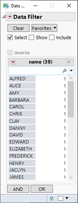
Change the filter settings (enable Include / Show depending on your use case)
Edit:
This explains the different modes https://www.jmp.com/support/help/en/17.2/#page/jmp/filtering-modes.shtml#ww609720 (select isn't available for local data filter)
- Mark as New
- Bookmark
- Subscribe
- Mute
- Subscribe to RSS Feed
- Get Direct Link
- Report Inappropriate Content
Re: Plot only the filtered data from a given column on a dashboard
@jthi wrote:select isn't available for local data filter
... but there is a wish to change that:
Local Data Filter - don't disable the SELECT option (:green_heart:)
would be quite helpful! -> plese click on the link and vote :)
- Mark as New
- Bookmark
- Subscribe
- Mute
- Subscribe to RSS Feed
- Get Direct Link
- Report Inappropriate Content
Re: Plot only the filtered data from a given column on a dashboard
Thanks for the reply folks,
But I'm looking for a JSL code lines to do that, not by the options I have in a graph.
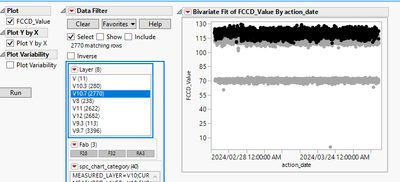
To better explain myself, my code gives the user the choosing options shown below.
When the user chooses V10.7 it highlights the relevant rows under column "Layer".
I want the graph to be shown only after the user chose the layer, and show only the chosen data.
- Mark as New
- Bookmark
- Subscribe
- Mute
- Subscribe to RSS Feed
- Get Direct Link
- Report Inappropriate Content
Re: Plot only the filtered data from a given column on a dashboard
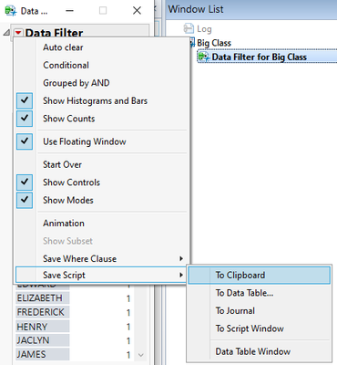
Do it first by hand and then get the script
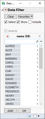
add show
go to red triangle menu and save script
Current Data Table() << Data Filter(
	Location({1104, 309}),
	Mode(Show(1)),
	Add Filter(columns(:name), Display(:name, N Items(15), Find(Set Text(""))))
)
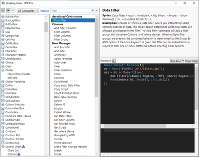
You can also go and check Data Filter from scripting index
and from there you easily get to documentation by pressing Help https://www.jmp.com/support/help/en/17.2/#page/jmp/data-table-messages.shtml?os=win&source=applicati... and https://www.jmp.com/support/help/en/17.2/#page/jmp/add-a-data-filter.shtml#ww795815
Recommended Articles
- © 2026 JMP Statistical Discovery LLC. All Rights Reserved.
- Terms of Use
- Privacy Statement
- Contact Us

