- Learn how to build custom Python data connectors and further customize JMP’s Data Connector Framework with the Python Data Connector Demo, available now in the JMP Marketplace!
- See how to create experiments to support product design and ID useful product features. Register for June 12 webinar, 2pm US Eastern Time.
- Subscribe to RSS Feed
- Mark Topic as New
- Mark Topic as Read
- Float this Topic for Current User
- Bookmark
- Subscribe
- Mute
- Printer Friendly Page
Discussions
Solve problems, and share tips and tricks with other JMP users.- JMP User Community
- :
- Discussions
- :
- Re: Normal Probability Plot with group of data

- Mark as New
- Bookmark
- Subscribe
- Mute
- Subscribe to RSS Feed
- Get Direct Link
- Report Inappropriate Content
Normal Probability Plot with group of data
Hi everyone,
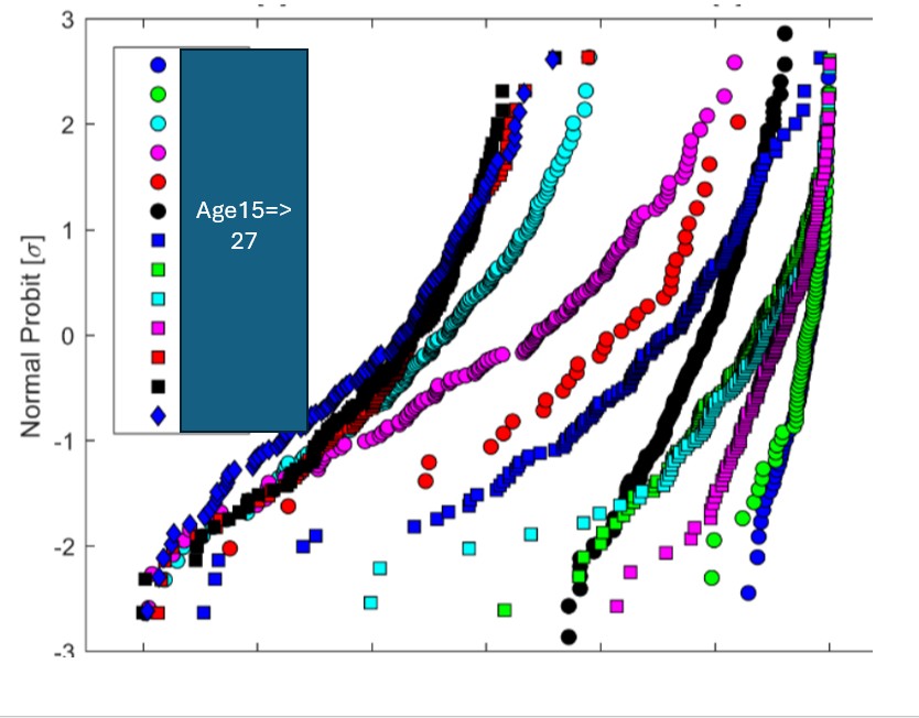
I would like to reproduce the type of plot shown in the attached figure.
The graph displays multiple datasets overlaid on a Normal Probability (Probit) scale on the Y‑axis, with each group shown using different marker colors and shapes.
Could you please advise which JMP platform(s) and workflow are best suited to generate such a graph?
More specifically, I would like to know:
- Which JMP platform to use (e.g., Graph Builder, Distribution, Fit Y by X, or Probability Plot)
- How to set the Y‑axis to Normal Probit (σ units)
- How to overlay multiple groups on the same probability plot
- How to customize markers and colors for each group
- How to add a legend similar to the one in the example
- Whether the underlying data table needs to be in long format (Value, Group) or wide format
Any example, instructions, or JSL script would be extremely helpful.
Thanks a lot in advance!
Accepted Solutions

- Mark as New
- Bookmark
- Subscribe
- Mute
- Subscribe to RSS Feed
- Get Direct Link
- Report Inappropriate Content
Re: Normal Probability Plot with group of data
I will use Big Class (JMP Sample Data folder) to illustrate. I assume that all the data is stacked in one column for the Y role. The corresponding group assignments exist in another column.
- Select Analyze > Distribution
- Select the height data column and click Y
- Select the grouping column sex and click By
- Click OK
The distribution platform will compute the quantiles and save them for you.
- Press and hold the CTRL key with Windows or the Command key with Mac
- Click the red triangle for height and select Normal Quantile Plot
- Press and hold the CTRL key with Windows or the Command key with Mac
- Click the red triangle for height and select Save > Normal Quantiles.
You are ready to plot!
- Select Graph > Graph Builder
- Drag height to the Y role
- Drag normal quantiles to the X role
- Drag sex to the Overlay role
These steps should produce the plot you want.

- Mark as New
- Bookmark
- Subscribe
- Mute
- Subscribe to RSS Feed
- Get Direct Link
- Report Inappropriate Content
Re: Normal Probability Plot with group of data
grouped Cumulative Probability in Graph Builder
if you have access to JMP 19, you can try the new Scoping :
Transform Columns - as comfortable as Summary Statistics? (:green_heart:)
- select your variable and in the right click menu pick Distributional: Cumulative Probability
- activate Scoping : Overlay and pick the Overlay column
- use Normal Probability in the axis settings
-> done


- Mark as New
- Bookmark
- Subscribe
- Mute
- Subscribe to RSS Feed
- Get Direct Link
- Report Inappropriate Content
Re: Normal Probability Plot with group of data
Thanks Hogi. I have tried that but it does not give [+/-sigma] as unit for the plot.
- Mark as New
- Bookmark
- Subscribe
- Mute
- Subscribe to RSS Feed
- Get Direct Link
- Report Inappropriate Content
Re: Normal Probability Plot with group of data
Oh, I missed this point, then you have to wrap the cumulative probability with normal quantile() - and you don't have to adjust the axis scale.
Normal Quantile(Col Rank( :height, :sex ) / (Col Number( :height, :sex ) + 1))
Recommended Articles
- © 2026 JMP Statistical Discovery LLC. All Rights Reserved.
- Terms of Use
- Privacy Statement
- Contact Us