- New to JMP? Let the Data Analysis Director guide you through selecting an analysis task, an analysis goal, and a data type. Available now in the JMP Marketplace!
- See how to install JMP Marketplace extensions to customize and enhance JMP.
- Subscribe to RSS Feed
- Mark Topic as New
- Mark Topic as Read
- Float this Topic for Current User
- Bookmark
- Subscribe
- Mute
- Printer Friendly Page
Discussions
Solve problems, and share tips and tricks with other JMP users.- JMP User Community
- :
- Discussions
- :
- Need Uneven Intervals on X Axis in Graph Builder (value labels didn't work)
- Mark as New
- Bookmark
- Subscribe
- Mute
- Subscribe to RSS Feed
- Get Direct Link
- Report Inappropriate Content
Need Uneven Intervals on X Axis in Graph Builder (value labels didn't work)
Hello all,
I've seen similar questions but nothing quite like this one. I have data that looks like this:
| Period | Start Date | End Date | RF |
| 1 | 01Jan2005 | 31Dec2005 | 0.1 |
| 2 | 01Jan2006 | 30Jun2006 | 0.2 |
| 3 | 01Jul2006 | 31Dec2006 | 0.3 |
| 4 | 01Jan2007 | 31Dec2007 | 0.4 |
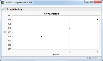
The Period column consists of consecutive integers, usually starting at 1. As you can see the Start Date column has uneven increments. Users want to see a graph of RF vs Period:
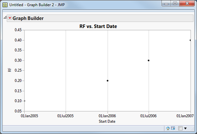
However the analysis we're doing is based on the Start Date column. That graph looks like this:
I'd like to have something like the second graph, only with Period numbers on the X axis, unevenly spaced. I tried setting value labels for Start Date but when dragged Start Date onto the X axis it ignored my value labels.
Thanks for any suggestions!
Peter
Accepted Solutions
- Mark as New
- Bookmark
- Subscribe
- Mute
- Subscribe to RSS Feed
- Get Direct Link
- Report Inappropriate Content
Re: Need Uneven Intervals on X Axis in Graph Builder (value labels didn't work)
Peter,
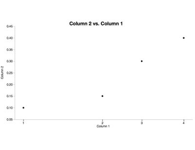
I "tricked" graph builder into doing this:
I used reference lines with 0% color with labels and then changed the increment on the x-axis until is was such that no dates plotted. So if you can script that maybe it would work. It would be a "pain" to do for a large dataset or more than once. It would be better if value labels would translate to the axis labels.
Ah but this is what you might have already found.....so I have nothing for you.
Good Luck
Karen
- Mark as New
- Bookmark
- Subscribe
- Mute
- Subscribe to RSS Feed
- Get Direct Link
- Report Inappropriate Content
Re: Need Uneven Intervals on X Axis in Graph Builder (value labels didn't work)
- Mark as New
- Bookmark
- Subscribe
- Mute
- Subscribe to RSS Feed
- Get Direct Link
- Report Inappropriate Content
Re: Need Uneven Intervals on X Axis in Graph Builder (value labels didn't work)
I looked at that before posting and the best suggestion was from Xan: add labeled reflines for the "real" labels. Was hoping for something easier.
- Mark as New
- Bookmark
- Subscribe
- Mute
- Subscribe to RSS Feed
- Get Direct Link
- Report Inappropriate Content
Re: Need Uneven Intervals on X Axis in Graph Builder (value labels didn't work)
Peter,
I "tricked" graph builder into doing this:
I used reference lines with 0% color with labels and then changed the increment on the x-axis until is was such that no dates plotted. So if you can script that maybe it would work. It would be a "pain" to do for a large dataset or more than once. It would be better if value labels would translate to the axis labels.
Ah but this is what you might have already found.....so I have nothing for you.
Good Luck
Karen
- Mark as New
- Bookmark
- Subscribe
- Mute
- Subscribe to RSS Feed
- Get Direct Link
- Report Inappropriate Content
Re: Need Uneven Intervals on X Axis in Graph Builder (value labels didn't work)
Thanks Karen. I was headed in that direction but your answer provided good clarification.
Recommended Articles
- © 2026 JMP Statistical Discovery LLC. All Rights Reserved.
- Terms of Use
- Privacy Statement
- Contact Us


