- New to JMP? Let the Data Analysis Director guide you through selecting an analysis task, an analysis goal, and a data type. Available now in the JMP Marketplace!
- See how to install JMP Marketplace extensions to customize and enhance JMP.
- Subscribe to RSS Feed
- Mark Topic as New
- Mark Topic as Read
- Float this Topic for Current User
- Bookmark
- Subscribe
- Mute
- Printer Friendly Page
Discussions
Solve problems, and share tips and tricks with other JMP users.- JMP User Community
- :
- Discussions
- :
- Re: JMP Control Chart Phase/Axis Organization
- Mark as New
- Bookmark
- Subscribe
- Mute
- Subscribe to RSS Feed
- Get Direct Link
- Report Inappropriate Content
JMP Control Chart Phase/Axis Organization
Hello! I recently am struggling with an issue in Control Charts.
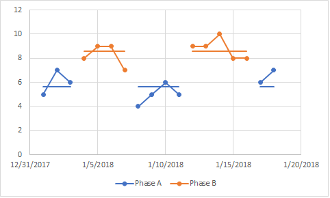
I have data organized by date with two main phases. Essentially, I want to be able to overlay the phases because in my data I go from phase A, to phase B, then back to phase A over time. By default JMP will separate my phases, then sort by date. This means the data is not in order by date, and all my phase B data is placed after phase A. Some of the phase B data happened before some of the phase A data so I want to be able to overlay them. An example of what I want in an excel graph is shown below:
You can see I alternate phases in this data. This data had date on the x-axis and every point was orderd by date.
You can also see that the means are shown on the data, with the averages shared across the phase. There is the same mean level for the A phase data and the same for all the B phase data, even though the phases were not totally continuous.
To get a similar graph displayed in JMP I have to label the phases with a new label every time it switches. I.E. Phase A, Phase B, Phase A revisit, Phase B revisit. This still wont allow me to share the average across those phases but will order everything by date.
Unfortunatley the control chart builder is very rigid in how it organizes phases/subgroups. Is there any way I can work around it without manually coding in an entirely new figure from scratch?
While not as ideal, I would also be open to using graph builder. So far I have tried using date as the x axis and phase as the overlay variable, but can't find a way to draw a mean bar across the data. Is there a way to group data as a series perhaps?
Thank you in advance for the help, I will be happy to provide any clarification necessary!
Corrie
- Mark as New
- Bookmark
- Subscribe
- Mute
- Subscribe to RSS Feed
- Get Direct Link
- Report Inappropriate Content
Re: JMP Control Chart Phase/Axis Organization
- Mark as New
- Bookmark
- Subscribe
- Mute
- Subscribe to RSS Feed
- Get Direct Link
- Report Inappropriate Content
Re: JMP Control Chart Phase/Axis Organization
Hi,
I've had the same issue. If you have one column with rows corresponding to your Phases, you can set custom order for them. The phases will appear in Control Charts according to the order you set. To set order go to: Column Info > Column Properties > Value Order then activate Custom Order and set order you want. I hope it helps.
- Mark as New
- Bookmark
- Subscribe
- Mute
- Subscribe to RSS Feed
- Get Direct Link
- Report Inappropriate Content
Re: JMP Control Chart Phase/Axis Organization
As there are no control limits on the graph you are attempting to duplicate, I would choose a platform other than Control Chart Builder. I believe you can produce what you want with the Variability Chart platform and probably Graph Builder as well.
Recommended Articles
- © 2026 JMP Statistical Discovery LLC. All Rights Reserved.
- Terms of Use
- Privacy Statement
- Contact Us

