- New to JMP? Let the Data Analysis Director guide you through selecting an analysis task, an analysis goal, and a data type. Available now in the JMP Marketplace!
- See how to install JMP Marketplace extensions to customize and enhance JMP.
- Subscribe to RSS Feed
- Mark Topic as New
- Mark Topic as Read
- Float this Topic for Current User
- Bookmark
- Subscribe
- Mute
- Printer Friendly Page
Discussions
Solve problems, and share tips and tricks with other JMP users.- JMP User Community
- :
- Discussions
- :
- Re: Is it possible to swap the x and y axis in JMP?
- Mark as New
- Bookmark
- Subscribe
- Mute
- Subscribe to RSS Feed
- Get Direct Link
- Report Inappropriate Content
Is it possible to swap the x and y axis in JMP?
I would like to graph an overlay plot. JMP limits me to putting the numerical values on the Y-Axis. I am unable to put multiple numerical parameters on the X-axis? Is there a way in JMP (JSL script even) to swap the axis?
Thanks
Accepted Solutions
- Mark as New
- Bookmark
- Subscribe
- Mute
- Subscribe to RSS Feed
- Get Direct Link
- Report Inappropriate Content
Re: Is it possible to swap the x and y axis in JMP?
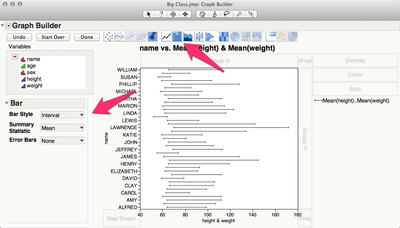
You need to add the bars to your graph and then change the bar style to interval.

Open("$SAMPLE_DATA\Big Class.jmp");
Graph Builder(
Variables( X( :height ), X( :weight, Position( 1 ) ), Y( :name ) ),
Elements(
Bar(
X( 1 ),
X( 2 ),
Y,
Legend( 2 ),
Bar Style( "Interval" ),
Summary Statistic( "Mean" )
)
)
)
- Mark as New
- Bookmark
- Subscribe
- Mute
- Subscribe to RSS Feed
- Get Direct Link
- Report Inappropriate Content
Re: Is it possible to swap the x and y axis in JMP?
You should be able to put numerical values on the x-axis as well. What happens when you attempt this?
- Mark as New
- Bookmark
- Subscribe
- Mute
- Subscribe to RSS Feed
- Get Direct Link
- Report Inappropriate Content
Re: Is it possible to swap the x and y axis in JMP?
Hi SFRubin I am only able to put one numerical parameter into the x-axis. As i am using the overlay plot i want to compare a few parameters on the same plot (overlay). I can do this by putting the mulitple parameters into the y-axis. The customer i am dealing with would prefer to view it with numerical values on the x-axis. Is there any option to swap the axis? or can i alter the JSL code to do so?
- Mark as New
- Bookmark
- Subscribe
- Mute
- Subscribe to RSS Feed
- Get Direct Link
- Report Inappropriate Content
Re: Is it possible to swap the x and y axis in JMP?
My apologies -- I didn't notice that you were trying to plot multiple x-axis values.
I do not know how to plot multiple x-axis values. I would suggest using separate charts, or you could try something primitive like rescaling your x-axis variables so that they can all be plotted using a single x-axis scale.
- Mark as New
- Bookmark
- Subscribe
- Mute
- Subscribe to RSS Feed
- Get Direct Link
- Report Inappropriate Content
Re: Is it possible to swap the x and y axis in JMP?
I don't think it's possible to get the graph you want out of the Overlay Plot platform.
However, you should be able to use Graph Builder to get the plot you want.
You can have multiple numeric variables on the X and Y axes in Graph Builder.
-Jeff
- Mark as New
- Bookmark
- Subscribe
- Mute
- Subscribe to RSS Feed
- Get Direct Link
- Report Inappropriate Content
Re: Is it possible to swap the x and y axis in JMP?
Hi Jeff, Thanks for reply. I tried using Graph Builder but can't get exactly what i would like. (i.e. I would like to see the shift on a unit across two parameters. So i want to connect a line between the two parameters for each unit if that makes sense). This can be done in the overlay plot using the 'needle' option. but it doesn't seem to be available in graph builder.
- Mark as New
- Bookmark
- Subscribe
- Mute
- Subscribe to RSS Feed
- Get Direct Link
- Report Inappropriate Content
Re: Is it possible to swap the x and y axis in JMP?
You need to add the bars to your graph and then change the bar style to interval.

Open("$SAMPLE_DATA\Big Class.jmp");
Graph Builder(
Variables( X( :height ), X( :weight, Position( 1 ) ), Y( :name ) ),
Elements(
Bar(
X( 1 ),
X( 2 ),
Y,
Legend( 2 ),
Bar Style( "Interval" ),
Summary Statistic( "Mean" )
)
)
)
- Mark as New
- Bookmark
- Subscribe
- Mute
- Subscribe to RSS Feed
- Get Direct Link
- Report Inappropriate Content
Re: Is it possible to swap the x and y axis in JMP?
Absolutely fantastic thanks. I'll pretend to everyone I sorted that myself!! :)
- Mark as New
- Bookmark
- Subscribe
- Mute
- Subscribe to RSS Feed
- Get Direct Link
- Report Inappropriate Content
Re: Is it possible to swap the x and y axis in JMP?
Sorry last question..Can i do this for more than 2 parameters. I cannot seem to get the bar to connect to more than two. Also is there a way to change the marker point of each interval to distinguish it from the other?
Any help would be great.
- Mark as New
- Bookmark
- Subscribe
- Mute
- Subscribe to RSS Feed
- Get Direct Link
- Report Inappropriate Content
Re: Is it possible to swap the x and y axis in JMP?
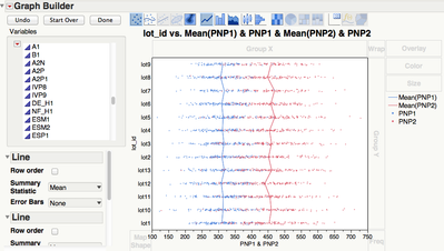
You can stack the variables into a single column in a new table. Then in Graph Builder, set the data as X, your categories as Y and the "Label" (your original variable names) as Color. Add duplicate point-type elements: one with Summary Statistics = None and the other with Summary Statistics = Mean and Error bars = range. And finally hide the mean point by setting the color to white or transparent.
The example script below should replicate what I just tried to describe. It should draw a line across three variables:
dt = Open( "$SAMPLE_DATA\Big Class.jmp" );
dt << New Column( "h+w", Numeric, Continuous, Formula( :height + :weight ) ); // Add a third variable
dt << Stack(
columns( :height, :weight, :Name( "h+w" ) ),
Source Label Column( "Label" ),
Stacked Data Column( "Data" )
); // Stack table
Graph Builder(
Size( 565, 514 ),
Show Control Panel( 0 ),
Variables( X( :Data ), Y( :name ), Color( :Label ) ),
Elements(
Points( X, Y, Color, Legend( 1 ), Jitter( 0 ), Error Bars( "Range" ), Summary Statistic( "Mean" ) ),
Points( X, Y, Color, Legend( 4 ), Jitter( 0 ) )
),
SendToReport(
Dispatch( {}, "name", ScaleBox, {Show Major Ticks( 0 )} ),
Dispatch(
{},
"400",
ScaleBox,
{Legend Model( 1, Properties( 0, {Line Color( 2 ), Fill Color( 0 )} ) ),
Legend Model( 4, Properties( 0, {Line Color( 21 )} ) )}
),
Dispatch( {}, "400", LegendBox, {Position( {-1, 0, 1, 2} )} ),
Dispatch( {}, "Graph Builder", FrameBox, {Marker Size( 5 )} )
)
);
Recommended Articles
- © 2026 JMP Statistical Discovery LLC. All Rights Reserved.
- Terms of Use
- Privacy Statement
- Contact Us

