- JMP will suspend normal business operations for our Winter Holiday beginning on Wednesday, Dec. 24, 2025, at 5:00 p.m. ET (2:00 p.m. ET for JMP Accounts Receivable).
Regular business hours will resume at 9:00 a.m. EST on Friday, Jan. 2, 2026. - We’re retiring the File Exchange at the end of this year. The JMP Marketplace is now your destination for add-ins and extensions.
- Subscribe to RSS Feed
- Mark Topic as New
- Mark Topic as Read
- Float this Topic for Current User
- Bookmark
- Subscribe
- Mute
- Printer Friendly Page
Discussions
Solve problems, and share tips and tricks with other JMP users.- JMP User Community
- :
- Discussions
- :
- Interpretation related to response model (RSM)

- Mark as New
- Bookmark
- Subscribe
- Mute
- Subscribe to RSS Feed
- Get Direct Link
- Report Inappropriate Content
Interpretation related to response model (RSM)
I attached an image. Please advise me on the following:
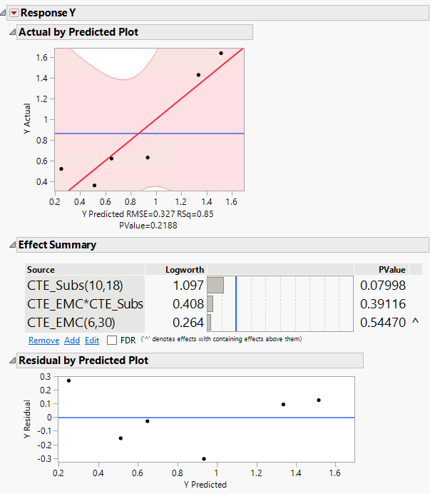
1) Actual by predicted plot: What is the red line, light red zone, and how should be the light red zone (I assume confidence band) be to be more robust and accurate? In my case It's very wide. Also, you can see the pvalue below the plot is 0.2188. If dots are inside the confidence band, is it a good sign?
2) Residual by predicted plot--> How should this plot be to show robustness? and what is the blue line.
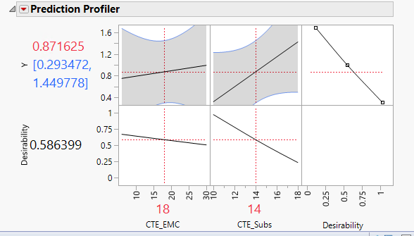
3) Please describe the prediction profiler plots? what are they exactly? and in my image, what does they imply?
Thanks
Accepted Solutions

- Mark as New
- Bookmark
- Subscribe
- Mute
- Subscribe to RSS Feed
- Get Direct Link
- Report Inappropriate Content
Re: Interpretation related to response model (RSM)
Hi @sam8546,
Here are some responses and ressources that might help you :
1) Actual by Predicted plot : This graph is a Leverage plot for the whole model. The blue line represents the null hypothesis (that the response is independent of the factors) and the red line represents the alternative hypothesis (that the response depends on the factors). The light red zone is a 95% confidence region plotted on top of the red line. If the horizontal blue line is contained by the red region, then the whole model test is not significant at the alpha = 0.05 level. If the blue line is not contained within the red region, then the whole model test is significant at the same level. In your case the blue line is contained in the confidence area and this confidence area is quite wide, suggesting that the model is not statistically significant to explain the variation of your response with the factors you have used. If dots are inside the confidence area, that suggest they are not outliers, so their behaviour is "normal" and could be predicted. However, as your confidence area is very wide, I'm afraid that doesn't bring any additional informations.
More infos here : Effect Leverage Plots (jmp.com)
and details here : Statistical Details for Leverage Plots (jmp.com)
2) Residual by Predicted plot : The residual by predicted plot is one of the diagnostic graphs helping you to check the assumptions of linear regression models. There are four assumptions associated with a linear regression model:
- Linearity: The relationship between X and the mean of Y is linear.
- Homoscedasticity: The variance of residual is the same for any value of X (graph "Plot Residual by Predicted").
- Independence: Observations are independent of each other (graph "Plot Residual by Row").
- Normality: For any fixed value of X, Y is normally distributed (normality of the residuals, graph "Plot Residual by Normal Quantiles").
So by using this graph, you typically want to see the residual values scattered randomly about zero (the blue line). In your case, it seems there is a curvature when looking at the residuals. A quadratic effect may be missing in the model.
More infos here : Row Diagnostics (jmp.com)
3) Prediction Profiler plots : I strongly suggest you have a look at Profiler.
Most of the answers to your questions should be there.
If you're looking for an example of a RSM experiment to better understand the different plots and informations, I suggest you give a look at Example of a Response Surface Model.
And if you're new to statistics and modeling, I would recommend using these ressources to have a better understanding of what you're doing (particularly for DoE):
- Statistical Thinking for Industrial Problem Solving
- DoE Welcome Kit
- Easy DOE:
- Recorded Mastering JMP (30 – 60 Minute)
I hope this answer will help you have a better overview and understanding,
"It is not unusual for a well-designed experiment to analyze itself" (Box, Hunter and Hunter)
- Mark as New
- Bookmark
- Subscribe
- Mute
- Subscribe to RSS Feed
- Get Direct Link
- Report Inappropriate Content
Re: Interpretation related to response model (RSM)
Hi Victor, Thank you, very useful. Just to make sure:
1) " 95% confidence region" and "alpha = 0.05 level" What does confidence band and alpha mean? Does it mean only 5% possibility to make wrong predictions by response? If so, why narrower mean better?
2) "If the horizontal blue line is contained by the red region, then the whole model test is not significant at the alpha = 0.05 level". when you say not significant, does that mean the fit model is not good enough to predict response? Then how can we make it better? by adding more data?
3) "So by using this graph, you typically want to see the residual values scattered randomly about zero " is there a criterion to make sure residual values scattered randomly about zero? only by looking it's hard to say! "A quadratic effect may be missing in the model", how can I add a quadratic effect? by adding more interactions?
Thanks
- Mark as New
- Bookmark
- Subscribe
- Mute
- Subscribe to RSS Feed
- Get Direct Link
- Report Inappropriate Content
Re: Interpretation related to response model (RSM)
Hi @sam8546,
1) Alpha (also called significance level) is the risk that in a statistical test a null hypothesis will be rejected when it is actually true. This is also known as a type I error, or a false positive. This means in your context the risk you're willing to accept that you detect a statistically significant effect or you obtain a statistically significant model to explain your response, where the null hypothesis is in fact true (so no statistically significant impact of the effects and/or the model to explain the response). The term "risk" refers to the chance or likelihood of making an incorrect decision based on this assumed correct model. A common threshold/value for this risk is 0.05 (so 5% chances of rejecting the null hypothesis when it's actually true), but you can specify it accordingly to your research.
A lower value for alpha (meaning you want to reduce the risk of wrong decisions) reduces the probability of a Type I error, but may increase the probability of a Type II error ("false negative", failing to reject the null hypothesis when there is actually a variation in the factors that is statistically significant at changing the reponse), as the null hypothesis is less likely to be rejected even if it is false.
The confidence level can be deduced from the alpha risk value : CI = 1 - alpha
In your case with a significance level of 0.05, the confidence level is 0,95 (95%).
A possible correct interpretation of this confidence level based on the profiler you show can be : "When CTE_EMC is at 18 and CTE_Subs at 14, I'm 95% confident that the response mean value is between 0,293472 and 1,449778". More infos here : 4.2.1 - Interpreting Confidence Intervals | STAT 200 (psu.edu)
2) That means that you're not able to find a statistically significant relation between the response and your factors based on this model, so you don't have enough evidence that the response is actually influenced by your factors. There may be several options to improve this situation, but here are some :
- Checking if there are any strange/outlier points (doesn't seem to be your case),
- Verifying how noise or other external factors are handled (any external variation/nuisance not controlled ?),
- Collecting more data and create replicates of your experimental runs (new independent runs done at the same factors settings as the previous ones already done)
- Modifying and testing other models that can be supported by your data and design : in case of a curvature (detected by a lack-of-fit test and/or residuals pattern), you may add a quadratic effect for one of your factor (X1.X1 in your model for example).
These are just some options, not an exhaustive list.
3) Very often, a visual analysis can be enough, but you can test it more rigourously if you want/need it. You can save the residuals in your datatable, and using the "Distributions" platform, perform a statistical test to check the normality of the residuals. As an example, here is the goodness of fit test for a normal distribution for the residuals from a model in the DoE datatable sample Battery Data.jmp :

To add a quadratic effect in a model, select a factor in the "Fit Model platform", check that the value 2 is displayed next to "Degree" and click on "Macros", then "Polynomial to Degree" :

In my example, this will add a new term A1.A1 in the model.
It may be better for you to attend some of the webinar and STIPS courses related to these statistics questions, you'll get a better overview and understanding of what and how to do some statistical analysis and testing, and the various assumptions behind (and how to check it).
Hope this answer will help you,
"It is not unusual for a well-designed experiment to analyze itself" (Box, Hunter and Hunter)

- Mark as New
- Bookmark
- Subscribe
- Mute
- Subscribe to RSS Feed
- Get Direct Link
- Report Inappropriate Content
Re: Interpretation related to response model (RSM)
Can someone please you please explain homoscedasticity and heteroscedasticity w.r.t DOE results residuals?

- Mark as New
- Bookmark
- Subscribe
- Mute
- Subscribe to RSS Feed
- Get Direct Link
- Report Inappropriate Content
Re: Interpretation related to response model (RSM)
Hi @Statexplorer : The idea of homoscedasticity/heteroscedasticity is as important for multiple regression models (several X's) as it is for simple linear regression (one X). One of the basic assumptions is these regression models is homoscedasticity; i.e., the variance (informally, "spread") of the residuals is the same throughout your design region. And we analyze designed experiments via multiple regression. If your experiment is a highly fractionated screening design, then heteroscedasticity may be difficult, if not impossible, to identify. That said, in general, the residual vs predicted plot should have no pattern to it...should be kind of a shotgun blast centered at 0. If it's cone-shaped, for example, then that tells you that the variability of your residuals is is non-constant (heterogeneous) throughout your design region . So, take a look at your residual vs predicted plot. And it may help here to tell us more about your DoE so that we can respond more effectively.

- Mark as New
- Bookmark
- Subscribe
- Mute
- Subscribe to RSS Feed
- Get Direct Link
- Report Inappropriate Content
Re: Interpretation related to response model (RSM)
Another way to think about it is that the linear regression model poses the mean response as conditional on the factor levels (linear combination), but the variance is constant. The Root Mean Square Error (RMSE) is the estimate of this constant. This assumption might not be valid, but then you need a different model in which the error is also conditional. (See the LogLinear Variance fitting personality in Fit Model.)
Recommended Articles
- © 2025 JMP Statistical Discovery LLC. All Rights Reserved.
- Terms of Use
- Privacy Statement
- Contact Us