- New to JMP? Let the Data Analysis Director guide you through selecting an analysis task, an analysis goal, and a data type. Available now in the JMP Marketplace!
- See how to install JMP Marketplace extensions to customize and enhance JMP.
- Subscribe to RSS Feed
- Mark Topic as New
- Mark Topic as Read
- Float this Topic for Current User
- Bookmark
- Subscribe
- Mute
- Printer Friendly Page
Discussions
Solve problems, and share tips and tricks with other JMP users.- JMP User Community
- :
- Discussions
- :
- How to show mean +/- 3SD range in graph builder?
- Mark as New
- Bookmark
- Subscribe
- Mute
- Subscribe to RSS Feed
- Get Direct Link
- Report Inappropriate Content
How to show mean +/- 3SD range in graph builder?
I want to show and compare the values by showing its mean+/-3SD range in graph builder.
The graph builder only provide the bar range of mean+/-SD.
- Mark as New
- Bookmark
- Subscribe
- Mute
- Subscribe to RSS Feed
- Get Direct Link
- Report Inappropriate Content
Re: How to show mean +/- 3SD range in graph builder?
Hi @jmpneeeewbie ,
Not sure if this is exactly what you want, but it is ONE way of getting what you want (I'm using the Big Class example table from JMP help):
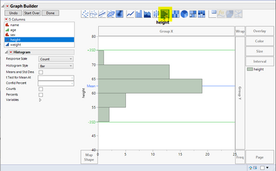
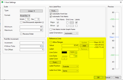
To get this, go to graph builder, select the histogram graph option and cast a column to the Y role in graph builder. If you then double click the Y axis, you can edit the setting for the axis and add some reference lines. I got the +/-3SD values by performing a histogram analysis on :height and then just calculating the +/-3SD values based on the SD of :height. In the Reference Lines sub panel, you can enter in the values for the lines, change the line colors and even line styles.
This is just one way it can be done.
Hope this helps!<
DS
- Mark as New
- Bookmark
- Subscribe
- Mute
- Subscribe to RSS Feed
- Get Direct Link
- Report Inappropriate Content
Re: How to show mean +/- 3SD range in graph builder?
Hi @jmpneeeewbie,
For Control chart, is there a reason for using Graph Builder and not Control Chart Builder (in Analyze, Quality and Process, Control Chart Builder) ?
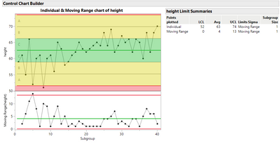
You just have to select your Y response, and in the left panel, check in the submenu "Limits[1]" the options "Zones" and "Shade Zones". Once I have checked these options and click on done, I have this control chart (for Big Class dataset) :
And you can easily spot the +/- 1 SD zone (C, in green), +/- 2 SD (B) and +/-3 SD (A) in yellow.
Maybe what not you expect, but I just wanted to make sure you know this option in Control Chart Builder.
"It is not unusual for a well-designed experiment to analyze itself" (Box, Hunter and Hunter)
Recommended Articles
- © 2026 JMP Statistical Discovery LLC. All Rights Reserved.
- Terms of Use
- Privacy Statement
- Contact Us


