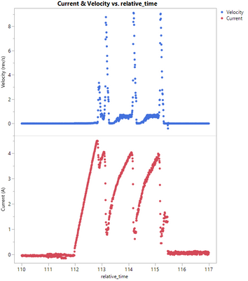
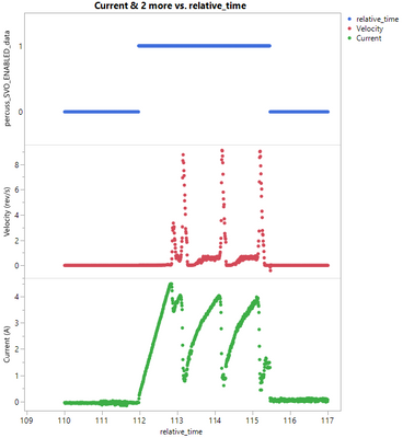
Hi all, I'm looking for a way on JMP 15.1 to set the default color of a series in a scatter plot or a line plot based on the column being used as the Y-value. The purpose here is to maintain consistency of the color when several variables are plot on the same graph. My issue is that with JMP's default legend color scheme, adding a new variable to the plot can cause all of the other series to change colors.
In the two example screenshots below, adding a new variable to the plot causes the colors of all items to change. I would like "Current" to always be the same color, no matter how many series or what order I have on the plot.


Another (unrelated?) question for you all: Why does the legend of the plot on the right show the x-axis column name instead of the y-axis column when plotting a nominal or ordinal data type? If I switch the data type of that top data series to continuous, the legend shows the column name just fine.