- New to JMP? Let the Data Analysis Director guide you through selecting an analysis task, an analysis goal, and a data type. Available now in the JMP Marketplace!
- See how to install JMP Marketplace extensions to customize and enhance JMP.
- Subscribe to RSS Feed
- Mark Topic as New
- Mark Topic as Read
- Float this Topic for Current User
- Bookmark
- Subscribe
- Mute
- Printer Friendly Page
Discussions
Solve problems, and share tips and tricks with other JMP users.- JMP User Community
- :
- Discussions
- :
- Re: How to make this kind of graphs in JMP?
- Mark as New
- Bookmark
- Subscribe
- Mute
- Subscribe to RSS Feed
- Get Direct Link
- Report Inappropriate Content
How to make this kind of graphs in JMP?
Hi, I'm new to JMP and have been trying to make some graphs similar to the following graphs (see picture) for hours just couldn't get it done. Basically, I conducted gluctose tolerance test on several people, so I have their blood glucose values in 0, 60, 120 and 180 minutes. What I did was to group these people into two groups, obese and non-obese. Now I want to make a graph that has two curves, one curve represents the mean values of blood glucose as trend (with error bars) in three hours in the obese group and the other shows similar results in the non-obese group. Anyone knows how to do it? Your help is greatly appreciated!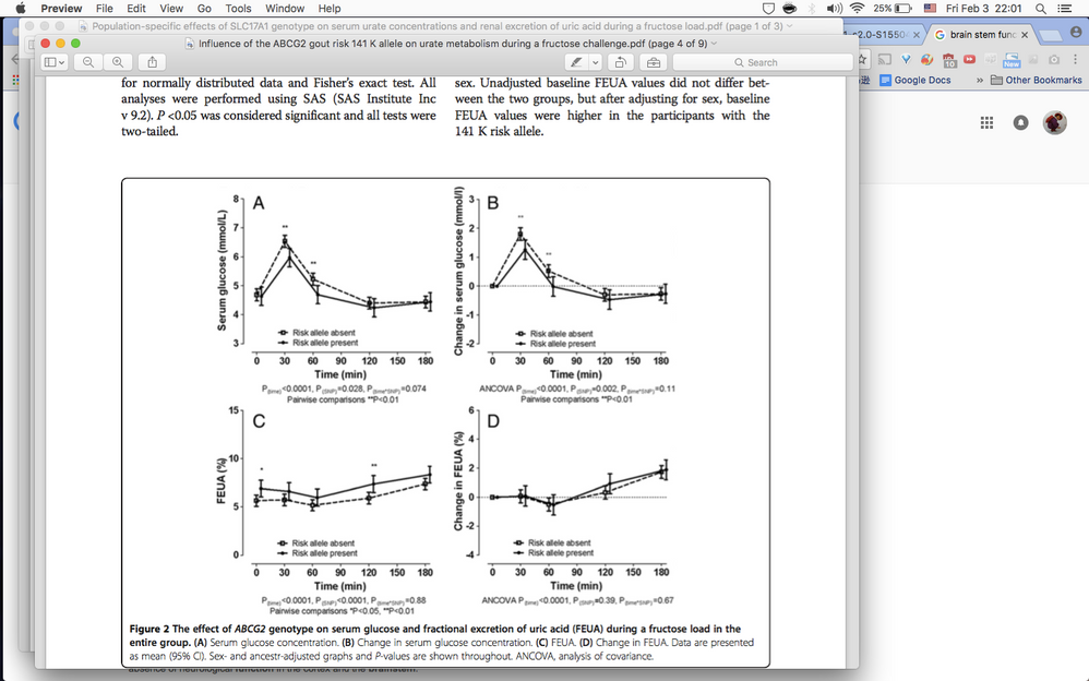
Accepted Solutions
- Mark as New
- Bookmark
- Subscribe
- Mute
- Subscribe to RSS Feed
- Get Direct Link
- Report Inappropriate Content
Re: How to make this kind of graphs in JMP?
Hello,
These types of graphs are possible and it depends on how you have your data structured in the table. Can you give and example of how your data is structured?
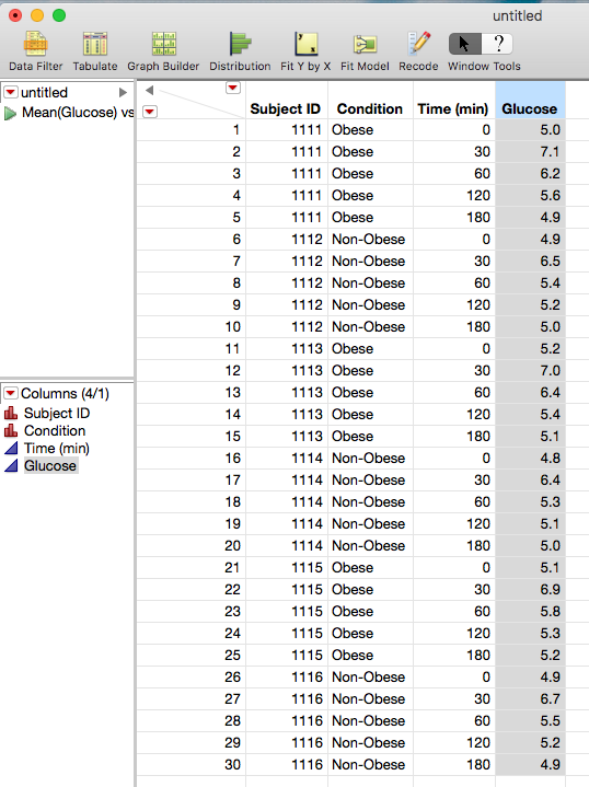
Here is an example of how the table should look:
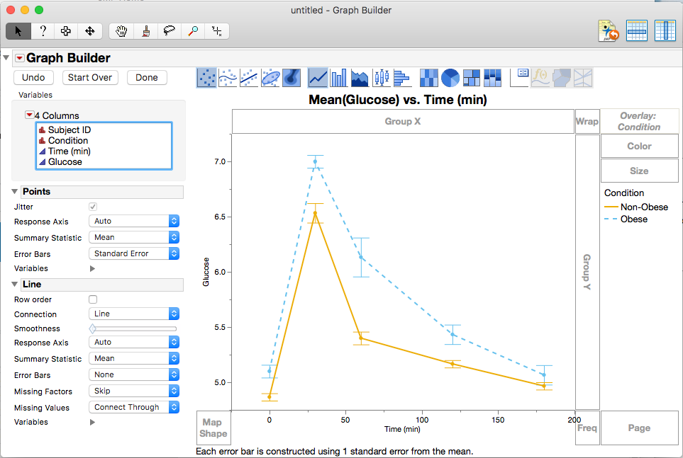
And then use Graph Builder from the Graph Menu. I dragged and drops the columns to the appropriate axis and condition to the overlay section. I then double clicked on the line on the legend and then selected the Obese line and changed line style to dashed. I also added error bars for the points section and selected summary statistic as Mean.
The options should look something like this:
Does that help? Am I missing any thing?
Chris
Data Scientist, Life Sciences - Global Technical Enablement
JMP Statistical Discovery, LLC. - Denver, CO
Tel: +1-919-531-9927 ▪ Mobile: +1-303-378-7419 ▪ E-mail: chris.kirchberg@jmp.com
www.jmp.com
- Mark as New
- Bookmark
- Subscribe
- Mute
- Subscribe to RSS Feed
- Get Direct Link
- Report Inappropriate Content
Re: How to make this kind of graphs in JMP?
Hi Chris,
Thank you so much for your help! I successfully made the graphs! It turned out that I'd been setting up the table wrong. Two more questions though, (1) how to add asterisk to graph to indicate significance? and (2) now that I have this graph with two curves representing changes in blood glucose within three hours in two different groups, how do I proceed to calculate the area under the curve for each group?
Ruby
- Mark as New
- Bookmark
- Subscribe
- Mute
- Subscribe to RSS Feed
- Get Direct Link
- Report Inappropriate Content
Re: How to make this kind of graphs in JMP?
I have some questions about your questions.
1) How are you determining significance?
a) I ask because that may have an impact on your second question
b Adding the asterisk can be as simple as making text label next to the point using the annotation tool and changing the font and background information for that text box that appears. Or create a new column with an asterisk as a character in the rows for the time points that are significant and choosing that column as a label column so it shows up as a label on the graph.
2) Can you tell me why you would like to calculate AUC and what you would like to use the two AUCs for? If you are intending to compare between the two groups, then there might be a different way to accomplish the same task. It could change what I would suggest.
Thanks,
Data Scientist, Life Sciences - Global Technical Enablement
JMP Statistical Discovery, LLC. - Denver, CO
Tel: +1-919-531-9927 ▪ Mobile: +1-303-378-7419 ▪ E-mail: chris.kirchberg@jmp.com
www.jmp.com
- Mark as New
- Bookmark
- Subscribe
- Mute
- Subscribe to RSS Feed
- Get Direct Link
- Report Inappropriate Content
Re: How to make this kind of graphs in JMP?
Hi Chris,
Sorry for taking so long to get back to you! To answer your questions:
(1) I determined the significance by doing ANOVA, so I guess adding asterisk would do the trick like you suggested.
(2) The reason that I wanted to calculate AUC was to compare between groups, just like you said. What would you advise?
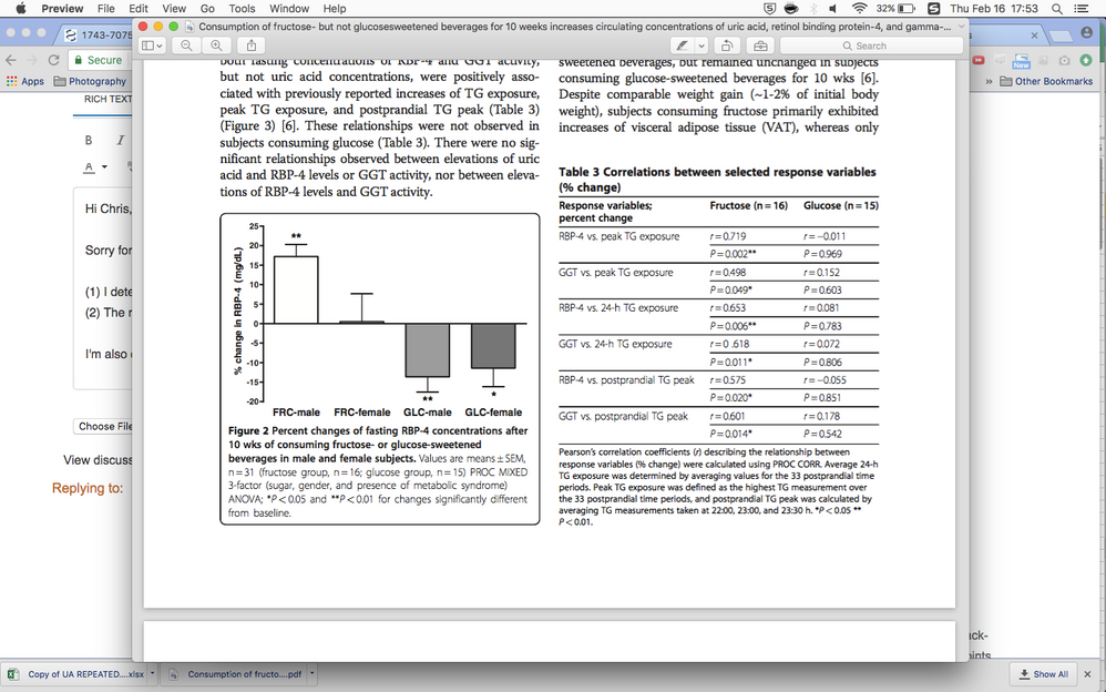
I'm also creating a bar chart but I couldn't make it look like that is presented below, meaning that I couldn't make the bars having a black outline with a white filling like they did for "FCR-male".
- Mark as New
- Bookmark
- Subscribe
- Mute
- Subscribe to RSS Feed
- Get Direct Link
- Report Inappropriate Content
Re: How to make this kind of graphs in JMP?
Right click on the graph and select customize. You can then change the fill color
- Mark as New
- Bookmark
- Subscribe
- Mute
- Subscribe to RSS Feed
- Get Direct Link
- Report Inappropriate Content
Re: How to make this kind of graphs in JMP?
Thanks for getting back to me.
1. Using a manual annotation method I described should work for you.
2. JMP will not be able to calculate the AUC in graph builder. It does do this for Logistic Regression, some curve fits for Non-linear platform, Partition and some other categorical response based modeling methods. For the comparison, if you goal is to say there is a statistical difference, a t-test or analysis of means would be good enough and you could get the mean difference between the groups. But if you are trying to quantitate the amount of difference, then I can see why you would want to use AUC. Maybe summing up the means at across the time points for each of the two groups and then taking the difference would give you an idea of the difference, You can used a combination of Tabulate (time as rows, glucose as a column with condition nested within), then make into data table, and then make a column formula to make the difference of each time point and/or the sum of the columns . Somebody else might have a better idea.
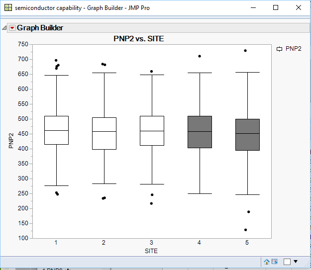
As for the bar chart you are trying to recreate, unfortunately the only way to change the fill color and still have a black boarder may be restricted to scripting it at this point. One can change the colors in to a Black and White scale using the color drop zone in graph builder and then changing each color of the groups one at a time or by using a color scheme. Now if you used an outlier box plot that Jim shows, then his method would work quite well.
Data Scientist, Life Sciences - Global Technical Enablement
JMP Statistical Discovery, LLC. - Denver, CO
Tel: +1-919-531-9927 ▪ Mobile: +1-303-378-7419 ▪ E-mail: chris.kirchberg@jmp.com
www.jmp.com
Recommended Articles
- © 2026 JMP Statistical Discovery LLC. All Rights Reserved.
- Terms of Use
- Privacy Statement
- Contact Us

