- New to JMP? Let the Data Analysis Director guide you through selecting an analysis task, an analysis goal, and a data type. Available now in the JMP Marketplace!
- See how to install JMP Marketplace extensions to customize and enhance JMP.
- Subscribe to RSS Feed
- Mark Topic as New
- Mark Topic as Read
- Float this Topic for Current User
- Bookmark
- Subscribe
- Mute
- Printer Friendly Page
Discussions
Solve problems, and share tips and tricks with other JMP users.- JMP User Community
- :
- Discussions
- :
- Re: How to draw a multivariate linear regression graph with multiple lines based...

- Mark as New
- Bookmark
- Subscribe
- Mute
- Subscribe to RSS Feed
- Get Direct Link
- Report Inappropriate Content
How to draw a multivariate linear regression graph with multiple lines based on selected variable

- Mark as New
- Bookmark
- Subscribe
- Mute
- Subscribe to RSS Feed
- Get Direct Link
- Report Inappropriate Content
Re: How to draw a multivariate linear regression graph with multiple lines based on selected variable
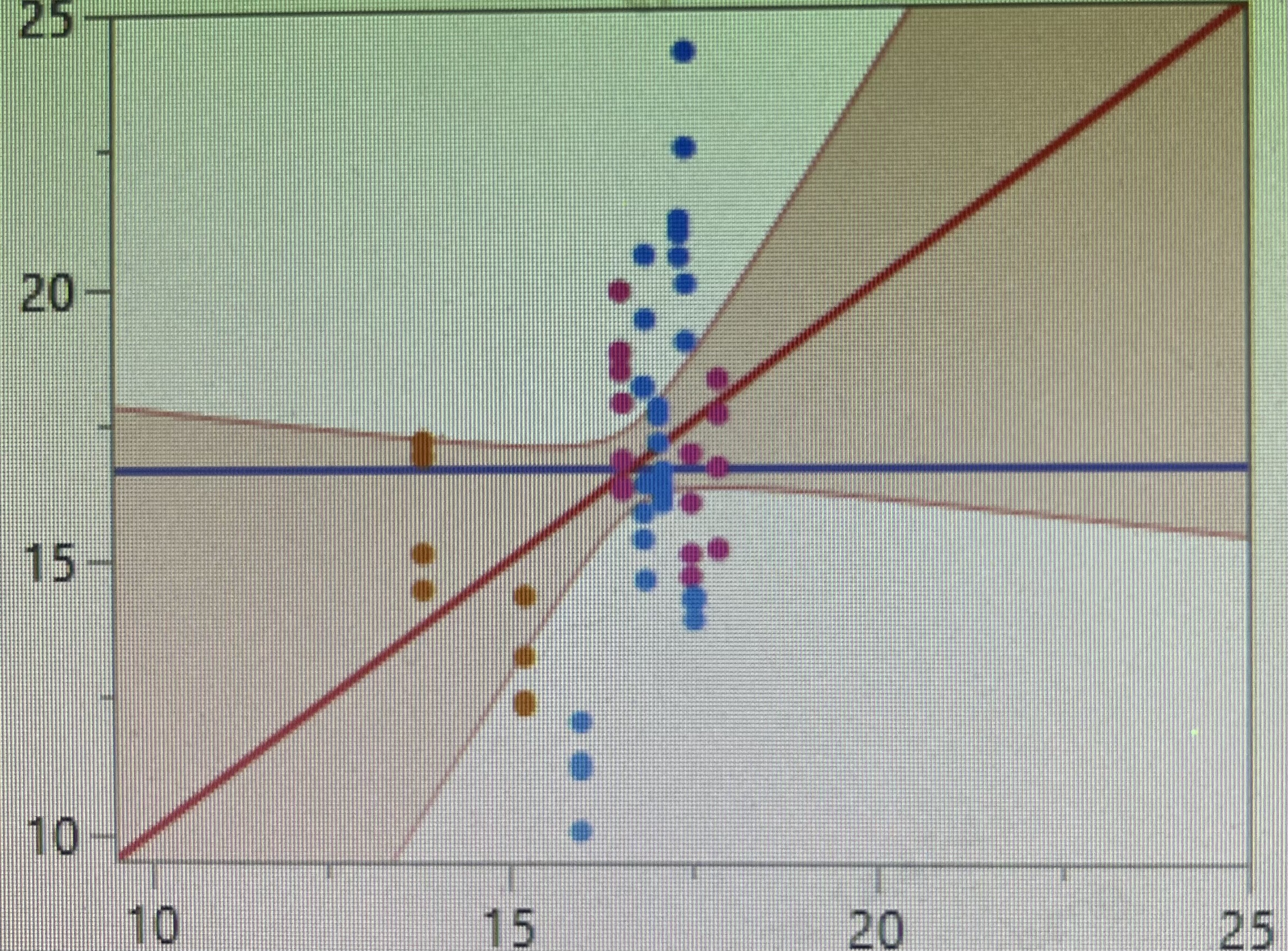
Currently, I guess you probably have a category column in the "Color" role, to give your datapoints three different colors. But they are still treated as the same dataset, so only one trend line is shown.
Instead of using the "Color" role, drag that category variable to the "Overlay" role. That should give three sets of points, and three trend lines.
More info: Graph Zones

- Mark as New
- Bookmark
- Subscribe
- Mute
- Subscribe to RSS Feed
- Get Direct Link
- Report Inappropriate Content
Re: How to draw a multivariate linear regression graph with multiple lines based on selected variable
Hey, so there is a lot to guess about in this question.
What platform are you using? Fit Y by X?
look for this option

- Mark as New
- Bookmark
- Subscribe
- Mute
- Subscribe to RSS Feed
- Get Direct Link
- Report Inappropriate Content
Re: How to draw a multivariate linear regression graph with multiple lines based on selected variable
I personallly use fit model tab, and if I only use 2 variables as model effect, it will produce multiple lines. In the condition, if I add cross effect (interaction), it only produce parallel lines, obviously not I want. If I do not add cross effect, it will produce the line I want. However, I still don't know how to add multiple lines with more than 3 variables. Thanks a lot!

- Mark as New
- Bookmark
- Subscribe
- Mute
- Subscribe to RSS Feed
- Get Direct Link
- Report Inappropriate Content
Re: How to draw a multivariate linear regression graph with multiple lines based on selected variable
This information helped a lot to identify the location of the issue : )
Seems that you want to see a regression (actually: multiple, like in the graph on the left) - and you wonder why you don't see them in the plot on the right. The plot on the right is something different - please note that the "same" values are on the x and y axis: It compares Y values with Y values - the predicted values with the actual "y' values (actual vs. predicted plot).

For a regression, one puts a an effect on the x axis and the actual values on the y axis. Then one can add the model fit and compare the regression with the actual values.
To see multiple fit curves in Fit Model, together with the raw values, you can use the prediction profiler and activate "raw values" and Interactions, as it is explained in Prediction Profiler enhancements in JMP® 18
Maybe going beyond what is needed here:
If there are multiple effects, and there are interactions [the influence of one effect changes depending on the setting of another effect], it's not enough to look at a static graph with a set of fit lines.There is a complicated interplay between the effect. This can be visualized in different ways:
- best: Prediction Profiler
the user can choose specific settings for every effect and check the influence on the fit result.
it is cool, it is interactive. But sometimes the user wants to see the interactions in a static plot.
Therefore, in JMP18, Prediction Profiler got the above mentioned enhancements ... - they came from: Interaction Plot
the idea: plot several curves that illustrate the interaction caused by variations of the other effect. Display the interplay in a Matrix.
Surprisingly, there is no universal definition how the curves are created (based on the fit or based on the input values). Therefore the curves in interaction plots can look completely different depending which software is used: JMP, Minitab, Cornerstone, JMP)
Creating two factor interaction plot (without the full matrix profile)
This is how an Interaction Plot looks in JMP: - As mentioned above, in Prediction Profile - in addition to the interactions, you can now add raw data points to the plot.
One disadvantage compared to the plot you showed is that one only sees a small subset of the data points, specifically: those belonging to the current settings of the effects. [to be able to compare the fit with the data]
There is a third plot type which tries to fix this issue. It corrects the position of the data points by adjusting the y values according to the fitted interactions:
Adjusted Response Graph (https://www.google.com/search?q=adjusted+response+graph+ )
This plot type is not available in JMP, to get such a plot please use other programs like Matlab or Cornerstone.


- Mark as New
- Bookmark
- Subscribe
- Mute
- Subscribe to RSS Feed
- Get Direct Link
- Report Inappropriate Content
Re: How to draw a multivariate linear regression graph with multiple lines based on selected variable
In your explanation you say there are "3 variable in the model" - in the plot on the left, you show 3 regression lines which hints towards: 1 continuos variable and 1 discrete variable (with 3 levels).
If you have some time ...
It will help us when you go to the samples data folder and pick a data set that is close in structure to your actual data set.
Then we can look at your settings in the fit model platform and suggest which plot type is most suitable ...

Recommended Articles
- © 2026 JMP Statistical Discovery LLC. All Rights Reserved.
- Terms of Use
- Privacy Statement
- Contact Us