- New to JMP? Let the Data Analysis Director guide you through selecting an analysis task, an analysis goal, and a data type. Available now in the JMP Marketplace!
- See how to install JMP Marketplace extensions to customize and enhance JMP.
- Subscribe to RSS Feed
- Mark Topic as New
- Mark Topic as Read
- Float this Topic for Current User
- Bookmark
- Subscribe
- Mute
- Printer Friendly Page
Discussions
Solve problems, and share tips and tricks with other JMP users.- JMP User Community
- :
- Discussions
- :
- Re: How to create isopleths of dissolved oxygen for lake?
- Mark as New
- Bookmark
- Subscribe
- Mute
- Subscribe to RSS Feed
- Get Direct Link
- Report Inappropriate Content
How to create isopleths of dissolved oxygen for lake?
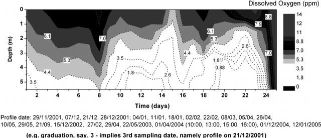
I am trying to create an isopleth of dissolve oxygen for a lake as shown below using JMP. The data I have includes month, depth, and dissolved oxygen.
.
Accepted Solutions
- Mark as New
- Bookmark
- Subscribe
- Mute
- Subscribe to RSS Feed
- Get Direct Link
- Report Inappropriate Content
Re: How to create isopleths of dissolved oxygen for lake?
In JMP there are two methods that might work, depending upon your table setup. Likely a contour is what you want
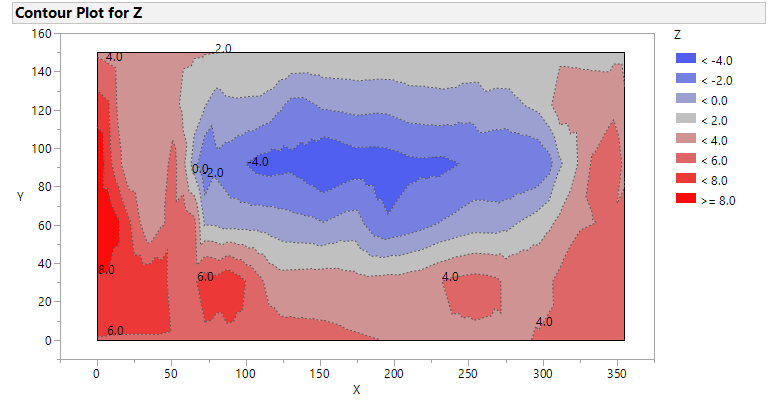
Below is a picture, from JMP sample data Little Pond. Its x axis is spatial distance not time. You will have to customize the color scheme. A script to create the picture follows.
You can produce a contour with Main Menu Graphs > Contour Plot or Graph Builder. Contour plot has more customization.
From Contour choose Days and Depth for X and Dissolved Oxygen for Y Ask to fill areas. You can choose your levels for the Z variable (Dissolved Oxygen).
Names Default To Here( 1 );
dt = Open( "$SAMPLE_DATA/Little Pond.jmp" );

obj = dt << Contour Plot(
	X( :X, :Y ),
	Y( :Z ),
	Show Data Points( 0 ),
	Fill Areas( 1 ),
	Label Contours( 1 ),
	Transform( "None" ),
	Specify Contours( Min( -4 ), Max( 8 ), N( 7 ) ),
	SendToReport(
		Dispatch( {}, "Contour Plot Graph", FrameBox, {Frame Size( 594, 326 )} )
	)
);- Mark as New
- Bookmark
- Subscribe
- Mute
- Subscribe to RSS Feed
- Get Direct Link
- Report Inappropriate Content
Re: How to create isopleths of dissolved oxygen for lake?
- Mark as New
- Bookmark
- Subscribe
- Mute
- Subscribe to RSS Feed
- Get Direct Link
- Report Inappropriate Content
Re: How to create isopleths of dissolved oxygen for lake?
For smoothing, the most general option is to create a smoothed version of your data in a new column with a regular modeling platform or the Guassian Process platform. And then graph that data.
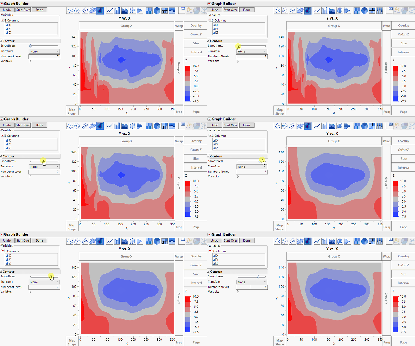
In JMP 14, there is a smoothness slider in Graph Builder's contour element which will dynamically apply a kernel density smoother. However, it doesn't have the line labeling options of the Contour Plot platform.
- Mark as New
- Bookmark
- Subscribe
- Mute
- Subscribe to RSS Feed
- Get Direct Link
- Report Inappropriate Content
Re: How to create isopleths of dissolved oxygen for lake?
In JMP there are two methods that might work, depending upon your table setup. Likely a contour is what you want
Below is a picture, from JMP sample data Little Pond. Its x axis is spatial distance not time. You will have to customize the color scheme. A script to create the picture follows.
You can produce a contour with Main Menu Graphs > Contour Plot or Graph Builder. Contour plot has more customization.
From Contour choose Days and Depth for X and Dissolved Oxygen for Y Ask to fill areas. You can choose your levels for the Z variable (Dissolved Oxygen).
Names Default To Here( 1 );
dt = Open( "$SAMPLE_DATA/Little Pond.jmp" );

obj = dt << Contour Plot(
	X( :X, :Y ),
	Y( :Z ),
	Show Data Points( 0 ),
	Fill Areas( 1 ),
	Label Contours( 1 ),
	Transform( "None" ),
	Specify Contours( Min( -4 ), Max( 8 ), N( 7 ) ),
	SendToReport(
		Dispatch( {}, "Contour Plot Graph", FrameBox, {Frame Size( 594, 326 )} )
	)
);- Mark as New
- Bookmark
- Subscribe
- Mute
- Subscribe to RSS Feed
- Get Direct Link
- Report Inappropriate Content
Re: How to create isopleths of dissolved oxygen for lake?
It is working! thank you so much.
- Mark as New
- Bookmark
- Subscribe
- Mute
- Subscribe to RSS Feed
- Get Direct Link
- Report Inappropriate Content
Re: How to create isopleths of dissolved oxygen for lake?
Oh, one item that is on a wish list that I hope JMP tackles in the next version is to separate the outline of shapes and the fill.
Since I liked your plot with the contour lines visible and a different color than the fill, I decided to see what it would take to get the outlines. It's not too bad. Here is the picture. The script is attached; it was tested in JMP12, 13, and 14.
- Mark as New
- Bookmark
- Subscribe
- Mute
- Subscribe to RSS Feed
- Get Direct Link
- Report Inappropriate Content
Re: How to create isopleths of dissolved oxygen for lake?
Thanks!
How can I make the line smoother?
- Mark as New
- Bookmark
- Subscribe
- Mute
- Subscribe to RSS Feed
- Get Direct Link
- Report Inappropriate Content
Re: How to create isopleths of dissolved oxygen for lake?
For smoothing, the most general option is to create a smoothed version of your data in a new column with a regular modeling platform or the Guassian Process platform. And then graph that data.
In JMP 14, there is a smoothness slider in Graph Builder's contour element which will dynamically apply a kernel density smoother. However, it doesn't have the line labeling options of the Contour Plot platform.
- Mark as New
- Bookmark
- Subscribe
- Mute
- Subscribe to RSS Feed
- Get Direct Link
- Report Inappropriate Content
Re: How to create isopleths of dissolved oxygen for lake?
Thanks!
Recommended Articles
- © 2026 JMP Statistical Discovery LLC. All Rights Reserved.
- Terms of Use
- Privacy Statement
- Contact Us


