- Learn how to build custom Python data connectors and further customize JMP’s Data Connector Framework with the Python Data Connector Demo, available now in the JMP Marketplace!
- See how to move from signal modeling to system modeling at the first JMP Aerospace Analytics webinar. Register. June 18, 1 p.m. US Eastern Time.
- Subscribe to RSS Feed
- Mark Topic as New
- Mark Topic as Read
- Float this Topic for Current User
- Bookmark
- Subscribe
- Mute
- Printer Friendly Page
Discussions
Solve problems, and share tips and tricks with other JMP users.- JMP User Community
- :
- Discussions
- :
- Re: How to create HEATMAPS that show the correlation (with different colour) and...
- Mark as New
- Bookmark
- Subscribe
- Mute
- Subscribe to RSS Feed
- Get Direct Link
- Report Inappropriate Content
How to create HEATMAPS that show the correlation (with different colour) and stars for the pvalue?

- Mark as New
- Bookmark
- Subscribe
- Mute
- Subscribe to RSS Feed
- Get Direct Link
- Report Inappropriate Content
Re: How to create HEATMAPS that show the correlation (with different colour) and stars for the pvalu
From the Analyze pulldown menu:
Analyze==>Multivariate Methods==>Multivariate
In the report output's red triangle, select Color Maps

- Mark as New
- Bookmark
- Subscribe
- Mute
- Subscribe to RSS Feed
- Get Direct Link
- Report Inappropriate Content
Re: How to create HEATMAPS that show the correlation (with different colour) and stars for the pvalu
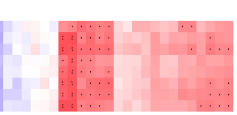
yes, but what if you would also like to put stars on each correlation (denoting p values <0.05)? As eg in the photo attached?
- Mark as New
- Bookmark
- Subscribe
- Mute
- Subscribe to RSS Feed
- Get Direct Link
- Report Inappropriate Content
Re: How to create HEATMAPS that show the correlation (with different colour) and stars for the pvalu
There isn't a builtin option to complete the full list of your requirements. However, a not very difficult script could generate the chart.
- Mark as New
- Bookmark
- Subscribe
- Mute
- Subscribe to RSS Feed
- Get Direct Link
- Report Inappropriate Content
Re: How to create HEATMAPS that show the correlation (with different colour) and stars for the pvalu
Could you give some more info for ''script dummies'' as me?
I recently (today) did my 1st heatmap on JMP following the instructions given in this very useful video: https://www.youtube.com/watch?v=uaBFoI3l-8U
If somebody could create a similar video but also including the script for how to add the stars (eg *p<0.05, **p<0.01, **** p<0.001), i think the whole JMP community would be really happy about it :)
Alternatively if someone had some time to explain step by step what script would be needed and how it could be incorporated in a JMP dataset it would still be very useful.
Thanks for the understanding!

- Mark as New
- Bookmark
- Subscribe
- Mute
- Subscribe to RSS Feed
- Get Direct Link
- Report Inappropriate Content
Re: How to create HEATMAPS that show the correlation (with different colour) and stars for the pvalu
Here is a script that should be a good start in creating what you want

Names Default To Here( 1 );

// Open a sample data table
dt = Open( "$SAMPLE_DATA/semiconductor capability.jmp" );

// Run the Correlation Platform to get the data
mult = dt << Multivariate(
	invisible,
	Y( :NPN1, :PNP1, :PNP2, :NPN2, :PNP3, :IVP1 ),
	Estimation Method( "Row-wise" ),
	Matrix Format( "Square" ),
	Scatterplot Matrix( 0 ),
	Pairwise Correlations( 1 )
);

// Create data tables of the stats required
dtCorr = Report( mult )["Correlations"][Matrix Box( 1 )] << make into data table(invisible);
dtSig = Report( mult )["Pairwise Correlations"][Table Box( 1 )] << make into data table(invisible);

// Delete the Row Name column, not wanted in analysis
dtCorr << delete columns( 1 );

// Set the 100 colors to be used to color the graph
colorMatrix = [-16558990, -16558990, -16557962, -16557962, -16557191, -16557191, -16556419, -16556419, -16555391,
-16555391, -16554619, -16554619, -16553848, -16553848, -16553076, -16553076, -16552048, -16552048, -16551277,
-16551277, -16550506, -16550506, -16549735, -16549735, -16548964, -16548964, -16547936, -16547936, -16481629,
-16481629, -16480858, -16480858, -16480087, -16480087, -16479316, -16479316, -16478288, -16478288, -16477517,
-16477517, -16476746, -16476746, -16410184, -16410184, -16343621, -16343621, -16277315, -16277315, -16210752,
-16210752, -16144190, -16144190, -16077628, -16077628, -16011321, -16011321, -15944759, -15944759, -15878196,
-15878196, -15811634, -15811634, -15745328, -15745328, -15678765, -15678765, -15612459, -15612459, -15415082,
-15415082, -15217705, -15217705, -15020328, -15020328, -14822951, -14822951, -14625829, -14625829, -14428452,
-14428452, -14231075, -14231075, -14099234, -14099234, -13901857, -13901857, -13704735, -13704735, -13507358,
-13507358, -13309981, -13309981, -13113116, -13113116, -12916508, -12916508, -12719643, -12719643, -12522778,
-12522778];

// Get the column names in the Corr data table
columnNamesList = dtCorr << get column names( string );

// Create the output
nw = New Window( "Correlations",
	gb = Graph Box(
		Frame Size( 800, 800 ),
		X Scale( 0, N Col( dtCorr ) + 2 ),
		Y Scale( 0, N Rows( dtCorr ) + 2 ),
		// Loop across the the rows and columns to find the correlation values and plot the results
		For( x = 1, x <= N Cols( dtCorr ), x++,
			For( y = 1, y <= N Rows( dtCorr ), y++,
				// Find the color to use from the color matrix
				fc = Abs( Floor( (dtCorr[y, x] * 100) + .5 ) );
				If( fc < 1, fc = 1 );
				fcc = colorMatrix[fc];
				// Set the color
				Eval( Parse( "Fill Color(" || Char( fcc ) || ");" ) );
				Pen Color( "black" );

				// create the output square
				xlist1 = Matrix( x ) || Matrix( x ) || Matrix( x + 1 ) || Matrix( x + 1 );
				xlist2 = Matrix( N Cols( dtCorr ) + 1 - y ) || Matrix( N Cols( dtCorr ) + 1 - y + 1 ) ||
				Matrix( N Cols( dtCorr ) + 1 - y + 1 ) || Matrix( N Cols( dtCorr ) + 1 - y );
				Polygon( xlist1, xlist2 );
				// Draw a line around the square
				Line( xlist1, xlist2 );
			)
		);

		// Add the "*" for significant correlations, by going through the significant data table
		Text Color( "Black" );
		Text Size( 20 );

		For( i = 1, i <= N Rows( dtSig ), i++,
			If( dtSig:Signif Prob[i] <= .05,
				textList = {};
				Insert Into( textList, Loc( columnNamesList, dtSig:Variable[i] )[1] + .5 );
				Insert Into( textList, N Cols( dtCorr ) + 1 - Loc( columnNamesList, dtSig:by Variable[i] )[1] + .5 );

				Text( Center Justified, textList, "*" );
				textList = {};
				Insert Into( textList, Loc( columnNamesList, dtSig:by Variable[i] )[1] + .5 );
				Insert Into( textList, N Cols( dtCorr ) + 1 - Loc( columnNamesList, dtSig:Variable[i] )[1] + .5 );

				// Write the symbol in the middle of the square
				Text( Center Justified, textList, "*" );
			)
		);
	)

);Recommended Articles
- © 2026 JMP Statistical Discovery LLC. All Rights Reserved.
- Terms of Use
- Privacy Statement
- Contact Us