- New to JMP? Let the Data Analysis Director guide you through selecting an analysis task, an analysis goal, and a data type. Available now in the JMP Marketplace!
- See how to install JMP Marketplace extensions to customize and enhance JMP.
- Subscribe to RSS Feed
- Mark Topic as New
- Mark Topic as Read
- Float this Topic for Current User
- Bookmark
- Subscribe
- Mute
- Printer Friendly Page
Discussions
Solve problems, and share tips and tricks with other JMP users.- JMP User Community
- :
- Discussions
- :
- How to automate variability chart plotting?
- Mark as New
- Bookmark
- Subscribe
- Mute
- Subscribe to RSS Feed
- Get Direct Link
- Report Inappropriate Content
How to automate variability chart plotting?
I have a table with following information.I have this data for ~40 different tests and upper and lower limit are different for each of the test.
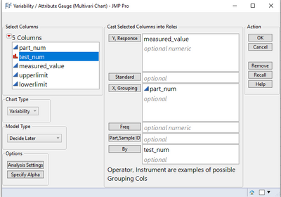
How can I automate the variability chart plotting?
| part_num | test_num | measured_value | upperlimit | lowerlimit |
Following is what I need to automate-
Thanks
- Mark as New
- Bookmark
- Subscribe
- Mute
- Subscribe to RSS Feed
- Get Direct Link
- Report Inappropriate Content
Re: How to automate variability chart plotting?
One easy way would be, if you have e.g. that data in 40 tables of different datasets with same structure (column names),
to build the analysis in the first one, save it as script, copy it to all other tables, and execute it.
Otherwise we would need more specific information, an example would also help.
- Mark as New
- Bookmark
- Subscribe
- Mute
- Subscribe to RSS Feed
- Get Direct Link
- Report Inappropriate Content
Re: How to automate variability chart plotting?
If you run the Variability Platform as you have it setup, you can go to the output and click on the red triangle next to "Variability Chart" and select
Save By-Group Script=>Script Window
and it will create the script you need.
Variability Chart( Y( :measured_value ), X( :part_num ), BY( :test_num ) );However, you mention Spec Limits, but in your Variability Chart specification, has no ability to handle Spec Limits.
So what I am saying, is that I think there are additional requirement that you may have for the output you want.
If not, the above script is what you need.
- Mark as New
- Bookmark
- Subscribe
- Mute
- Subscribe to RSS Feed
- Get Direct Link
- Report Inappropriate Content
Re: How to automate variability chart plotting?
I was able to automate this part -
Variability Chart( Y( :measured_value ), X( :part_num ), BY( :test_num ) );I need to put the reference lines with upper spec limit and lower spec limit on to the variability plot and this is the part I'm struggling with.
So let's say I have 9 different tests and the upper limit and lower limit are different for these 9 tests,how do I automate that?
- Mark as New
- Bookmark
- Subscribe
- Mute
- Subscribe to RSS Feed
- Get Direct Link
- Report Inappropriate Content
Re: How to automate variability chart plotting?
varChart = Variability Chart( Y( :measured_value ), X( :part_num ), BY( :test_num ) );
ResponseMean = 10;
Report(varchart)[AxisBox(1)] << Add Ref Line( ResponseMean, "Solid", "Blue", Concat("Standard: ",char(Round(ResponseMean,1))) , 1 )
Assuming you run the whole thing in a for loop you can take yor spec limits from a list or column in another table. Then read them into this script and the third line shows you how to add a line to the variability charts. Copy it multiple times for USL, LSL and mean.
Recommended Articles
- © 2026 JMP Statistical Discovery LLC. All Rights Reserved.
- Terms of Use
- Privacy Statement
- Contact Us


