- New to JMP? Let the Data Analysis Director guide you through selecting an analysis task, an analysis goal, and a data type. Available now in the JMP Marketplace!
- See how to install JMP Marketplace extensions to customize and enhance JMP.
- Subscribe to RSS Feed
- Mark Topic as New
- Mark Topic as Read
- Float this Topic for Current User
- Bookmark
- Subscribe
- Mute
- Printer Friendly Page
Discussions
Solve problems, and share tips and tricks with other JMP users.- JMP User Community
- :
- Discussions
- :
- Re: The Smooth Line in the Graph Builder
- Mark as New
- Bookmark
- Subscribe
- Mute
- Subscribe to RSS Feed
- Get Direct Link
- Report Inappropriate Content
How is the Smooth Line in the Graph Builder determined
Can anyone tell me how the smooth line is generated in the Graph Builder? I assume is some sort of running average, but anyone know how many values or what range its pulling to make the average?
Accepted Solutions
- Mark as New
- Bookmark
- Subscribe
- Mute
- Subscribe to RSS Feed
- Get Direct Link
- Report Inappropriate Content
Re: The Smooth Line in the Graph Builder
The smoother utilized in the Graph Builder platform is a cubic spline with a lambda of 0.05 and standardized X values. The same spline can be obtained through the Bivariate platform by selecting Analyze > Fit Y by X, supplying the Y and X variables, and clicking OK. On the resulting Bivariate report window, select Fit Spline > Other from the popup menu. Then supply a smoothness parameter (lambda) of 0.05, and check the Standardize X box.
This information is from the JMP Statistics and Graphics Guide for version 8.0.2 and this info is found on pages 929-930 in Chapter 43. This is in the section on "Changing the Graph Element".
The "standardization of X" has the same effect as subtracting the mean and dividing by the standard deviation for the X variable and then fitting the spline. The only difference is that in Graph Builder and the Fit Y by X platform, the data is still plotted on the original scale rather than the standardized scale. Using standardized X values seems to smooth out the fit a little
- Mark as New
- Bookmark
- Subscribe
- Mute
- Subscribe to RSS Feed
- Get Direct Link
- Report Inappropriate Content
Re: The Smooth Line in the Graph Builder
- Mark as New
- Bookmark
- Subscribe
- Mute
- Subscribe to RSS Feed
- Get Direct Link
- Report Inappropriate Content
Re: The Smooth Line in the Graph Builder
Hi,
Is there a way to extract the equations of the smoothed curves ?
Thanks
- Mark as New
- Bookmark
- Subscribe
- Mute
- Subscribe to RSS Feed
- Get Direct Link
- Report Inappropriate Content
Re: The Smooth Line in the Graph Builder
@samir here are two posts on cubic splines.
this one is probably what you want (thanks @Duane_Hayes:(
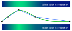
this one shows another way to get the coefficients; I used the smoothed spline values to control the color.
- Mark as New
- Bookmark
- Subscribe
- Mute
- Subscribe to RSS Feed
- Get Direct Link
- Report Inappropriate Content
Re: The Smooth Line in the Graph Builder
- Mark as New
- Bookmark
- Subscribe
- Mute
- Subscribe to RSS Feed
- Get Direct Link
- Report Inappropriate Content
Re: The Smooth Line in the Graph Builder
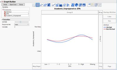
I see the option of cubic splines is available in JMP at graph builder with categorical variables. For example, when you test the moderating(interacting) effect of a categorical variable on the effect of a categorical variable to a categorical outcome. Does this make sense? Is that possible?
- Mark as New
- Bookmark
- Subscribe
- Mute
- Subscribe to RSS Feed
- Get Direct Link
- Report Inappropriate Content
Re: The Smooth Line in the Graph Builder
I can make sense in cases like this where the response has two levels and the factor is ordinal. In that case, the Y reflects the proportion of the two values and you get of the trend for how that proportion changes with the GPA. Your "Missing" value on the X axis, however, is categorically different and should be plotted separately.
A more common view for categorical data would be a stacked bar of the counts or proportions for each outcome for each GPA value.
- Mark as New
- Bookmark
- Subscribe
- Mute
- Subscribe to RSS Feed
- Get Direct Link
- Report Inappropriate Content
Re: The Smooth Line in the Graph Builder
Thank you very much for your prompt reply and heartening answer.
- Mark as New
- Bookmark
- Subscribe
- Mute
- Subscribe to RSS Feed
- Get Direct Link
- Report Inappropriate Content
Re: The Smooth Line in the Graph Builder
@mpb, thanks for this info. This is very useful.
Another question, is there a way to disable "Standardize X" in Graph Builder? In Bivariate, there is a checkbox to enable/disable "Standardize X". I thought Graph Builder might have that too, but I can't find it.
Thanks,
Shaira
Recommended Articles
- © 2026 JMP Statistical Discovery LLC. All Rights Reserved.
- Terms of Use
- Privacy Statement
- Contact Us


