- New to JMP? Join us Sept. 23-24 for the Early User Edition of Discovery Summit, tailor-made for new users. Register now for free!
- Use World Cup data to build models, explore spatial relationships, and create informative visualizations in JMP. Register. July 17, 2 pm US Eastern Time.
- Your voice matters! Tell us how you prefer to receive JMP updates, so we can tailor our communication to your needs. Take short survey.
- Subscribe to RSS Feed
- Mark Topic as New
- Mark Topic as Read
- Float this Topic for Current User
- Bookmark
- Subscribe
- Mute
- Printer Friendly Page
Discussions
Solve problems, and share tips and tricks with other JMP users.- JMP User Community
- :
- Discussions
- :
- Re: Graph/Legend flexibility

- Mark as New
- Bookmark
- Subscribe
- Mute
- Subscribe to RSS Feed
- Get Direct Link
- Report Inappropriate Content
Graph/Legend flexibility
I have some working scripts that manipulate a data table and create a graph..... all is well......
However, I'd like to accommodate changes in the data over time. For instance -- there are currently 5 levels of priority that can be reported in the database (i.e. Blocker, Critical, Major, Minor, Trivial) ---- but not all are used during every reporting period by the users (e.g. Critical, Major, Minor may be the only entries for a particular reporting period)..... it is very likely that users will include all (i.e. all 5) priorities in the future for a particular reporting period. Also --- it is likely that for the next reporting period the user's may only use 3 of the priority levels.
My dilemma --- my current graph script only accommodates a fixed number of priorities ---- so if I build it to only handle 4 then I may be excluding data on the graph ---- I have tried to force it to always show 5 priorities but it seems to mess up the legend (wrong order of labels/colors)........ Is there a way to make it dynamic depending on the data values to be used in the 'overlay'?
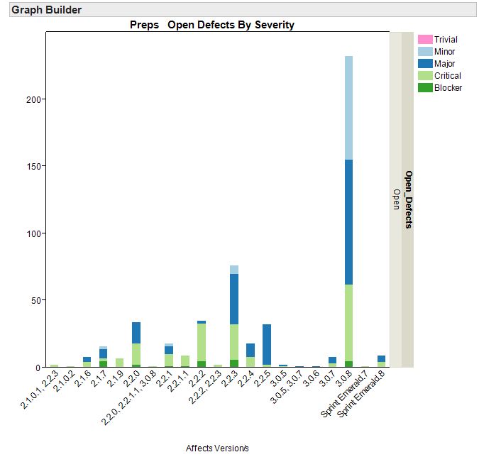
// Build the visualization Graph to show severity of open defects//
wind = New Window( "Open Defects by Severity",
Graph Builder(
  Size( 570, 616 ),
  Show Control Panel( 0 ),
  Variables(
            X( :Name( "Affects Version/s" ) ),
            Group Y( :Open_Defects ),
            Overlay( :Priority )
  ),
  Elements(
            Bar( X, Legend( 2 ), Bar Style( "Stacked" ), Summary Statistic( "N" ) )
  ),
  SendToReport(
            Dispatch(
                           {},
                           "Affects Version/s",
                           ScaleBox,
                           {Show Major Ticks( 0 ), Rotated Labels( "Automatic" )}
  ),
            Dispatch(
                           {},
                           "400",
                           ScaleBox,
                           {Legend Model(
                                          2,
                                          Properties( 3, {Line Color( -10931939 ), Fill Color( -10931939 )} ),
                                          Properties( 2, {Line Color( -2062516 ), Fill Color( -2062516 )} ),
                                          Properties( 1, {Line Color( -11722634 ), Fill Color( -11722634 )} ),
                                          Properties( 0, {Line Color( -3383340 ), Fill Color( -3383340 )} )
                           )}
            ),
            Dispatch( {}, "400", LegendBox, {Position( {3, 2, 1, 0} )} )
       )
)
);

Accepted Solutions

- Mark as New
- Bookmark
- Subscribe
- Mute
- Subscribe to RSS Feed
- Get Direct Link
- Report Inappropriate Content
Re: Graph/Legend flexibility
Good question. The only work-around I can think of is to add dummy rows to the data table representing all priority levels but with missing values for the other columns.
- Mark as New
- Bookmark
- Subscribe
- Mute
- Subscribe to RSS Feed
- Get Direct Link
- Report Inappropriate Content
Re: Graph/Legend flexibility
Xan:
I was thinking of that as well ----- but I was afraid it would 'add' fake data ----- but your suggestion to add missing values to the other columns may work --- I'll give it a try
- Mark as New
- Bookmark
- Subscribe
- Mute
- Subscribe to RSS Feed
- Get Direct Link
- Report Inappropriate Content
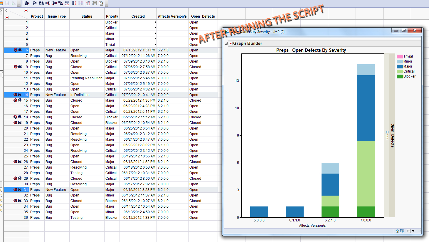
Re: Graph/Legend flexibility
Ok --- here is what I have and it works fine.... --- thanks to the suggestion of Xan....
I added 5 'vacant' rows of data ---- the only field that is entered on each row is in the column marked 'Priority' ---- The script creates 5 rows at the beginning of the data table and populates the Priority column with 5 entries
| dt<<Add Rows(5,0); | |
| :Priority<<values({Blocker,Critical,Major,Minor,Trivial}); |
The remainder of the script filters out those rows because no other fields within the rows have data - so these new rows do not corrupt the graphs that are generated (i.e. showing the additional Priority data).
Now every graph generated shows each of the 5 priorities in the Legend even if those priorities did not exist in the original data ----- this helps with consistency in the color scheme we developed for each priority and in the order they are presented in the Legend. ---- we populate a PowerPoint with side-by-side graphs so it's important the color scheme and order within the Legend are consistent....

- Mark as New
- Bookmark
- Subscribe
- Mute
- Subscribe to RSS Feed
- Get Direct Link
- Report Inappropriate Content
Re: Graph/Legend flexibility
Twaintwist,thanks for your post to raise a important question. I believe that also here i have the same problem. I have some difficulte to understand your final solution. Can you attached a jmp table as example for me? Can you paste the final JSl containing add row and set value here so that i can test. Thank you! Kun
- Mark as New
- Bookmark
- Subscribe
- Mute
- Subscribe to RSS Feed
- Get Direct Link
- Report Inappropriate Content
Re: Graph/Legend flexibility
Kun,
Attached you should find the JMP script (Adding rows Script.jsl), the dataTable (general_report.jmp) and a screen shot of the results (After.jpg)....
The script adds 5 new rows to the top of the dataTable, then it populates those 5 rows with 5 unique character names in the 'Priority' column. This will make sure that every graph generated using this script will show all five names in the Legend. I do this because as new dataTables are generated over time some will have all 5 names and some will not. When they don't have all 5 names the Legend does not remain in the same order or color scheme ---- so when comparing graphs from previous runs the Legends don't match and it it is confusing. By forcing the 5 names it produces Legends that are consistent....

- Mark as New
- Bookmark
- Subscribe
- Mute
- Subscribe to RSS Feed
- Get Direct Link
- Report Inappropriate Content
Re: Graph/Legend flexibility
Thank you,Twaintwist!
Your table file and JSL help me understand your issue and final solution. Learn an important application case.
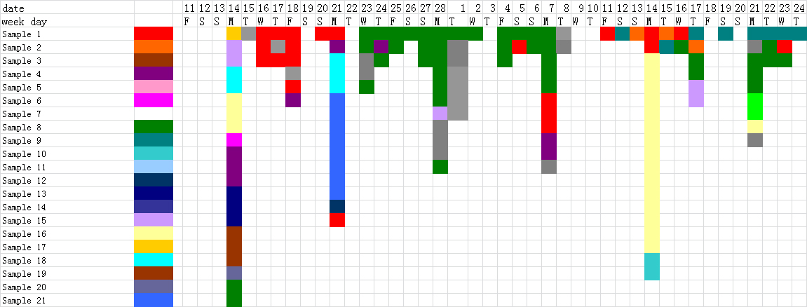
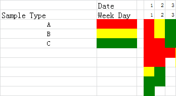
Here i try to use a bar-like graph to show daily sampe loading type,sequence and numbers in our lab. Here you can find totally there are 21 types of sample to enter our lab to test. I try to track their arrival sequence every day. I use one color for one kind of sample. If there are the same successive samples reach, it will be a long bar with the same color. I have attached a graph produced by excel. Do you believe we can realized it via jmp JSL way?
Thank you in advance.
Kun
- Mark as New
- Bookmark
- Subscribe
- Mute
- Subscribe to RSS Feed
- Get Direct Link
- Report Inappropriate Content
Re: Graph/Legend flexibility
Kun, I am fairly new to JMP so I'm not sure if it is capable of producing the results that you are describing....
- Mark as New
- Bookmark
- Subscribe
- Mute
- Subscribe to RSS Feed
- Get Direct Link
- Report Inappropriate Content
Re: Graph/Legend flexibility
Kun,
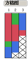
Stacked bars might work if you add a filler white category for the gaps. Another idea is the Heat Map element in Graph Builder. Pic attached. Are you can make a scatter plot and choose a filled rectangular marker for each point.

- Mark as New
- Bookmark
- Subscribe
- Mute
- Subscribe to RSS Feed
- Get Direct Link
- Report Inappropriate Content
Re: Graph/Legend flexibility
Xan,
thanks for your help.Your suggestion seems can not solve my problem. I try to better explain my need here again. As you can find the attached "lab sample entry" table, here i record all sample entry type, time and sequence. I try to get final grap output as attached "desired graph output". Color means diffrent sample type. Sequence of sample entry is quite important for us. The earliest entry will located in the first row of every day. The last entry will be located in the last row of every day. Every cell means a sample batch.
I have tested using cell plot after transform the origial table to get a transform table. However as you can find in attached cell plot, i can not get desired color. JMP seems always start to color from the first type of product. This is not my desired way. I need fix color for every type of sample.
Can you give me some suggestion? Thank you in adavance.
Kun
Recommended Articles
- © 2026 JMP Statistical Discovery LLC. All Rights Reserved.
- Terms of Use
- Privacy Statement
- Contact Us