- New to JMP? Let the Data Analysis Director guide you through selecting an analysis task, an analysis goal, and a data type. Available now in the JMP Marketplace!
- See how to install JMP Marketplace extensions to customize and enhance JMP.
- Subscribe to RSS Feed
- Mark Topic as New
- Mark Topic as Read
- Float this Topic for Current User
- Bookmark
- Subscribe
- Mute
- Printer Friendly Page
Discussions
Solve problems, and share tips and tricks with other JMP users.- JMP User Community
- :
- Discussions
- :
- Graph Builder - subplot with different color settings?
- Mark as New
- Bookmark
- Subscribe
- Mute
- Subscribe to RSS Feed
- Get Direct Link
- Report Inappropriate Content
Graph Builder - subplot with different color settings?
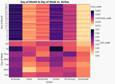
Let's say I want to generate a graph to illustrate the ratio of flights with >100min delay, split by airline and separate graphs for the different days of a week and the days of the month.
As there is just a single "color" slot, I can just use the ratio per week OR the ratio per month as color - therefore, the other plot is always nonsense.
There are 2 legends which allow me to adjust the color ranges and gradient settings separately for both subplots, but I couldn't find the knob which allowed me to select two different columns for the color of the two plots.
How can I create a plot in Graph Builder where both subplots show the correct values?
dt = Open( "$SAMPLE_DATA/Airline Delays.jmp" );

dt << New Column( "ratio_week",
	Formula( Col Number( If( :Arrival Delay > 100, 1, . ), :Airline, :Day of Week ) / Col Number( 1, :Airline, :Day of Week ) )
);
dt << New Column( "ratio_month",
	Formula( Col Number( If( :Arrival Delay > 100, 1, . ), :Airline, :Day of Month ) / Col Number( 1, :Airline, :Day of Month ) )
);

dt << Graph Builder(
	Size( 600, 557 ),
	Show Control Panel( 0 ),
	Summary Statistic( "Median" ),
	Graph Spacing( 4 ),
	Variables(
		X( :Airline ),
		Y( :Day of Month ),
		Y( :Day of Week ),
		Color( :ratio_month )
	),
	Elements( Position( 1, 1 ), Heatmap( X, Y, Legend( 5 ) ) ),
	Elements( Position( 1, 2 ), Heatmap( X, Y, Legend( 6 ) ) ),
	Column Switcher(
		:ratio_month,
		{:ratio_week, :ratio_month},
		Retain Axis Settings( 1 )
	)
)Accepted Solutions
- Mark as New
- Bookmark
- Subscribe
- Mute
- Subscribe to RSS Feed
- Get Direct Link
- Report Inappropriate Content
Re: Graph Builder - subplot with different color settings?
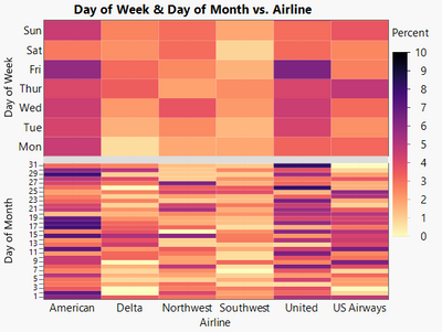
Hm, as a fallback solution one could stack the 2 pieces of information into a single column to get the correct values for both plots.
But I hope that there exists a simpler solution directly via Graph Builder ?
dt = Open( "$SAMPLE_DATA/Airline Delays.jmp" );

New Column( "larger100min",
	Formula( If( :Arrival Delay > 100, 1, . ) )
);

obj = Tabulate(
	Add Table(
		Column Table( Statistics( N Missing ), Analysis Columns( :larger100min ) ),
		Column Table( Statistics( N ) ),
		Row Table( Grouping Columns( :Airline, :Day of Week ) ),
		Row Table( Grouping Columns( :Airline, :Day of Month ) )
	)
);
{dt2,dt3}=obj << Make Into Data Table;
obj << Close Window;

dt2 << Concatenate(	dt3,Append to first table);

dt2 << New Column( "Percent", Set Each Value(	((:N - :"N Missing(larger100min)"n) / :N) * 100));


dt2:Day of Week << Set Property(
	"Value Order",
	{Custom Order(
		{"Mon", "Tue", "Wed", "Thur", "Fri", "Sat", "Sun"}
	), Common Order( 0 )}
);


Graph Builder(
	Size( 526, 448 ),
	Show Control Panel( 0 ),
	Summary Statistic( "Median" ),
	Graph Spacing( 10 ),
	Variables(
		X( :Airline ),
		Y( :Day of Week ),
		Y( :Day of Month ),
		Color( :Percent )
	),
	Elements( Position( 1, 1 ), Heatmap( X, Y, Legend( 14 ) ) ),
	Elements( Position( 1, 2 ), Heatmap( X, Y, Legend( 15 ) ) ),
	SendToReport(
		Dispatch(
			{},
			"Day of Week",
			ScaleBox,
			{Min( -0.5 ), Max( 6.5 ), Inc( 1 ), Minor Ticks( 0 )}
		),
		Dispatch(
			{},
			"Day of Month",
			ScaleBox,
			{Min( 0.5 ), Max( 31.5 ), Inc( 1 ), Minor Ticks( 0 )}
		)
	)
)
- Mark as New
- Bookmark
- Subscribe
- Mute
- Subscribe to RSS Feed
- Get Direct Link
- Report Inappropriate Content
Re: Graph Builder - subplot with different color settings?
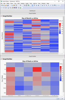
Is there a reason to not use multiple graph builders (you are plotting two "different" things).
Names Default To Here(1);
dt = Open("$SAMPLE_DATA/Airline Delays.jmp");

dt << New Column("ratio_week", Formula(Col Number(If(:Arrival Delay > 100, 1, .), :Airline, :Day of Week) / Col Number(1, :Airline, :Day of Week)));
dt << New Column("ratio_month",
	Formula(Col Number(If(:Arrival Delay > 100, 1, .), :Airline, :Day of Month) / Col Number(1, :Airline, :Day of Month))
);

Local Here(
	table1 = Open("C:\Program Files\SAS\JMPPRO\17\Samples\Data\Airline Delays.jmp");
	New Window("Airline Delays - Dashboard",
		Tab Page Box(
			"Dashboard",
			V Splitter Box(
				Size(737, 973),
				<<Sizes({0.5, 0.5}),
				Tab Page Box(
					"Graph Builder",
					Scroll Box(
						Size(737, 456),
						Flexible(1),
						V List Box(
							table1 << Graph Builder(
								Size(650, 438),
								Show Control Panel(0),
								Fit to Window,
								Summary Statistic("Median"),
								Graph Spacing(4),
								Variables(X(:Airline), Y(:Day of Month), Color(:ratio_month)),
								Elements(Heatmap(X, Y, Legend(5)))
							)
						)
					)
				),
				Tab Page Box(
					"Graph Builder",
					Scroll Box(
						Size(737, 456),
						Flexible(1),
						V List Box(
							table1 << Graph Builder(
								Size(658, 434),
								Show Control Panel(0),
								Fit to Window,
								Summary Statistic("Median"),
								Graph Spacing(4),
								Variables(X(:Airline), Y(:Day of Week), Color(:ratio_week)),
								Elements(Heatmap(X, Y, Legend(5)))
							)
						)
					)
				)
			)
		)
	) << Move Window(954, 59) << Set Window Icon("ReportFile");
);- Mark as New
- Bookmark
- Subscribe
- Mute
- Subscribe to RSS Feed
- Get Direct Link
- Report Inappropriate Content
Re: Graph Builder - subplot with different color settings?
if you want to generate a dashboard - multiple Graph Builders are OK
- not very nice, but OK.
If you want to publish a paper or generate a final presentation for your management, everybody will definitely prefer the combined graph, not the screenshot of the Dashboard :)
- Mark as New
- Bookmark
- Subscribe
- Mute
- Subscribe to RSS Feed
- Get Direct Link
- Report Inappropriate Content
Re: Graph Builder - subplot with different color settings?
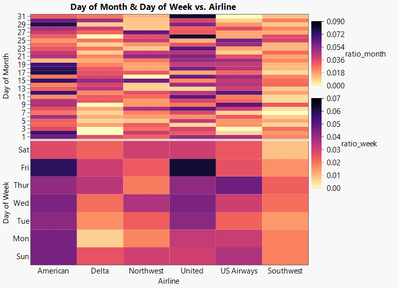
Thanks to a question raised by @dale_lehman :
there is now also a new answer to this post :)
The result is not at all better than with the workaround - but it's now just a single step to get there ;)
dt = Open( "$SAMPLE_DATA/Airline Delays.jmp" );

dt << New Column( "ratio_week",
	Formula( Col Number( If( :Arrival Delay > 100, 1, . ), :Airline, :Day of Week ) / Col Number( 1, :Airline, :Day of Week ) )
);
dt << New Column( "ratio_month",
	Formula( Col Number( If( :Arrival Delay > 100, 1, . ), :Airline, :Day of Month ) / Col Number( 1, :Airline, :Day of Month ) )
);

Graph Builder(
	Size( 600, 557 ),
	Show Control Panel( 0 ),
	Summary Statistic( "Median" ),
	Graph Spacing( 4 ),
	Variables(
		X( :Airline ),
		Y( :Day of Month ),
		Y( :Day of Week ),
		Color( :ratio_month ),
		Color( :ratio_week )
	),
	Elements( Position( 1, 1 ), Heatmap( X, Y, Color( 1 )) ),
	Elements( Position( 1, 2 ), Heatmap( X, Y, Color( 2 ) ) )
)
Recommended Articles
- © 2026 JMP Statistical Discovery LLC. All Rights Reserved.
- Terms of Use
- Privacy Statement
- Contact Us


