- New to JMP? Let the Data Analysis Director guide you through selecting an analysis task, an analysis goal, and a data type. Available now in the JMP Marketplace!
- See how to install JMP Marketplace extensions to customize and enhance JMP.
- Subscribe to RSS Feed
- Mark Topic as New
- Mark Topic as Read
- Float this Topic for Current User
- Bookmark
- Subscribe
- Mute
- Printer Friendly Page
Discussions
Solve problems, and share tips and tricks with other JMP users.- JMP User Community
- :
- Discussions
- :
- Re: Graph Builder Problem with Lines

- Mark as New
- Bookmark
- Subscribe
- Mute
- Subscribe to RSS Feed
- Get Direct Link
- Report Inappropriate Content
Graph Builder Problem with Lines
Hi All,
When I create a graph in graph builder with continuous data in the Y and the X axis, and use one categorical in the Overlay, I get continuous lines. But as soon as I put a second categorical in "Color," the lines change to dotted, etc even though the line style shows an uninterrupted line. This didn't use to happen and I don't know why it is happening. I had asked about this problem before and, unfortunately, the solutions didn't let work for my purpose.
I am attaching a sample file from the JMP help index to which I saved the script for a couple of graphs that show what I mean.
Any help with this issue is much appreciated!
Barbara
Accepted Solutions

- Mark as New
- Bookmark
- Subscribe
- Mute
- Subscribe to RSS Feed
- Get Direct Link
- Report Inappropriate Content
Re: Graph Builder Problem with Lines
- Mark as New
- Bookmark
- Subscribe
- Mute
- Subscribe to RSS Feed
- Get Direct Link
- Report Inappropriate Content
Re: Graph Builder Problem with Lines
- Mark as New
- Bookmark
- Subscribe
- Mute
- Subscribe to RSS Feed
- Get Direct Link
- Report Inappropriate Content
Re: Graph Builder Problem with Lines
Hi Jed, the only problem with this solution is that it eliminates individual markers. With colors in the encoding, I get only dots. I can change them individually but that's seems quite cumbersome for larger data sets.
- Mark as New
- Bookmark
- Subscribe
- Mute
- Subscribe to RSS Feed
- Get Direct Link
- Report Inappropriate Content
Re: Graph Builder Problem with Lines
Would adding another set of points work for what you're trying to do? You can use the Variables section to change how the overlay is applied to the points all at once.

- Mark as New
- Bookmark
- Subscribe
- Mute
- Subscribe to RSS Feed
- Get Direct Link
- Report Inappropriate Content
Re: Graph Builder Problem with Lines
Thank you for the effort. Unfortunately, it doesn't solve my problem with the interrupted lines.

- Mark as New
- Bookmark
- Subscribe
- Mute
- Subscribe to RSS Feed
- Get Direct Link
- Report Inappropriate Content
Re: Graph Builder Problem with Lines
This discussion has continued in Graph builder problem with lines, markers, and dots
... leading to this "workaround" via preferences/Graph Builder settings :
// execute the code if you know what you are doing - changing the preferences is dangerous
Set Platform Preferences(
Graph Builder(
Overlay Auto Line Styles Limit( 1, <<On ),
Overlay Auto Marker Styles Limit( 62, <<Off ));
);
//--------------------------------------------------
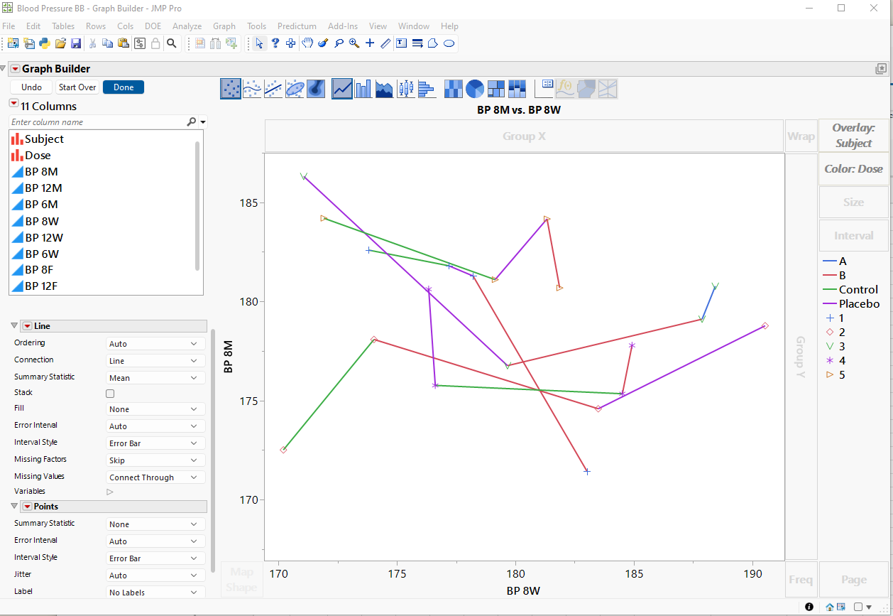
Open( "$SAMPLE_DATA/Blood Pressure.jmp" );
Graph Builder(
Size( 843, 698 ),
Graph Spacing( 4 ),
Variables( X( :BP 8W ), Y( :BP 8M ), Overlay( :Subject ), Color( :Dose ) ),
Elements( Line( X, Y, Legend( 11 ) ), Points( X, Y, Legend( 12 ) ) )
);The idea:
- Reduce the auto limit for line styles to 1 - to plot all lines as solid lines.
- However, keep the auto limit for markers - to get different markers for different overlay groups.
- use color to specify the color.
The result:
- individual traces for each subject
- all lines are solid
- different markers for the different subjects
- color indicates: dose
-> all the requirements combined into one plot.
The disadvantage: changed settings in the preferences (see Do you use the preferences? )

- Mark as New
- Bookmark
- Subscribe
- Mute
- Subscribe to RSS Feed
- Get Direct Link
- Report Inappropriate Content
Re: Graph Builder Problem with Lines
Overlay can be used for different/distinct purposes:
- 1) to "group data" for smoother, line, bar and other plots
- 2a) to control the style of lines
- 2b) to control the style of markers
- 2c) ...
This is great if you need one of these functions or multiple options 'synchronously'.
However, it is inconvenient when you need some of the functions in a non-synchronous way.
An example:
How to assign markers for categories which don't coincide with the Overlay groups?
Let's try to create a plot with the following settings [just a slight difference to the settings in the previous post]:
- individual traces for each subject
- different
markerscolors for the different subjects (wrap is added to check: 1 subplot = 1 subject = 1 color?) colormarker indicates: dose

The graph looks simple enough, doesn't it? But it's extremely difficult to create in Graph Builder.
Give it a try and share your experience!
Start with this script — all you need to do is adjust the markers (... and keep the colors as they are)
Open( "$SAMPLE_DATA/Blood Pressure.jmp" );
Graph Builder(
	Graph Spacing( 4 ),
	Variables(
		X( :BP 8W ),
		Y( :BP 8M ),
		Wrap( :Subject ),
		Overlay( :Subject, Overlay Encoding( "Color" ) ),
	),
	Elements(
		Line( X, Y),
		Points( X, Y )
	)
);- Mark as New
- Bookmark
- Subscribe
- Mute
- Subscribe to RSS Feed
- Get Direct Link
- Report Inappropriate Content
Re: Graph Builder Problem with Lines
@hogi wrote:The disadvantage: changed settings in the preferences (see Do you use the preferences? )
Fortunately, there is no need to change the settings in the preferences.
Much better: save the Overlay Auto Line Styles Limit with the plot:
Open( "$SAMPLE_DATA/Blood Pressure.jmp" );
Graph Builder(
	Variables( X( :BP 8W ), Y( :BP 8M ), Overlay( :Subject ), Color( :Dose ) ),
	Elements( Line( X, Y ), Points( X, Y) )
);

// all lines: -> solid!

 gb = (current report() << XPath("//OutlineBox[@helpKey = 'Graph Builder']")) << get scriptable object ;
 gb << Overlay Auto Line Styles Limit( 1 )
- Mark as New
- Bookmark
- Subscribe
- Mute
- Subscribe to RSS Feed
- Get Direct Link
- Report Inappropriate Content
Re: Graph Builder Problem with Lines
@babn wrote:
Hi Jed, the only problem with this solution is that it eliminates individual markers. With colors in the encoding, I get only dots. I can change them individually but that's seems quite cumbersome for larger data sets.
agree! it is possible to adjust the markers individually. but why is it necessary?
I am confident in a future version of JMP, there will be a Column Property: Value Markers
... and a corresponding formalism in Graph Builder to use the setting.
Recommended Articles
- © 2026 JMP Statistical Discovery LLC. All Rights Reserved.
- Terms of Use
- Privacy Statement
- Contact Us