- New to JMP? Let the Data Analysis Director guide you through selecting an analysis task, an analysis goal, and a data type. Available now in the JMP Marketplace!
- See how to install JMP Marketplace extensions to customize and enhance JMP.
- Subscribe to RSS Feed
- Mark Topic as New
- Mark Topic as Read
- Float this Topic for Current User
- Bookmark
- Subscribe
- Mute
- Printer Friendly Page
Discussions
Solve problems, and share tips and tricks with other JMP users.- JMP User Community
- :
- Discussions
- :
- Re: Control Chart Builder: Shaded Zones
- Mark as New
- Bookmark
- Subscribe
- Mute
- Subscribe to RSS Feed
- Get Direct Link
- Report Inappropriate Content
Control Chart Builder: Shaded Zones
Hi,
Control chart builder comes with shaded zones that are applied based on zones. I want to be able to customize the zones so that the chart displays zones where I want them specifically as opposed to where the zones are dictated. Is there a way to customize or change the zone settings? For example, I would like green zone to from 0-100, yellow zone from 100-300, red zone from 300-500.
Thank you for your time.
Control Chart Builder(
	Size(534, 456),
	Show Control Panel(0),
	Variables(
		Subgroup(:"Point of Use Sample ID-Result Units-Date Collected-1/3/2023"n),
		Y(:"211-ppb-114.2"n)
	),
	Chart(Position(1), Limits(Shade Zones(1)), Add Spec Limits({LSL(0), USL(500), Target(250)})),
	SendToReport(
		Dispatch(
			{},
			"211-ppb-114.2",
			ScaleBox,
			{Format("Best", 12), Min(-7.39525022607722), Max(502.242588833477), Inc(100),
			Minor Ticks(1), Add Ref Line(0, "Solid", "Blue", "LSL", 1),
			Add Ref Line(500, "Solid", "Blue", "USL", 1),
			Add Ref Line(250, "Solid", "Blue", "Target", 1)}
		),
		Dispatch(
			{},
			"graph display 1 title",
			TextEditBox,
			{Set Text("Individual & Moving Range chart of 211-ppb")}
		),
		Dispatch({}, "Subgroup display 1 title", TextEditBox, {Set Text("Date")}),
		Dispatch({}, "Y display 1 title", TextEditBox, {Set Text("211-ppb")}),
		Dispatch(
			{},
			"Control Chart Builder",
			FrameBox,
			{Grid Line Order(2), Reference Line Order(1)}
		)
	)
)- Tags:
- windows
Accepted Solutions
- Mark as New
- Bookmark
- Subscribe
- Mute
- Subscribe to RSS Feed
- Get Direct Link
- Report Inappropriate Content
Re: Control Chart Builder: Shaded Zones
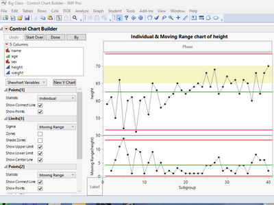
Reference Lines that have a range specified can be used to display colored areas. Here is a simple example.
names default to here(1);
dt =
// Open Data Table: Big Class.jmp
// → Data Table( "Big Class" )
Open( "$SAMPLE_DATA/Big Class.jmp" );

ccb = Control Chart Builder(
	Variables( Y( :height ) )
);
ccbr = ccb << report;
ccbr[AxisBox(2)] << Add Ref Line( {65, 70}, "Solid", "Yellow", "", 1, 0.25 );
- Mark as New
- Bookmark
- Subscribe
- Mute
- Subscribe to RSS Feed
- Get Direct Link
- Report Inappropriate Content
Re: Control Chart Builder: Shaded Zones
Thank you!
- Mark as New
- Bookmark
- Subscribe
- Mute
- Subscribe to RSS Feed
- Get Direct Link
- Report Inappropriate Content
Re: Control Chart Builder: Shaded Zones
Using Send to Report() is not a good practice in scripting.
See this example of a variation of the reference line for an axis:
Names Default to Here( 1 );

dt = Open( "$SAMPLE_DATA/Big Class.jmp" );

ccb = dt << Control Chart Builder( Variables( Y( :weight ) ), Show Control Panel( 0 ) );

rpt = ccb << Report;

rpt[AxisBox(2)] << Add Ref Line( { 90, 100 }, "Solid", "Red" );- Mark as New
- Bookmark
- Subscribe
- Mute
- Subscribe to RSS Feed
- Get Direct Link
- Report Inappropriate Content
Re: Control Chart Builder: Shaded Zones
Thanks for the feedback and solution.
Recommended Articles
- © 2026 JMP Statistical Discovery LLC. All Rights Reserved.
- Terms of Use
- Privacy Statement
- Contact Us


