- New to JMP? Let the Data Analysis Director guide you through selecting an analysis task, an analysis goal, and a data type. Available now in the JMP Marketplace!
- See how to install JMP Marketplace extensions to customize and enhance JMP.
- Subscribe to RSS Feed
- Mark Topic as New
- Mark Topic as Read
- Float this Topic for Current User
- Bookmark
- Subscribe
- Mute
- Printer Friendly Page
Discussions
Solve problems, and share tips and tricks with other JMP users.- JMP User Community
- :
- Discussions
- :
- Connect dots in boxplots by ID (row order?) in Graph Builder
- Mark as New
- Bookmark
- Subscribe
- Mute
- Subscribe to RSS Feed
- Get Direct Link
- Report Inappropriate Content
Connect dots in boxplots by ID (row order?) in Graph Builder
Hi
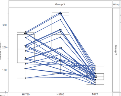
I'm trying to connect individual data points in a repeated measures in graph builder. Using row order, it seems it makes two lines (i.e. from the left box, one line to the middle and one line to the right box) I just want one connecting from left-middle-right!
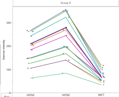
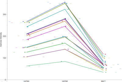
Using ID as overlay, it gets correct (Pic 2). But then I can't do the box plots correct? (Pic 3)

- Tags:
- windows
- Mark as New
- Bookmark
- Subscribe
- Mute
- Subscribe to RSS Feed
- Get Direct Link
- Report Inappropriate Content
Re: Connect dots in boxplots by ID (row order?) in Graph Builder
The same ID has repeated measurements in three different conditions, A - B and C.
It's in stacked/tall format. Would you like it it in wide for this? I don't see how that would work. It's not specific for this dataset, in general I want to to graphs with repeated measures that connects via a line.. Wheter its 2 (pre-pst), 3 or more repeates.
e.g:
- Mark as New
- Bookmark
- Subscribe
- Mute
- Subscribe to RSS Feed
- Get Direct Link
- Report Inappropriate Content
Re: Connect dots in boxplots by ID (row order?) in Graph Builder
- Mark as New
- Bookmark
- Subscribe
- Mute
- Subscribe to RSS Feed
- Get Direct Link
- Report Inappropriate Content
Re: Connect dots in boxplots by ID (row order?) in Graph Builder
In my caase, putting ID as overlay gets me closer (and not using row order). Then, unclick overlay for those elements not needed; in this graph only for the line. But this messes up coloring (and one have to change every line individually?).
If i'm putting in a dot with meanSD instead of a bar chart, this messes up alignment..
- Mark as New
- Bookmark
- Subscribe
- Mute
- Subscribe to RSS Feed
- Get Direct Link
- Report Inappropriate Content
Re: Connect dots in boxplots by ID (row order?) in Graph Builder
Actually, a very common issue in JMP - further details can be found here:
Graph Builder. Combine Smoother and Line - how?
The easiest trick:
Disable Overlay for any of the other plots, just use it for the line graph.
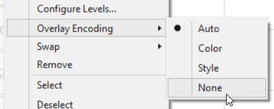
Bsisedes that, some plots can be fixed by setting Overlay Encoding to NONE
and using the Color Drop Zone in addition to control the colors.
↑ for new JMP users (keep the plot as simple as possible)
__________________________________
↓ for more advanced users who have to create more complicated plots
If you want to create
- Bar Graphs with stacked / side by side option
- multiple smoothers in addition to line graphs
- grouped Box plots
... you have an issue.
THE solution for this issue and many others:
Graph Builder - Overlay by multiple columns
... please vote.
The issue could also be solved with a very tiny new feature :Graph Builder: Line - possibility to add breaks
The idea: For line graph, an option to remove all lines which run from right to left.
a workaround proposed by @XanGregg :
Hide the the backwards line segments by assigning their own legend color:
https://community.jmp.com/t5/JMP-Wish-List/Graph-Builder-Line-possibility-to-add-breaks/idc-p/799851...
The benefit of Color compared to Overlay:
it is less "expensive", in JMP 19, you an use up to 20 (?) columns as color : )
On the other had, just one column can be selected as Overlay : (
which brings us back to:
Graph Builder - Overlay by multiple columns
- « Previous
-
- 1
- 2
- Next »
Recommended Articles
- © 2026 JMP Statistical Discovery LLC. All Rights Reserved.
- Terms of Use
- Privacy Statement
- Contact Us


