- Subscribe to RSS Feed
- Mark Topic as New
- Mark Topic as Read
- Float this Topic for Current User
- Bookmark
- Subscribe
- Mute
- Printer Friendly Page
Discussions
Solve problems, and share tips and tricks with other JMP users.- JMP User Community
- :
- Discussions
- :
- Re: Colored Bars in Tabulate Chart
- Mark as New
- Bookmark
- Subscribe
- Mute
- Subscribe to RSS Feed
- Get Direct Link
- Report Inappropriate Content
Colored Bars in Tabulate Chart
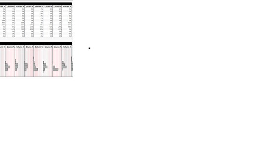
Is there a way (I am hoping via scripting) that will allow me to color the bars in the chart of a tabulate window. Also, is there way to get rid of the red dots in the background. This chart is a much nicer way of displaying some data, but it is not very customizable.
- Mark as New
- Bookmark
- Subscribe
- Mute
- Subscribe to RSS Feed
- Get Direct Link
- Report Inappropriate Content
Re: Colored Bars in Tabulate Chart
The only solution that I can suggest, is to take the results from your Tabulate Table, and to make it into a data table, and then run the Distribution Platform or Graph Builder against that output. You will get much further along in getting the changes you want.
- Mark as New
- Bookmark
- Subscribe
- Mute
- Subscribe to RSS Feed
- Get Direct Link
- Report Inappropriate Content
Re: Colored Bars in Tabulate Chart
- Mark as New
- Bookmark
- Subscribe
- Mute
- Subscribe to RSS Feed
- Get Direct Link
- Report Inappropriate Content
Re: Colored Bars in Tabulate Chart
If you are planning on scripting it, then you may want to explore Summary under the Tables menu and then use Graph Builder or Distribution. Script the two together and it will be faster as well. Maybe something like this:
Names Default to Here (1);
Open("$SAMPLE_DATA/Big Class.jmp");
Data Table( "Big Class" ) << Summary(
	Group( :age, :sex ),
	Mean( :height ),
	Mean( :weight ),
	Freq( "None" ),
	Weight( "None" ),
	statistics column name format( "stat of column" ),
	Link to original data table( 0 ),
	output table name( "Big Class Summary" )
);
dts= Data Table ("Big Class Summary");

dts << Graph Builder(
	Size( 534, 448 ),
	Show Control Panel( 0 ),
	Variables( X( :sex ), Y( :Mean of height ), Y( :Mean of weight ) ),
	Elements( Position( 1, 1 ), Histogram( X, Y, Legend( 5 ) ) ),
	Elements( Position( 1, 2 ), Histogram( X, Y, Legend( 6 ) ) ),
	SendToReport(
		Dispatch(
			{},
			"400",
			ScaleBox,
			{Legend Model( 5, Properties( 0, {Line Color( 0 ), Fill Color( 3 )} ) ),
			Legend Model( 6, Properties( 0, {Line Color( 0 ), Fill Color( 5 )} ) )}
		)
	)
);Data Scientist, Life Sciences - Global Technical Enablement
JMP Statistical Discovery, LLC. - Denver, CO
Tel: +1-919-531-9927 ▪ Mobile: +1-303-378-7419 ▪ E-mail: chris.kirchberg@jmp.com
www.jmp.com
- Mark as New
- Bookmark
- Subscribe
- Mute
- Subscribe to RSS Feed
- Get Direct Link
- Report Inappropriate Content
Re: Colored Bars in Tabulate Chart
Maybe there is a much better solution: If I use "Big Class" and plot using graph builder: height on Y and sex on GroupX and show it all as a histogram: the histogram is by count. I would love to see it by percent (and then I can color by my third column).
- Mark as New
- Bookmark
- Subscribe
- Mute
- Subscribe to RSS Feed
- Get Direct Link
- Report Inappropriate Content
Re: Colored Bars in Tabulate Chart
Can you post some sample data?
- Mark as New
- Bookmark
- Subscribe
- Mute
- Subscribe to RSS Feed
- Get Direct Link
- Report Inappropriate Content
Re: Colored Bars in Tabulate Chart
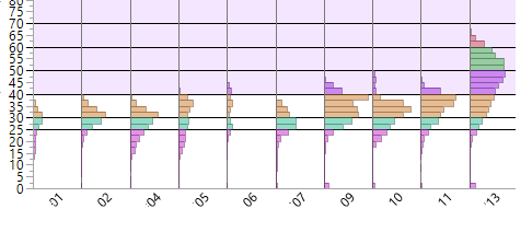
These are what I am using now. I would like to be able to plot these with percent instead of by count. That way the data from 13 does not make the data from 06 seem to disappear.
- Mark as New
- Bookmark
- Subscribe
- Mute
- Subscribe to RSS Feed
- Get Direct Link
- Report Inappropriate Content
Re: Colored Bars in Tabulate Chart
Hi @mann,
I think what @pmroz is asking is what is the structure of the data table that you are using to create the table in tabulate? What are the columns and rows?
Chris
Data Scientist, Life Sciences - Global Technical Enablement
JMP Statistical Discovery, LLC. - Denver, CO
Tel: +1-919-531-9927 ▪ Mobile: +1-303-378-7419 ▪ E-mail: chris.kirchberg@jmp.com
www.jmp.com
- Mark as New
- Bookmark
- Subscribe
- Mute
- Subscribe to RSS Feed
- Get Direct Link
- Report Inappropriate Content
Re: Colored Bars in Tabulate Chart
Tabulate does this just fine, but I could not then cause tall students to be purple, and middle weight students to be blue.
Graph builder does allow that kind of coloring, but does not allow the histogram by percentages, only by counts.
Recommended Articles
- © 2026 JMP Statistical Discovery LLC. All Rights Reserved.
- Terms of Use
- Privacy Statement
- Contact Us


