- New to JMP? Let the Data Analysis Director guide you through selecting an analysis task, an analysis goal, and a data type. Available now in the JMP Marketplace!
- See how to install JMP Marketplace extensions to customize and enhance JMP.
- Subscribe to RSS Feed
- Mark Topic as New
- Mark Topic as Read
- Float this Topic for Current User
- Bookmark
- Subscribe
- Mute
- Printer Friendly Page
Discussions
Solve problems, and share tips and tricks with other JMP users.- JMP User Community
- :
- Discussions
- :
- Re: Can JMP show the probability of 1 result or range through a graph?
- Mark as New
- Bookmark
- Subscribe
- Mute
- Subscribe to RSS Feed
- Get Direct Link
- Report Inappropriate Content
Can JMP show the probability of 1 result or range through a graph?
Hello everyone!!!, a question:
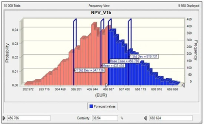
What graph in JMP can answer the probabilities of obtaining a value or range of response, for example like the following graph.
Greetings,
Marco
- Tags:
- windows
Accepted Solutions
- Mark as New
- Bookmark
- Subscribe
- Mute
- Subscribe to RSS Feed
- Get Direct Link
- Report Inappropriate Content
Re: Can JMP show the probability of 1 result or range through a graph?
Then what you need is just a Local Data Filter - and a Filter Change Handler that updates the results in the probabilities panel.
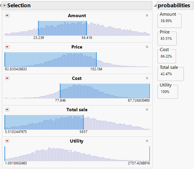
The advantage: With the Data Filter it doesn't matter how many questions you will ask - just add as many selections as you want and the corresponding probabilities will show up automatically:
/*""" https://community.jmp.com/t5/Discussions/Can-JMP-show-the-probability-of-1-result-or-range-through-a/m-p/697164/highlight/true#M88257

Author: hogi
Date: 2023-11-12

NB: back again at simple Data Filter

*/

Names Default To Here( 1 );

convertToList = Function( {myExpr},
	myHead = Head( Name Expr( myExpr ) );
	Substitute( Name Expr( myExpr ), Name Expr( myHead ), Expr( List() ) );
);

findArgs = Function( {myList, myHead},
	{NArgs, myArg},
	matches = {};
	NArgs = N Arg( myList );
	For Each( {i}, 1 :: NArgs,
		myArg = Arg( Name Expr( myList ), i );
		If( Head( Name Expr( myArg ) ) == Name Expr( myHead ),
			Insert Into( matches, convertToList( Name Expr( myArg ) ) )
		);
	);
	matches;
);


all Cols = Current Data Table() << get column references();
New Window( "probabilites",
	H List Box( Current Data Table() << data filter( Local,Title("Selection"), 	Show Controls( 0 ),
	Show Modes( 0 ),
	Show Counts( 0 ), Conditional( 0 ), columns( Name Expr( all Cols ) ) ), hlb = H List Box() )
);

ldf = ((Current Report()["Selection"]) << get scriptable object);


update = Function( {a},
	{ldflist,filterExpr,myCols,myFilters,lookupTable,myValue},
	ldf = ((Current Report()["Selection"]) << get scriptable object);
	ldflist = Convert To list( ldf << get script );
	filterExpr = findArgs( ldflist, Expr( AddFilter() ) );
	myCols = Transform Each({x},findArgs( Name Expr( filterExpr ), Expr( columns() )),x << get name) ;
	myFilters = findArgs( Name Expr( filterExpr ), Expr( Where() ) );

	lookupTable = Associative Array( Transform Each( {x, i}, myFilters, Eval List( {If(Head(x)==Expr(And()),Arg( Arg(x,1), 1 )<< get name,  Arg(x,1)<< get name) , i} ) ) );


	myBox = Outline Box( "probabilities" );
	For Each( {x}, myCols,
		Try( myPos = Eval(substitute(Expr(lookupTable[_x_]),Expr(_x_),Name Expr(x)));
		Eval(
			Substitute(
					Expr(
						sel_rows = Current Data Table() << get rows where( _match_ );
						myValue = Char( Round( N Items(sel_rows)  / N rows(current data table()) * 100, 2 ) ) || "%";

					),
				Expr( _match_ ), Name Expr( myFilters[myPos] ),
			)
		),
		myValue = "100%");

		Insert Into( myBox, Panel Box( x, Text Box( myValue ) ) );
	);

	Try(result << delete);
		hlb << append( result = myBox );
);


rs = ldf << make filter change handler( update );
(Current Report() << xpath("//FrameBox")) << Frame Size( 500, 50 );
- Mark as New
- Bookmark
- Subscribe
- Mute
- Subscribe to RSS Feed
- Get Direct Link
- Report Inappropriate Content
Re: Can JMP show the probability of 1 result or range through a graph?
This code isn't good enough for me to turn it into an add-in (it would require at least one partial rewrite for me to consider it adequate), especially because I won't be updating it. If you wish to make it into an adding using Add-In Manager is the best option.
The script has been added as .zip file because it contains multiple files which must be in specific folders. After unpacking it
you should be able to open and run probability_calculator.jsl
- Mark as New
- Bookmark
- Subscribe
- Mute
- Subscribe to RSS Feed
- Get Direct Link
- Report Inappropriate Content
Re: Can JMP show the probability of 1 result or range through a graph?
Here is an alternative implementation which also allows "combined" filter conditions (A and B and C ...).
For this case it makes sense to enable the Conditional(1) setting - then additional filters will only show values that are within the range of the first filters.
In addition, one can create several filter "groups". Click on OR and a filter group N+1 is generated with the corresponding probability value.
drawbacks:
- with the current version of Jmp, Conditional(1) and filter groups via OR are not compatible :(
So, if you want to compare different selection groups, you have to do this without the Conditional(1) feature.
here is a wish to fix this problem: data filters: more flexible use of the conditional flag - The possibilities to adjust the graph are more restricted than in GraphBuilder:
- selected values are indicated via the semitransparent blue region, which looks nice.
On the other hand, it's not possible to switch "different colors for selected/unselected"
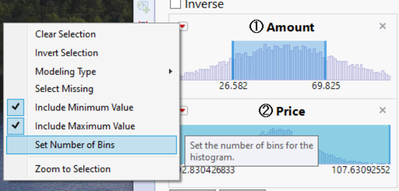
- the default number of bins in a data filter is 10, just giving a rough idea of the actual distribution.
Number of Bins can be adjusted via the red triangle menu:
/*""" https://community.jmp.com/t5/Discussions/Can-JMP-show-the-probability-of-1-result-or-range-through-a/m-p/697074/highlight/true#M88231

Topic: direct access to data filter selections via ldf << get where clause
Author: hogi
Date: 2023-11-12
*/

Names Default To Here( 1 );

convertToList = Function( {myExpr},{Nargs,myList},
	Nargs= N Arg(Name Expr(myExpr));
	myList={};
	For(i=1, i<=NArgs, i++,
	Insert Into(myList,Arg(Name Expr(myExpr),i))
	);
	return(Name Expr(myList))
);


New Window( "probabilites",
H list Box (
Current Data Table() <<
		data filter(
			Local,
			Title( "Selection" ),
			Show Controls( 1 ),
			Show Modes( 0 ),
			Conditional( 1 ),
			add Filter (columns(Column(1),Column(2)),Display( Column(1), NBins( 100 ) ),Display( Column(2), NBins( 100 ) ))
	),
	H List Box( Name Expr( myExpr ), hlb = H List Box() ));
);


update = Function( {a}, {myExpr,myselection},
// collect Selections from Local Data Filter - every OR is a group - kind of ...

	ldf = Current Report()["Selection"] << get scriptable Object;
	myExpr = Parse( ldf << get where clause );
	myExpr=Arg( myExpr, 1 );
	mySelections = If( (Head( myExpr ) == Expr( Or() ) & Head( Arg(myExpr,1) ) != Expr( Equal() )),
		convertToList(Name Expr(myExpr)  ), // several filter groups
		Eval List({Name Expr(myExpr)}) // one filter group

	);

// calculate the new values
	myBox = Outline Box( "probabilities" );
	For Each( {x, i}, mySelections,
		Eval(
			Substitute(
					Expr(
						sel_rows = Current Data Table() << get rows where( _match_ );
						myValue = Char( Round( N Items( sel_rows ) / N Rows( Current Data Table() ) * 100, 2 ) ) || "%";
					),
				Expr( _match_ ), Name Expr( x )
			)
		);
		Insert Into( myBox, Panel Box( "selection group # " || Char( i ), Text Box( myValue ) ) );
	);
// update the results
	Try( result << delete );
	hlb << append( result = myBox );
);

ldf = ((Current Report()["Selection"]) << get scriptable object);
rs = ldf << make filter change handler( update );
(Current Report() << xpath( "//FrameBox" )) << Frame Size( 500, 50 ) << Fill Selection Mode( "Selected Same Color" );
- Mark as New
- Bookmark
- Subscribe
- Mute
- Subscribe to RSS Feed
- Get Direct Link
- Report Inappropriate Content
Re: Can JMP show the probability of 1 result or range through a graph?
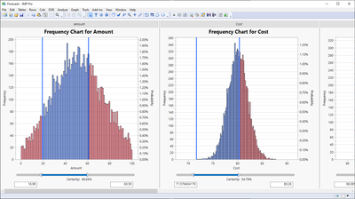
if certainty ~ probabilty, the calculated values should be OK *)
community feedback appreciated :)
The probabilities are calculated with the formula - line 55:
N Items( sel_rows ) / N Rows( Current Data Table() ) * 100*) one restriction:
excluded rows are not handled separately. So, if you have such rows, delete them. Or adjust the equation.
- Mark as New
- Bookmark
- Subscribe
- Mute
- Subscribe to RSS Feed
- Get Direct Link
- Report Inappropriate Content
Re: Can JMP show the probability of 1 result or range through a graph?
I don't know any easy way to do exactly what your example shows, but you can of course construct it manually using the quantiles from the Distribution platform. That platform also has an option to display the cdf, so that automatically shows the cumulative probabilities throughout the range. You can also add reference lines at any particular value you are interested in, and select rows less than that value and that part of the histogram will be highlighted. But beyond that I'm not aware of an automatic mechanism to produce your example. Perhaps someone else does or perhaps someone can write a script to do that.
- Mark as New
- Bookmark
- Subscribe
- Mute
- Subscribe to RSS Feed
- Get Direct Link
- Report Inappropriate Content
Re: Can JMP show the probability of 1 result or range through a graph?
Do you want the empirical result or one based on a model? Which JMP plot do you want to augment with this capability?
- Mark as New
- Bookmark
- Subscribe
- Mute
- Subscribe to RSS Feed
- Get Direct Link
- Report Inappropriate Content
Re: Can JMP show the probability of 1 result or range through a graph?
Hello Mark,
I'm glad to greet you, JMP seems like a great software to me and I think someone can achieve it.
Regarding your question: Do you want the empirical result or one based on a model? Which JMP plot do you want to augment with this capability?
1. The simulation result could generate a bar graph for each objective with the option of entering a value and knowing its % probability or entering a range and knowing its % probability or entering a % probability and knowing the probable value or enter a probable % range and know the probable value range.
2. It should be based on a model, if possible in the Prediction Profiler
Greetings!
Marco
- Mark as New
- Bookmark
- Subscribe
- Mute
- Subscribe to RSS Feed
- Get Direct Link
- Report Inappropriate Content
Re: Can JMP show the probability of 1 result or range through a graph?
To some extent the profiler already does what you suggest. If your Y variable is nominal, the profiler will show the estimated probability for whatever set of X variables you choose. If you change the X variables, the estimated probability will adjust. If you are looking for a display that automatically builds a table showing probabilities as functions of X or a histogram (such as you displayed) that has you enter a value and has the area adjust, I believe that either requires someone to script that or you might suggest that as a wish for further development.
- Mark as New
- Bookmark
- Subscribe
- Mute
- Subscribe to RSS Feed
- Get Direct Link
- Report Inappropriate Content
Re: Can JMP show the probability of 1 result or range through a graph?
Hi Dale,
I am happy to greet you, could you please show an example of your ingenious idea?
Greetings,
Marco
- Mark as New
- Bookmark
- Subscribe
- Mute
- Subscribe to RSS Feed
- Get Direct Link
- Report Inappropriate Content
Re: Can JMP show the probability of 1 result or range through a graph?
Hi @Marco1,
I think the Design Space Profiler may be helpful for what you intend to do.
Based on Monte-Carlo simulations, and if you provide some specifications (Lower and/or Upper Specification Limits), the Design Space Profiler will calculate and display the in-spec rate, based on specific inputs ranges.
You can look at an example here and see if it corresponds to your needs : Example of Design Space Profiler.
I hope this answer will help you,
"It is not unusual for a well-designed experiment to analyze itself" (Box, Hunter and Hunter)
- Mark as New
- Bookmark
- Subscribe
- Mute
- Subscribe to RSS Feed
- Get Direct Link
- Report Inappropriate Content
Re: Can JMP show the probability of 1 result or range through a graph?
Victor
Interesting idea, but I'm not finding the Design Space Profiler. I ran a Fit model with a nominal Y variable and one continuous X variable and there is only the Profiler option at the red arrow and the red arrow for the Profiler does not list Design Space Profiler as an option (not even grayed out). Where do I find it?
- Mark as New
- Bookmark
- Subscribe
- Mute
- Subscribe to RSS Feed
- Get Direct Link
- Report Inappropriate Content
Re: Can JMP show the probability of 1 result or range through a graph?
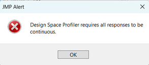
The Design Space Profiler is only available for continuous responses :
As the original poster @Marco1 did not mention any nominal response, I thought the Design Space Profiler may be close to his expectations and goal :
What graph in JMP can answer the probabilities of obtaining a value or range of response
Best,
"It is not unusual for a well-designed experiment to analyze itself" (Box, Hunter and Hunter)
- Mark as New
- Bookmark
- Subscribe
- Mute
- Subscribe to RSS Feed
- Get Direct Link
- Report Inappropriate Content
Re: Can JMP show the probability of 1 result or range through a graph?
Hello Victor,
I am happy to greet you, the alternative you show is an interesting way to solve the problem, I will review it. Thank you!
Greetings,
Marco
Recommended Articles
- © 2026 JMP Statistical Discovery LLC. All Rights Reserved.
- Terms of Use
- Privacy Statement
- Contact Us
