- JMP will suspend normal business operations for our Winter Holiday beginning on Wednesday, Dec. 24, 2025, at 5:00 p.m. ET (2:00 p.m. ET for JMP Accounts Receivable).
Regular business hours will resume at 9:00 a.m. EST on Friday, Jan. 2, 2026. - We’re retiring the File Exchange at the end of this year. The JMP Marketplace is now your destination for add-ins and extensions.
- Subscribe to RSS Feed
- Mark Topic as New
- Mark Topic as Read
- Float this Topic for Current User
- Bookmark
- Subscribe
- Mute
- Printer Friendly Page
Discussions
Solve problems, and share tips and tricks with other JMP users.- JMP User Community
- :
- Discussions
- :
- Box Plots Shifted in Graph Builder
- Mark as New
- Bookmark
- Subscribe
- Mute
- Subscribe to RSS Feed
- Get Direct Link
- Report Inappropriate Content
Box Plots Shifted in Graph Builder
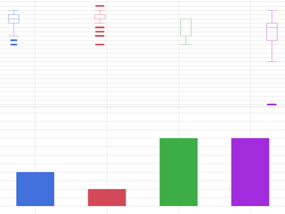
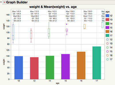
For some reason I can't figure out, my box plots are appearing on either side of the ordinal x-axis line in this graph building chart. I can see the boxes well enough but why off-center (left of the grid line on the LHS and right of the grid line on the RHS)?
Running on Mac, JMP® 14.2.0
Thanks!
- Mark as New
- Bookmark
- Subscribe
- Mute
- Subscribe to RSS Feed
- Get Direct Link
- Report Inappropriate Content
Re: Box Plots Shifted in Graph Builder
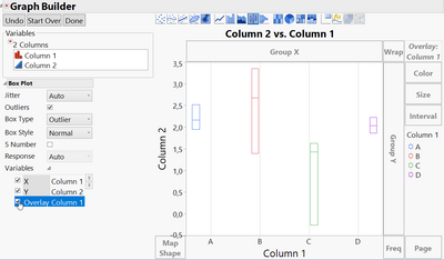
I can't see your axis setting but it happens if the value is on Overlay too.
You can switch it off while check the Overlay tick box off.
- Mark as New
- Bookmark
- Subscribe
- Mute
- Subscribe to RSS Feed
- Get Direct Link
- Report Inappropriate Content
Re: Box Plots Shifted in Graph Builder
Thanks for the quick response1
You were correct, I had the x also as overlay ignorer that the box plots would adopt the color of the legend.
The box plots going off center like this seems like a bug, not a feature?
I moved the X variable to 'Color' and out of 'Overlay' and it's centered now. Very helpful.
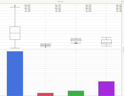
But now the box plots are monochrome. And the 5 number summary (part of the reason i wanted the boxes centered in the first place) is nearly falling off the chart on the RHS. Definitely an improvement because before the 5 number summary wasn't even visible for the right most box.
- Mark as New
- Bookmark
- Subscribe
- Mute
- Subscribe to RSS Feed
- Get Direct Link
- Report Inappropriate Content
Re: Box Plots Shifted in Graph Builder
Question to the community. @mlo1 gave an answer that addressed the offset problem (thank you). But that solution created a new issue (no color on my box plots). Do I accept it as a solution and start a new thread on the issue of coloring box plots? Or persist on this thread because the offset in the box plots with overlay X looks like a bug.
What's customary and what's most effective?
Thanks.
- Mark as New
- Bookmark
- Subscribe
- Mute
- Subscribe to RSS Feed
- Get Direct Link
- Report Inappropriate Content
Re: Box Plots Shifted in Graph Builder
I think we might have simple, orthogonal discussions in a perfect world. Here, not so much. If you think that your new question will lead to a lengthy discussion, then it would be better to start a separate discussion. In this case, though, the answer is straight-forward.
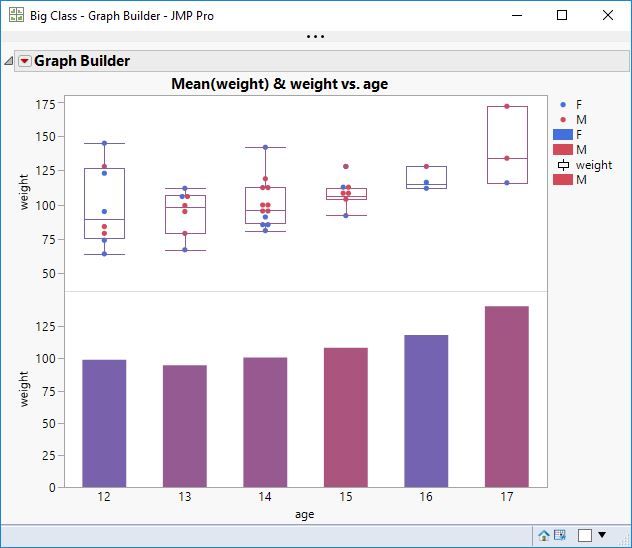
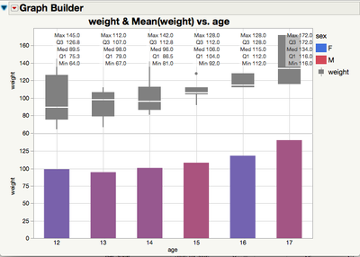
I used Big Class for this demonstration. I added age to the X axis. I added weight to the Y axis. I added weight again below the previous weight on the Y axis. I changed the lower plot to use the bar element instead of points. I changed the upper plot to use the box plot element instead of points. I added sex to the Color role. The boxes seem to have adopted the same blended color as the bars. Maybe the order of my steps makes a difference.
- Mark as New
- Bookmark
- Subscribe
- Mute
- Subscribe to RSS Feed
- Get Direct Link
- Report Inappropriate Content
Re: Box Plots Shifted in Graph Builder
Thanks for this reply. I got away from this question and just coming back.
I'm on a Mac, 64 bit with JMP 14.3.
When I try your sequence of steps on Big Class, I don't get the box plots adopting the color of the blended bars below. I changed the box plot type to solid the emphasize the color.
Also, I'd actually like to have the color be drawn from 'age' in this case, not another variable. When I do that, i get the shifted and colored response:
I tried adjusting the 'jitter' settings but to no effect. An additional hazard to this is the 5 number summary is unreadable at the RHS.
Could this be remedied in a future release? How do I make a JMP bug report?
- Mark as New
- Bookmark
- Subscribe
- Mute
- Subscribe to RSS Feed
- Get Direct Link
- Report Inappropriate Content
Re: Box Plots Shifted in Graph Builder
If you right click in the graph, Box Plot , Box Placement, Align, shat should do the job.
Recommended Articles
- © 2025 JMP Statistical Discovery LLC. All Rights Reserved.
- Terms of Use
- Privacy Statement
- Contact Us
