- New to JMP? Let the Data Analysis Director guide you through selecting an analysis task, an analysis goal, and a data type. Available now in the JMP Marketplace!
- See how to install JMP Marketplace extensions to customize and enhance JMP.
- Subscribe to RSS Feed
- Mark Topic as New
- Mark Topic as Read
- Float this Topic for Current User
- Bookmark
- Subscribe
- Mute
- Printer Friendly Page
Discussions
Solve problems, and share tips and tricks with other JMP users.- JMP User Community
- :
- Discussions
- :
- Box plots and points have different overlap settings
- Mark as New
- Bookmark
- Subscribe
- Mute
- Subscribe to RSS Feed
- Get Direct Link
- Report Inappropriate Content
Box plots and points have different overlap settings
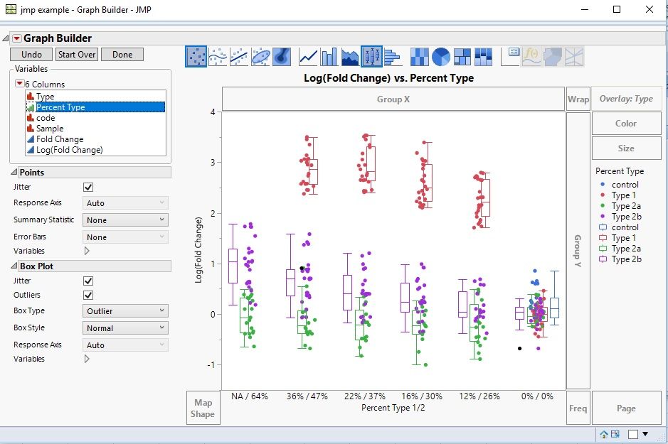
I saw this message that seems to be smililar to what I want: "move the specific points over their respective box plot", but I can't seem to grasp exactly what needs to be combined in 'tables > stack' to separate the points into their respective "series" as excel would call it and here is defined with overlay.
It is as if the box plots have a hidden 'series overlap' variable set to 0% (excel term with bar graphs) and the points have a separate hidden 'series overlap' variable set to 100%. So how with tables>stacks or some other change can I get the point overlap to 0%?
Used variable columns:
X: Percent Type
Y: log(fold change)
Overlay: Type
Active graphs: Box plot & points
Thank you for your guidance, as I could continue to blindly click around for a few more hours, or check with a few gurus...
Accepted Solutions
- Mark as New
- Bookmark
- Subscribe
- Mute
- Subscribe to RSS Feed
- Get Direct Link
- Report Inappropriate Content
Re: Box plots and points have different overlap settings
John,
This is not an issue with your table, it is an idiosyncracy of GraphBuilder with Overlay:
- Boxplots are offset, but
- Points are not offset.
[The message you pointed to the user had two Y values]. I have a couple alternatives and recommendations:
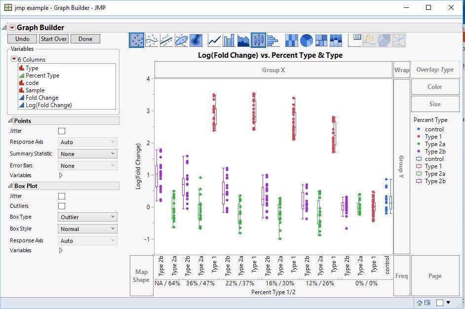
- Keep your graph as is. Now drag Type to just above your X axis of Percent Type 1/2. Then points and boxplots are a little offset. But this is more readable.
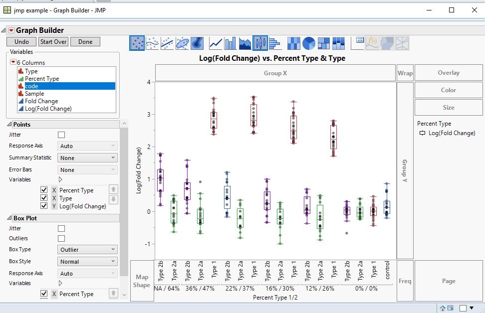
- Using the graph above, remove Type from overlay. Now the points an boxplots are aligned. However, unfortunately, the boxplots are all one color, that takes a little scripting (or point an clicking) to change (see below).
- If it is difficult to drag Type to just above the X axis of Percent Type 1/2, create a new column called Percent Tpe that is the combination of columns Percent Type1/2 and Type (highlight those two columns, then from the main menu select Cols>Utilities>Combine Columns, and use this for the X axis.
I have a recommendation to right click on the column you use for teh X-axis and select Property Value Ordering, so you can get the order you prefer on the X-axis.
To customize the color of the boxplots, Right click in on the graph (framebox) and select Customize. You will see each boxplot listed. Click on sech one and select the coordinating color for Type. If you are doing ths often, this can be done with a script, vs. point and click.
Hope that helps. This should be marked as a wishlist item to have a Graph Builder option to offset points when Overlay is used, so the offset matches the boxplot offest.
- Mark as New
- Bookmark
- Subscribe
- Mute
- Subscribe to RSS Feed
- Get Direct Link
- Report Inappropriate Content
Re: Box plots and points have different overlap settings
OK, here are the results for those interested in something similar:
Option 1:
Original graph with 'type' nested into the x axis (top nest insert, not bottom):
Option 2:
Same as above with 'type' removed from the 'overlay' section and box plots colored in manually:
If I can find out how to find the entire script that is used to build the graph, I might use option 2, but if I have to manually color all 18 boxes, I'll stick to option 1, because I need to build 24 graphs and I don't yet see how to make a script or "template" that I can import new data into an existing graph and replace it's data table...time to look up scripting.
Thanks gzmorgan0.
- Mark as New
- Bookmark
- Subscribe
- Mute
- Subscribe to RSS Feed
- Get Direct Link
- Report Inappropriate Content
Re: Box plots and points have different overlap settings
- Mark as New
- Bookmark
- Subscribe
- Mute
- Subscribe to RSS Feed
- Get Direct Link
- Report Inappropriate Content
Re: Box plots and points have different overlap settings
If you put type on the color then the points get colored by that as well, you may have to adjust styles/markers/colors in certain situations, but usually this will do the job already ( based on your result).
Recommended Articles
- © 2026 JMP Statistical Discovery LLC. All Rights Reserved.
- Terms of Use
- Privacy Statement
- Contact Us


