- New to JMP? Let the Data Analysis Director guide you through selecting an analysis task, an analysis goal, and a data type. Available now in the JMP Marketplace!
- See how to install JMP Marketplace extensions to customize and enhance JMP.
- Subscribe to RSS Feed
- Mark Topic as New
- Mark Topic as Read
- Float this Topic for Current User
- Bookmark
- Subscribe
- Mute
- Printer Friendly Page
Discussions
Solve problems, and share tips and tricks with other JMP users.- JMP User Community
- :
- Discussions
- :
- Re: Bar graph of split column
- Mark as New
- Bookmark
- Subscribe
- Mute
- Subscribe to RSS Feed
- Get Direct Link
- Report Inappropriate Content
Bar graph of split column
Hi,
I have a table with many columns. one is a binary variable with 0,1 and lables 0=No, 1=Yes.
Another is a formula column based on several others which is categorical with the numbers 0-5.
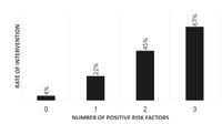
I would like to create a bar graph with the categorical column on the x axis and the percentage of yes in each category as the y axis.
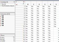
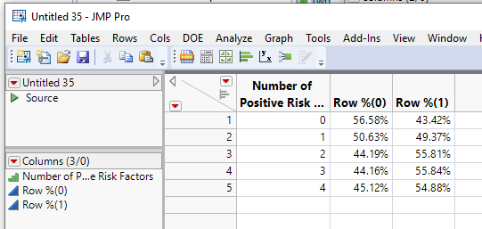
I could obtain this data by splitting the table using these two columns (split by = the categorical column and split column= binary column) and then get the distribution of all columns (=original categories), and look at the prob of Yes.
but how do I get this in a bar graph?
this is a pic of the spited data:
and this is a pic of the kind of graph i would like to create:
TIA
Accepted Solutions
- Mark as New
- Bookmark
- Subscribe
- Mute
- Subscribe to RSS Feed
- Get Direct Link
- Report Inappropriate Content
Re: Bar graph of split column
This can be accomplished fairly simply using
Analyze==>Tabulate
and then graphing the data from the resulting table
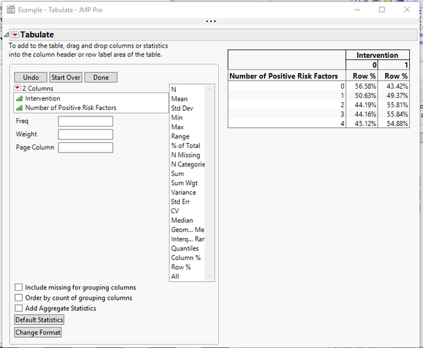
- Start with your 2 columns, the one with 0-1 values and the other with your 0-4 values. Both columns need to have a modeling type of Ordinal. I have called the rows, "Intervention" and "Number of Positive Risk Factors".
- Place "intervention as a column grouping variable
- Place "Number of Positive Risk Factors" as a row grouping variable
- Set the statistic as Row %
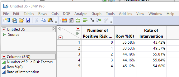
- Go to the red triangle and select "Make into Data Table"
- Change the name of the Column "Row %(1)" to "Rate of Intervention"
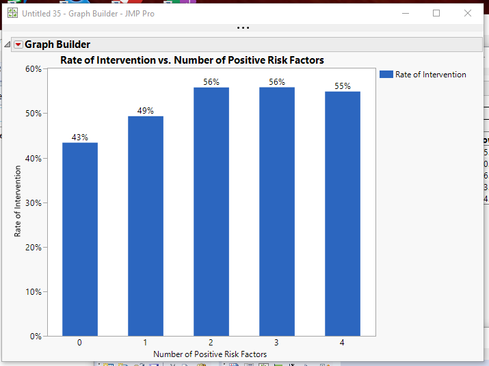
- Go to Graph Builder and create the graph
- Drag "Number of Positive Risk Factors" to the X axis
- Drag "Rate of Intervention" to the Y axis
- Click on the Bar Graph icon to change the graph to a bar chart
- In the Bar details section on the left side of the window, change the Label to "Label by Value"
Here is a script that produces the above
Names Default to Here(1);
dt=new table("Example",
	add rows(400),
	new column("Intervention", ordinal, set each value(Random Integer(0,1))),
	new column("Number of Positive Risk Factors",ordinal,set each value(Random Integer(0,4)))
);

// Calculate the Statistic
tab = dt << Tabulate(invisible,
	Add Table(
		Column Table( Grouping Columns( :Intervention ), Statistics( Row % ) ),
		Row Table( Grouping Columns( :Number of Positive Risk Factors) )
	)
);
dtFinal = tab << make into data table;

// Change Column Name
dtFinal:Name("Row %(1)") << Set Name("Rate of Intervention");

// Create Graph
Graph Builder(
	Size( 534, 450 ),
	Show Control Panel( 0 ),
	Variables( X( :Number of Positive Risk Factors ), Y( :Rate of Intervention ) ),
	Elements( Bar( X, Y, Legend( 6 ), Label( "Label by Value" ) ) )
);- Mark as New
- Bookmark
- Subscribe
- Mute
- Subscribe to RSS Feed
- Get Direct Link
- Report Inappropriate Content
Re: Bar graph of split column
This can be accomplished fairly simply using
Analyze==>Tabulate
and then graphing the data from the resulting table
- Start with your 2 columns, the one with 0-1 values and the other with your 0-4 values. Both columns need to have a modeling type of Ordinal. I have called the rows, "Intervention" and "Number of Positive Risk Factors".
- Place "intervention as a column grouping variable
- Place "Number of Positive Risk Factors" as a row grouping variable
- Set the statistic as Row %
- Go to the red triangle and select "Make into Data Table"
- Change the name of the Column "Row %(1)" to "Rate of Intervention"
- Go to Graph Builder and create the graph
- Drag "Number of Positive Risk Factors" to the X axis
- Drag "Rate of Intervention" to the Y axis
- Click on the Bar Graph icon to change the graph to a bar chart
- In the Bar details section on the left side of the window, change the Label to "Label by Value"
Here is a script that produces the above
Names Default to Here(1);
dt=new table("Example",
	add rows(400),
	new column("Intervention", ordinal, set each value(Random Integer(0,1))),
	new column("Number of Positive Risk Factors",ordinal,set each value(Random Integer(0,4)))
);

// Calculate the Statistic
tab = dt << Tabulate(invisible,
	Add Table(
		Column Table( Grouping Columns( :Intervention ), Statistics( Row % ) ),
		Row Table( Grouping Columns( :Number of Positive Risk Factors) )
	)
);
dtFinal = tab << make into data table;

// Change Column Name
dtFinal:Name("Row %(1)") << Set Name("Rate of Intervention");

// Create Graph
Graph Builder(
	Size( 534, 450 ),
	Show Control Panel( 0 ),
	Variables( X( :Number of Positive Risk Factors ), Y( :Rate of Intervention ) ),
	Elements( Bar( X, Y, Legend( 6 ), Label( "Label by Value" ) ) )
);Recommended Articles
- © 2026 JMP Statistical Discovery LLC. All Rights Reserved.
- Terms of Use
- Privacy Statement
- Contact Us
