- Subscribe to RSS Feed
- Mark Topic as New
- Mark Topic as Read
- Float this Topic for Current User
- Bookmark
- Subscribe
- Mute
- Printer Friendly Page
Discussions
Solve problems, and share tips and tricks with other JMP users.- JMP User Community
- :
- Discussions
- :
- Re: Bar charts for oneway
- Mark as New
- Bookmark
- Subscribe
- Mute
- Subscribe to RSS Feed
- Get Direct Link
- Report Inappropriate Content
Bar charts for oneway
Seems like default graphic for oneway is dots. How do I change that to bars?
- Mark as New
- Bookmark
- Subscribe
- Mute
- Subscribe to RSS Feed
- Get Direct Link
- Report Inappropriate Content
Re: Bar charts for oneway
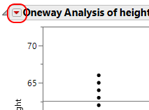
Many platforms include display options under the red-triangle menu:
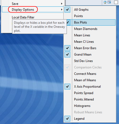
Click on the triangle, and look to the bottom of the menu for the Display Options, which include box plots, mean error bars, and more:
I hope that helps!
- Mark as New
- Bookmark
- Subscribe
- Mute
- Subscribe to RSS Feed
- Get Direct Link
- Report Inappropriate Content
Re: Bar charts for oneway
think it is the most frequently used format
- Mark as New
- Bookmark
- Subscribe
- Mute
- Subscribe to RSS Feed
- Get Direct Link
- Report Inappropriate Content
Re: Bar charts for oneway
A bar chart is a very poor representation for a oneway analysis of variance (ANOVA): it does not display variance!
The typical view is a boxplot or a probability plot which display both mean and variability. These plots display data anomalies such as outliers, modality (clusters) and stong skews in the data. In my opinion, and I believe most statisticians will agree, a bar chart is the least informative display for a Oneway analysis.
Use GraphBuilder if you want bar graphs of the means of groups.
- Mark as New
- Bookmark
- Subscribe
- Mute
- Subscribe to RSS Feed
- Get Direct Link
- Report Inappropriate Content
Re: Bar charts for oneway
- Mark as New
- Bookmark
- Subscribe
- Mute
- Subscribe to RSS Feed
- Get Direct Link
- Report Inappropriate Content
Re: Bar charts for oneway
If you want your bar chart, you can get that in Graph Builder, and it can display the means and the error bars associated with them.
- Mark as New
- Bookmark
- Subscribe
- Mute
- Subscribe to RSS Feed
- Get Direct Link
- Report Inappropriate Content
Re: Bar charts for oneway
I did try that but found I was unable to suppress missing values from the
display
- Mark as New
- Bookmark
- Subscribe
- Mute
- Subscribe to RSS Feed
- Get Direct Link
- Report Inappropriate Content
Re: Bar charts for oneway
Can you provide more details, and maybe even a sample data table. The community may be able to help solve that issue if you can provide that.
- Mark as New
- Bookmark
- Subscribe
- Mute
- Subscribe to RSS Feed
- Get Direct Link
- Report Inappropriate Content
Re: Bar charts for oneway
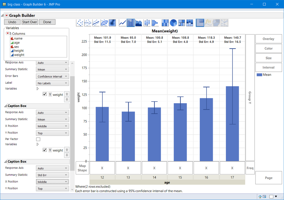
GraphBuilder has an option to display categories, that is, when an X- group has all missing values. That is an option trhat can be turned on or off from the red-inverted triangle menu. I opened Big Class. JMP and deleted one value in column weight, hence a missing value. I also randomly selected 2 row right clicked and selected, Exclude.
- Drag :weight to the Y area
- Right click in the graph, select Points > Change points to bars.
- Add two Caption Box: one for Mean and one for Std Err or N or other summary statistics. To make them bold right click in the graph and select Customize. Then for each Text, select and chane the font to Bold.
- Drag :age to the X-Grouping Area.
- Right click on the X-Group and select X Group Edge then select bottom.
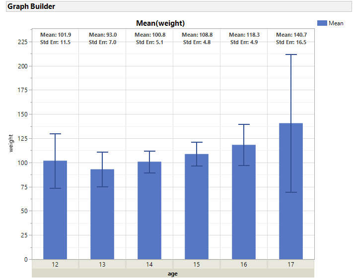
You will see the graph below. Now Journal the graph (CTRL + J). Missing does not appear, but messages about exclusions and type of error bar does appear, which I find informative. If you want to remove that message, type S from the keyboard or from the menu click on the selection tool (the fat plus). Right click on the unwanted text and select Cut or Clear or Delete.
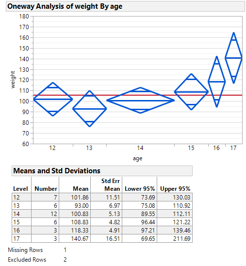
Note using Fit Y by X there are multiple views of the data. Below is one with X Axis proportional ( to size, N). That can be turned off as well.
This shows missing and exclusions. Again, once journaled, you can select the text and remove it.
Recommended Articles
- © 2026 JMP Statistical Discovery LLC. All Rights Reserved.
- Terms of Use
- Privacy Statement
- Contact Us

