- New to JMP? Let the Data Analysis Director guide you through selecting an analysis task, an analysis goal, and a data type. Available now in the JMP Marketplace!
- See how to install JMP Marketplace extensions to customize and enhance JMP.
- Subscribe to RSS Feed
- Mark Topic as New
- Mark Topic as Read
- Float this Topic for Current User
- Bookmark
- Subscribe
- Mute
- Printer Friendly Page
Discussions
Solve problems, and share tips and tricks with other JMP users.- JMP User Community
- :
- Discussions
- :
- Allign different sets of data
- Mark as New
- Bookmark
- Subscribe
- Mute
- Subscribe to RSS Feed
- Get Direct Link
- Report Inappropriate Content
Allign different sets of data
Hi all,
I need your help in suggesting how to allign different data to be on the same Y axis level.
to adjust the x values so that they can be compared (not standardization).
see attached file
thank you very much
- Mark as New
- Bookmark
- Subscribe
- Mute
- Subscribe to RSS Feed
- Get Direct Link
- Report Inappropriate Content
Re: Allign different sets of data
Hi @eldad_galili ,
Not really sure what you're trying to do, but if you're just wanting to have them shifted relative to each other so they can be closer together, one option would be to standardize the data and then add some offset, say 5 or 10 units for x2, x3 and so on. So x would have no offset, x2 would have an offset of 10, and x3 would have an offset of 20, and so on. Another option might be to transform them by changing the values to be on a range from 0 to 1. Both of these options can be found by right clicking a column and selecting New Column Formula > Distribution > and then either Standardize or Range 0 to 1.
If you can provide a visual of what you'd like see, or how you want the graphic to look like, that would help a lot in determining the correct direction to set you in.
Hope this helps!,
DS
- Mark as New
- Bookmark
- Subscribe
- Mute
- Subscribe to RSS Feed
- Get Direct Link
- Report Inappropriate Content
Re: Allign different sets of data
I echo the need for more context, but one idea I have is to index each of the x series so that they start at 100. This allows them to be compared on a constant scale without standardizing them (just a different constant scale). However, when I do this with your data, it looks fairly strange as each data series varies relatively little over time. The variability is very low, except for a few distinct points in each series. As a result, the graphs appear as horizontal lines with a few outliers. My guess is that you either want to focus on these outliers, or remove them from the analysis so that the slight differences in the series can be visually seen.
- Mark as New
- Bookmark
- Subscribe
- Mute
- Subscribe to RSS Feed
- Get Direct Link
- Report Inappropriate Content
Re: Allign different sets of data
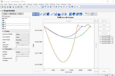
Are you looking for something like:
Recommended Articles
- © 2026 JMP Statistical Discovery LLC. All Rights Reserved.
- Terms of Use
- Privacy Statement
- Contact Us


