A recent wishlist item asked for a number format which was a version of scientific notation using superscript exponentiation instead of the computerese "e" separators for powers of 10. In other words, 3.4 × 10⁵ instead of 3.4e+5. Since superscripted digits are available as Unicode characters, it's possible to write such numbers as regular text, without the need for explicit superscripting. And that means we can get such numbers on an axis with a custom label format.
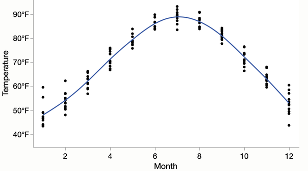
Graph axes have long supported custom label formats, which are JSL expressions that can produce arbitrary axis labels. Here's an example that adds "°F" to the y-axis labels.

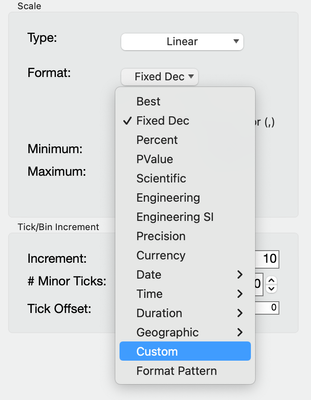
I made it by picking Custom as the Format in the Axis Settings dialog.

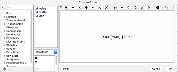
And then clicking "Custom Format" to bring up a version of the Formula Editor to create this simple formula.

The formula for scientific is more complicated but still fits within the framework. I created this formula, which starts with JMP's regular scientific notation and then replaces the exponent's digits with the corresponding superscripted characters.
Local( {supers = "⁰¹²³⁴⁵⁶⁷⁸⁹", d, parts},
	parts = Words( Format( value, "Scientific", width, dec ), "e" ); // split on e
	Substitute Into( parts[2], "+", "", "-", "⁻" ); // ignore +, superscript -
	For( d = 0, d <= 9, d++, // superscript each digit
		Substitute Into( parts[2], Char( d ), Substr( supers, d + 1, 1 ))
	);
	if (value == 0, "0", parts[1] || " × 10" || parts[2]); // add x10 unless 0
)
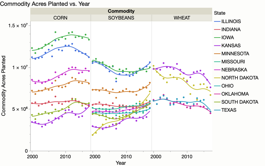
Here's a graph using that format.

Finally, here's the entire script for the graph, with the custom format as a part of the axis customizations and data filter to just show the top states.
Open( "$SAMPLE_DATA/Corn Wheat Soybean Production.jmp" );
Graph Builder(
	Transform Column(
		"Maximum[Commodity Acres Planted][State,Commodity]",
		Formula( Col Maximum( :Commodity Acres Planted, :State, :Commodity ) )
	),
	Size( 658, 487 ),
	Show Control Panel( 0 ),
	Variables(
		X( :Year ),
		Y( :Commodity Acres Planted ),
		Group X( :Commodity ),
		Overlay( :State )
	),
	Elements( Points( X, Y, Legend( 35 ) ), Smoother( X, Y, Legend( 36 ) ) ),
	Local Data Filter(
		Add Filter(
			columns( :"Maximum[Commodity Acres Planted][State,Commodity]"n ),
			Where(
				:"Maximum[Commodity Acres Planted][State,Commodity]"n >= 4658000
			)
		)
	),
	SendToReport(
		Dispatch( {}, "Year", ScaleBox,
			{Min( 1999.5 ), Max( 2017.5 ), Inc( 10 ), Minor Ticks( 1 )}
		),
		Dispatch( {}, "Commodity Acres Planted", ScaleBox,
		{Format( "Custom",
			Formula(
				Local( {supers = "⁰¹²³⁴⁵⁶⁷⁸⁹", d, parts},
					parts = Words( Format( value, "Scientific", width, dec ), "e" );
					Substitute Into( parts[2], "+", "", "-", "⁻" );
					For( d = 0, d <= 9, d++,
						Substitute Into( parts[2], Char( d ), Substr( supers, d + 1, 1 ))
					);
					if (value == 0, "0", parts[1] || " × 10" || parts[2]);
				)
			)
		), Min( 0 ), Max( 15.5e6 ), Inc( 5e6 ), Minor Ticks( 4 )}
	))
);