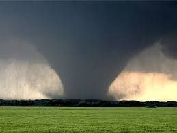
F5 Tornado – Jarrell, TX – 2018
In this final Tornado Trend Challenge, we will answer the question: “Do you believe that tornadoes in the US are shifting location?” In our first two blogs we were able to show that there was lack of evidence to say that tornadoes are both increasing in number and getting more destructive. You can revisit these blogs here: https://community.jmp.com/t5/Scott-Wise-s-Blog/Tornado-Trend-Challenge-Critical-Thinking-in-Three-Di....
Traditionally, we associate the area of the United States that has the most tornadoes to still be in the Midwest…like when Kansas based Dorothy got swept up in the opening tornado in the classic “Wizard of Oz” movie. However, a popular current view is that tornadoes are now less likely to happen in the older US Midwest “Tornado Alley” and are now happening further east in the newly termed US Southeast “Dixie Alley”.
Again, we will use the excellent data from the NOAA Storm Events Database, filtered for all US tornado incidents from 1950 to 2022. You can find this public data at the following link: (https://www.ncdc.noaa.gov/stormevents/ftp.jsp). In this excellent data repository, we had lots of information about tornado dates, starting locations, and relative strength (F-Scale*). We will also use the JMP Graph Builder platform to make interactive visuals that can provide solutions to our questions.
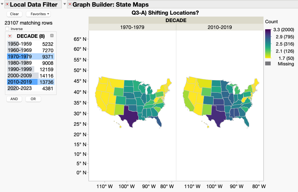
Our first view is to look at a state-based geographic map where we can use a colored gradient scale showing the average tornado count. When comparing the older decade of 1970-1979 to the more recent 2010-2019, you can see that it does seem that higher counts (darker colors) are shifting a little further east into places like Mississippi and Alabama. However, one major draw-back of using this type of map is that it hides the true starting position of each tornado by grouping them together into the general state shapes. Also, with large land areas like Texas dominating the space, it gets even harder to visualize true differences among all the states.

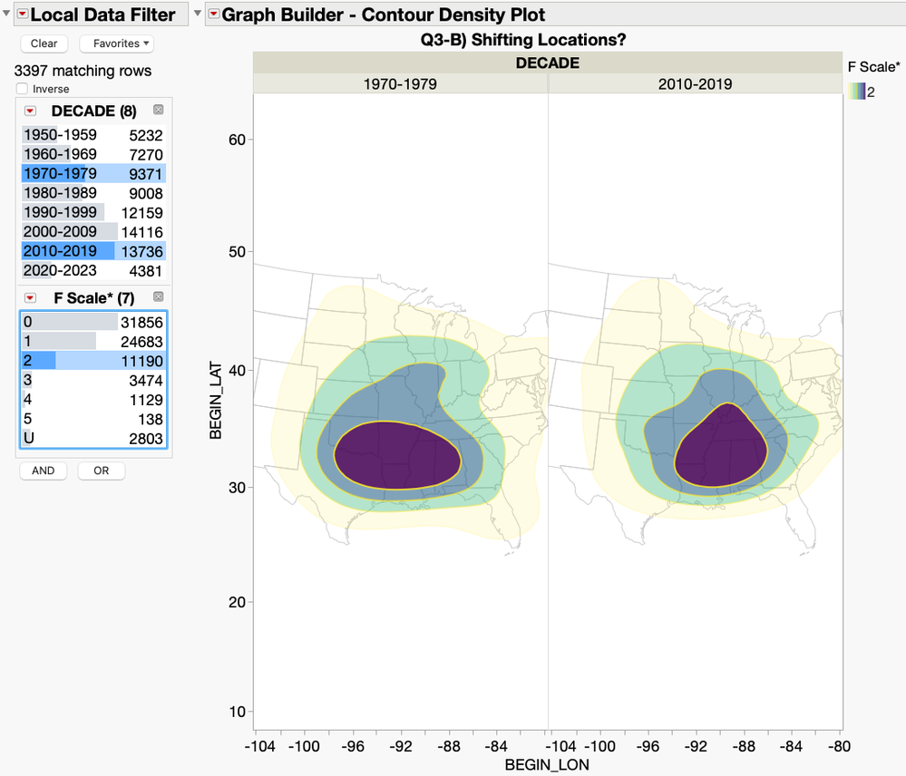
A better view would be to use a contour density map that allows us to see the true density groupings of tornado starting positions within the decades. We used the same 1970-1979 versus 2010-2019 comparison view and even included the F-Scale* (tornado strength) in the filter to allow for more drilldown. The graph below shows our most compelling view which focused on the F-Scale 2* tornado type for a more “apples-to-apples” comparison. Now we finally see a slight shift east in the starting tornado positional densities on the map. However, this is by no means as drastic a difference as the popular view would have you believe, as the both the Midwest and Southeast regions still show rather high densities of occurrences.

There is a supporting scientific weather theory that points to the effect that rising temperatures are having in causing a shift in the atmospheric jet stream further to the southeast. This in turn can change where thunderstorms are more likely to occur, which can spawn tornadoes. However, while there might be some visual support in our graphs that tornado occurrence is slightly shifting eastward, we would need even more data and larger shift patterns to be able to truly back this claim. So, we will say to the question on whether tornadoes in the US are shifting that still more study is needed.
In researching and writing this blog series, I was struck by how hard it is to find patterns in the behavior of random occurrence events like those of tornadoes. For just for a single tornado to appear, it needs the perfect conditions of thunderstorm fuel and upper wind shear to even form. Gladly we now have better access to more data and powerful visual exploration tools like the JMP Graph Builder that can a least help judge for ourselves the validity of the sensational statements we hear about tornadoes and other things in our world. Please see the following Tornado Trend Challenge JMP Public link if you would like to view/interact with these graphs and data yourself: https://public.jmp.com/packages/XyMCFvqxR9Dftkqhvvt6l.