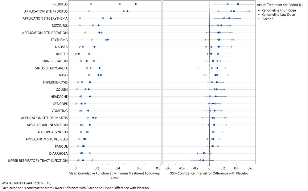
Last May, I introduced the Recurrence Report for JMP Clinical 19. In that post, I used a dot-forest plot (Figure 3) to highlight the most important treatment emergent adverse events (TEAEs) that took place in a clinical trial of patients with probable mild-to-moderate Alzheimer’s disease. The plot is reproduced below for convenience in Figure 1.

Figure 1. Dot-forest plot of treatment emergent adverse events
For background, the trial duration was 26 weeks with 254 patients randomized to one of three treatment arms, high or low dose xanomeline or placebo. A total of 242 different preferred terms (PTs) were observed during the study, with 230 PTs observed among the TEAEs. A total of 1,126 TEAEs were experienced, indicating some recrudescence of PTs within patient across time.
Recurrence analyses rely heavily on the use of multiple data visualizations to efficiently summarize, interpret, and communicate the findings. Imagine if you needed to review the data visualizations for 230 different PTs to understand safety from a recurrence perspective. Plots like Figure 1 are useful to help identify which individual events to explore in more detail.
 Figure 2. Mean cumulative function plot for pruritis TEAEs
Based on Figure 1, pruritis TEAEs show excess risk between the active arms compared to placebo; safety scientists can focus on this and other events where one or more of the 95% confidence intervals exclude 0. Plots of the mean cumulative function (MCF) can be used to assess the average number of events expected for each treatment for a given length of treatment exposure. Figure 2 summarizes the risk of pruritis (itching) TEAEs over time. The limitation of Figure 1, however, is that it only communicates the risk between treatments at a single point in time. The selected time point is the minimum of the maximum observed follow up for each treatment arm – the minimax follow up. Here, that value is approximately 211 days. You will observe in Figure 2 that the placebo follow up ends at this time. Imagine drawing a reference line at this time across all three arms. These are the estimates and intervals summarized in Figure 1. This ignores the differences for the preceding 210 days!
There have been other attempts to identify signals considering the entire duration of follow up between AEs. The tendril plot shows change over time between two treatments in terms of the timing and recurrence of AEs. The more that a particular arm has AEs compared to the other arm bends the tendril to the left or the right to show increased risk for a particular treatment over time. Tendril plots have been recommended for use in data monitoring committee meetings as a way of showing the differences in recrudescence of events over time between treatments. However, there are a number of limitations of the tendril plot:
- The angle indicating the change in risk over time is arbitrary.
- The x- and y-axes have no meaning and are not associated with any particular data value. The duration of time is based on the length of the tendrils, which is generally difficult to discern.
- It is unclear how to interpret the curves practically, and an AE that tends to occur only on one arm can produce a tendril that completes a full circle, heading in the same direction of events that are not particularly notable (See Figure 2 of the linked paper).
- The tendril plot is limited to two treatments.
I think we can do better!
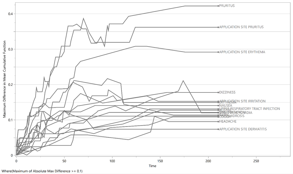
Return to the MCF plot for pruritis in Figure 2. At each time point along the x-axis, we can compute the max difference as the maximum value of MCFs across all treatments minus the minimum value of MCFs across all treatments. These max differences are plotted across time in Figure 3. Note that I filtered the data table to events that experienced a max difference of at least 0.1 at least once along the curve.

Figure 3. Max difference plot
This plot has a similar function as the tendril plot in screening for notable event recurrence but with a number of benefits.
- Meaningful axes
- The x-axis makes it very straightforward to understand what is happening for events at a given time.
- The y-axis has a very clear interpretation in that it represents the maximum difference in MCFs between all pairs of treatments (see the right panel of Figure 5 here). In other words, it represents the increase in the average number of events between the least and most safe treatment at a particular time.
- Any number of treatments can be accommodated. The goal is to identify PTs where large differences are observed between arms, which can be done for any number of treatment arms. However, in the special case of two treatment arms, direction can be considered as is done for the tendril plot to communicate elevated risk for one treatment versus the other.
- Straightforward interpretation. Users can explore events in further detail that show large differences between treatments across time.
The max difference plot will be available in JMP Clinical 19.1. Both the dot-forest plot and max difference plot can be used to identify meaningful safety signals while considering the timing and recrudescence of TEAEs.
You must be a registered user to add a comment. If you've already registered, sign in. Otherwise, register and sign in.