JMPer Cable
A technical blog for JMP users of all levels, full of how-to's, tips and tricks, and detailed information on JMP features- JMP User Community
- :
- Blogs
- :
- JMPer Cable
- :
- Problem solving in JMP and using graph customizations to create a Smith Chart
- Subscribe to RSS Feed
- Mark as New
- Mark as Read
- Bookmark
- Subscribe
- Printer Friendly Page
- Report Inappropriate Content
The Engineering Mailbag
Episode 3: John Jacob Jingleheimer…Smith Charts!
Every now and again we systems engineers run into interesting questions that would fall somewhat outside the typical range of JMP usage. These applications are generally clever, and many times bring home how using data isn’t just for business or technical problems. Other times, the questions are just unexpected, challenging problems. I call these "curveballs."
I love a good curveball.
I wanted to share this particular one for a couple of reasons. First, it’s an example of how to repurpose graph customizations to reach a goal. And, second, I’m going to illustrate the thought process I go through when solving problems using JMP. In short, this is one of those cases where the journey is significantly more instructive than the result. So, without further qualification, below is an example of a really good curveball from another colleague from New York state that I thought would be fun to share.
…And for the record, Nick, this was not a “quick question"!! ;D
The Question
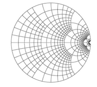
Mike [JMP],Quick question – do you know if there exists an add-on or a script for JMP for plotting polar coordinate types of graphs? Namely looking to do contour plots on a Smith Plot, example pasted below, for some RF impedance analysis.... We can live with converting to rectangular coordinates for now, but figured it was worth asking if you’ve seen it before or knew someone at JMP who might be able to help.
Smith chart template – is there a way to plot two data fields (real & imaginary coordinate values) onto a Smith chart?
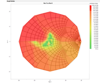
Found an example of contour plot on Google. Seems like something JMP could do…
Thanks,
Nick [User]
My Response:
Hi, Nick,Can you share the data you’ve used to make that contour plot?
I might be able to create a shapefile that would fit the bill of overlaying the grid on top of the data. (No promises, but I’d need the data to cross check if I did it correctly.)
Best,
M
What the heck is a Smith Chart?
That’s exactly what I was thinking when I saw this question. To be honest, I’d seen the questions he mentioned in the Community. I took one look at the Community question and thought, “Nope. That’s for someone else.” Apparently, life had other ideas. So, suitably chastised, I began with figuring out what these plots were. It’s pretty interesting reading, but to be honest, the nitty-gritty details really don’t matter for this discussion.
At a high level, a Smith Chart is a flavor of polar coordinate plot used for electrical engineering. (That made sense to me.) It also turns out that they are made of overlapping circles and circle arcs where the radius of a given circle is related to measured physical quantities. (Again – no problem, particularly because a kind professor had posted their lecture notes on their website, which included the required equations to relate the physical quantities to the radii of the circles.) Further, it’s pretty common for people who work with these things to convert the data from the Polar coordinate system (data points plotted in radius and angle) to a Cartesian system (data points plotted in x and y) for easier plotting.
The Development Process
When I was done with my research, I had discovered that I need to somehow build a group of circles with specific radii, and I needed those radii to match up with a user-provided set of data. The more I thought about this, the less my initial idea of building a shapefile for Graph Builder seemed to be a good fit. This was further validated by a colleague who thought it would be problematic. But, why? Well, first off, the data would have to be rescaled to the same scale as the shapefile coordinate system. Even with detailed documentation, this seemed to be a minefield of problems. It would have ultimately required that I either build a completely self-contained add-in that scaled everything behind the scenes or that I build the shapefile, throw it over the fence, and hope it ran without issues. I wasn’t crazy about either of those options. Second, I would have to figure out how to get those arcs set-up to start and end at the intersections with the circles correctly. Not an easy task.
The evidence indicated that I had to scrap my initial idea – before I even had the data I asked for! Where would I go from here? Back to the beginning! I started with a simple line of questioning to recast my problem.
- Can I plot the data? Yes, because I can expect that the users will be converting the data to Cartesian coordinates, I can use one of the standard platforms (Graph Builder or Contour Plot) to generate a plot of the data.
- What do I need to do to the plot to make it into a Smith Chart? I need to create a series of circles, arcs, and lines and label them.
- How do I draw all of that? I have two options. Graph Builder would let me use shapefiles, but we’ve already eliminated that option. A shapefile also wouldn’t let me use text labels easily. Graphics Scripts could be used to annotate the existing plot, but that would require scripting which could be intimidating to a user.
- What if I built a little add-in that would do the annotation? The more closely I looked at this problem, the more I realized that was the direction I’d have to go. But, I also realized that if I committed to creating an add-in, I could recycle a lot of support code from my most recent build of the Semiconductor Tool Kit. (Always save your code, kids!)
Graphics Scripts
Open up a plot in JMP – any 2D plot....Go on, I’ll wait….
Ready?
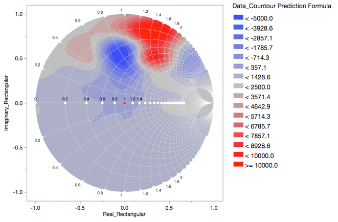
Right! Right-click on the graph area and look toward the bottom. Do you see the “Customize…” option? Have you ever explored that option? Most people haven’t. I expect that will start to change because of JMP 14 (Boundary Map), but up until now, I don’t think it’s been a very common area of use in JMP. Which is a pity, because you can do so much with customizations. And it turns out that a Smith Chart is really easy to create by adding Graphics Scripts to a plot’s customizations. Now, some of you have probably broken into a cold sweat because I used the “s-word” – no, not that s-word – I meant “scripts.” But, remember, all we need are circles, a line, and labels, and these are easy to script. I’m also going to add a shape to create a mask around the bits we don’t need and to make the labels easier to see. Here’s how we make each of those as seen in the Smith Chart below.
Graphing the Data
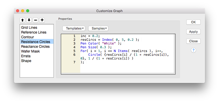
Graphics Scripts first need a graph. So, step 1 (as should always be the case) is to graph the data. In this case, I used a smoothed formula in a contour plot (more on that little workflow here: All Wafer Maps Are Wrong: An Adventure in Semiconductor Data Visualization). From there, you open the Customizations for the graph. To add a Graphics Script into Customizations, you just push the “+” button at the list of layers on the left. This gives you a new entry in the stack and a blank script field on the right. You can name the script, if you want, by double-clicking on the title (I recommend you do – it’s just good organization). There are some templates and samples that you can explore in the dropdowns above the scripting field that you can play with to get ideas. The order that layers appear in the stack determines what is on top. The layers at the bottom are closest to your eyeball (note - this is backward from what most graphic arts software does!) Last, while I’m using a few of the Graphics Scripts, there are others. They can be found under the Graphics group in the scripting guide (In JMP - Help > Scripting Guide. Select the Functions Category to make it easier to find).
Drawing Circles
Circles use the Circle({<x>,<y>},<radius>) command in a Graphics Script. Here’s the script I used for the circles with their centers on the line y = 0 in the example (the green text describes what each part does).
// make a list of circles using a desired step and range of resistances
inc = 0.2;
resCircs = Index( 0, 5, 0.2 );
// set line color and weight
Pen Color( "Gray" );
Pen Size( 1 );
// loop through the list of resistances, calculate and plot a circle for each one
For( i = 1, i <= N Items( resCircs ), i++,
       Circle( {resCircs[i] / (1 + resCircs[i]), 0}, 1 / (1 + resCircs[i]) )
);
The code for the arcs are actually also circles. (Remember, an arc is just a portion of a circle.) The difference is just in how the center and radius are calculated. There are also two circles created per entry in the list – one for the positive curve and one for the negative curve.
inc = 0.2;
reactCircs = Index( 0, 5, 0.2 );
Pen Color( "Gray" );
Pen Size( 1 );
For( i = 1, i <= N Items( reactCircs ), i++,
       Circle( {1, 1 / reactCircs[i]}, 1 / reactCircs[i] );
       Circle( {1, 1 / -reactCircs[i]}, 1 / -reactCircs[i] );
);
Next, I’ll create a shape to mask out the parts of the circles I don’t need.
Drawing Irregular Shapes (Polygons)
Irregular shapes use the Polygon([<xMatrix>],[<yMatrix>]) command. You can also define each vertex location using an {x,y} notation, but that was painful to work with. The code looks like this (with the matrices removed for readability):
// define the fill color
Fill Color( "white" );
// define the polygon using matrices
Polygon([… xmatrix…],[…ymatrix…]);
The omitted coordinates define a square with a circle knocked out of the center of the same size as the largest of the circles centered on the y = 0 line. Putting the polygon script below the circle scripts (i.e., closer to the top of the stack) masks out the parts of the circles that aren’t needed for the Smith Plot.
Drawing Markers and Text
Markers (data points) use the command Marker( Color State(<color>), [<xMatrix>], [<yMatrix>]). The Color State argument is optional but lets you control the marker colors independent of any other scripts. Putting text labels onto a graph uses Text(<justification>, {<x>,<y>}, <string>). The justification argument is optional, and the {x,y} location are for the center of the text field. In the example, the coordinates are the same between the markers and the text and I just incorporated some offsets and justification adjustments to get things aligned properly (which gave rise to that hairy if statement at the end). To make this easier, I used a single matrix that contained the x,y coordinate and the label as a number.
// coordinate matrix [x, y, label]
mat = [<matrix>];
// set line color and weight and the text size
Pen Color( "Gray" );
Pen Size( 1 );
Text Size( 8 );
// make the markers
Marker( Color State( "Gray" ), mat[0, 1], mat[0, 2] );
// make the labels using the matrix with some offsets and rounding
For( j = 1, j <= N Rows( mat ), j++,
       If( Round( mat[j, 2], 1 ) < 0,
              string = "  -" || Char( Round( mat[j, 3] * 1, 2 ) ) || "  ",
              string = "  " || Char( Round( mat[j, 3] * 1, 2 ) ) || "  "
       );
       If(
              Round( mat[j, 1], 1 ) <= 0 & Round( mat[j, 2], 1 ) > 0,
                      Text( Right Justified, {mat[j, 1], mat[j, 2] + 0.03}, string ),
              Round( mat[j, 1], 1 ) > 0 & Round( mat[j, 2], 1 ) > 0 & mat[j, 3] <= 2,
                      Text( {mat[j, 1], mat[j, 2] + 0.03}, string ),
              Round( mat[j, 1], 1 ) > 0 & Round( mat[j, 2], 1 ) < 0 & mat[j, 3] <= 2,
                      Text( {mat[j, 1], mat[j, 2] - 0.05}, string ),
              Round( mat[j, 1], 1 ) <= 0 & Round( mat[j, 2], 1 ) < 0,
                      Text( Right Justified, {mat[j, 1], mat[j, 2] - 0.05}, string ),
              Round( mat[j, 1], 1 ) <= 0 & Round( mat[j, 2], 1 ) == 0,
                      Text( Center Justified, {mat[j, 1], mat[j, 2] + 0.03}, string ),
              Round( mat[j, 1], 1 ) > 0 & Round( mat[j, 2], 1 ) == 0 & mat[j, 3] <= 1.4,
                      Text( Center Justified, {mat[j, 1], mat[j, 2] + 0.03}, string )
       );
);
Drawing Lines
A line uses the command Line({<x1>,<y1>},{<x2>,<y2>}). In the example, I put my line in with some other bits and pieces in the “Errata” script:
// set line color and weight
Pen Color( "Gray" );
Pen Size( 1 );
// draw the line, circle, and center marker
Line( {-1, 0}, {1, 0} );
Circle( {0 / (1 + 0), 0}, 1 / (1 + 0) );
Marker( Color State( "red" ), {0, 0} );
Putting Everything Together
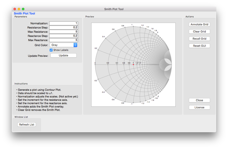
Using the Annotate portion of the Semiconductor Tool Kit (which does the exact same thing as we are doing here), it was fairly easy to substitute the calculations into the existing code and create a new Application using Application Builder (always recycle your code, folks!). The customizations are applied to a blank graph box as a preview. When you are happy with the results, you can click the Annotate Button that will copy the Graphics Scripts to the Customizations for your plots.
Final Thoughts
So, what did I learn in this little adventure? First – follow the facts; this includes the scoping part of a problem. My original idea was flat-wrong, but while I was learning how wrong it was, I was gathering the information needed to get a proper solution. Second – don’t be afraid to burn the straw man. Don’t be afraid to let go of your initial concept if it’s not going to work. Third – I’m constantly amazed by how much can be done with customizations.
The Smith Chart Generator Add-In is available if you want to tinker with it.
A Note From The Author
For those of you reading this again, no you’re not crazy, the title did change a little. I received a request to update the title so that it would be easier for our search engines to find. I can only guess this is because some search engines are modern incarnations of 19th-century reference librarians with no sense of humor. Apologies for any inconvenience. -M
P.S. Sincerest apologies for any “John Jacob Jingleheimer Schmit” earworms you may be experiencing. -M.
Editor's note: Have you read the other installments in our Engineering Mailbag series? See how Mike helps a user who was using JMP to decide whether to sign up for a snow removal service and develop unique visualizations for STEAM education programs.
You must be a registered user to add a comment. If you've already registered, sign in. Otherwise, register and sign in.
- © 2026 JMP Statistical Discovery LLC. All Rights Reserved.
- Terms of Use
- Privacy Statement
- Contact Us

