cancel
Showing results for 
Show  only  | Search instead for 
Did you mean: 
Browse apps to extend the software in the new JMP Marketplace
Choose Language Hide Translation Bar
New Control Chart Builder Features in JMP 17

JMP 17 brings many new features to Control Chart Builder (CCB), including

  • Reorganization of the Quality and Process menu
  • Laney P’ and U’ control charts
  • Button to switch XBar charts to IMR charts/Label role
  • N Subgroups in the saved limits table
  • K-Sigma option
  • Three Way control chart dialog overhaul
  • Connect thru Missing
  • Row legend

Reorganization of the menu

The first thing you will notice about CCB is that the quality and process menu has been reorganized.
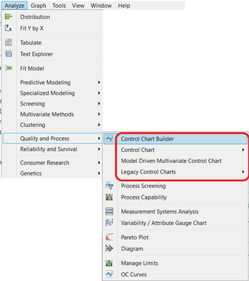
Figure 1Figure 1

All control chart options have been grouped together to appear in the top section of the menu. 

Laney P’ and U’ Charts

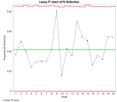
Laney P’ and U’ charts are new for version 17. For an example, open Electrical Component Defect Screening found in the Quality Control folder:

Open("$SAMPLE_DATA/Quality Control/Electrical Component Defect Screening.jmp");

To create a Laney P’ chart, click Analyze->Quality and Process->Control Chart->Laney P’ Control Chart. Specify N Defective as Y, n Defective. Specify Week as Subgroup. Specify N Units as n Trials. Click OK.
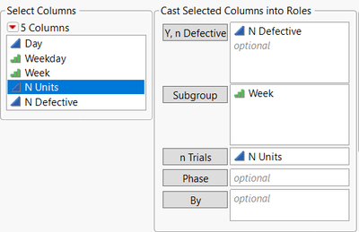
Figure 2Figure 2Figure 3Figure 3

To learn more about Laney charts, read my earlier blog post.

Switch to IMR Chart/Label role

Data can sometimes be in a format where the subgroup levels are not unique, but they should be treated as unique.  For an example, open Big Class.jmp found in the sample data folder:

Open("$SAMPLE_DATA/Big Class.jmp");

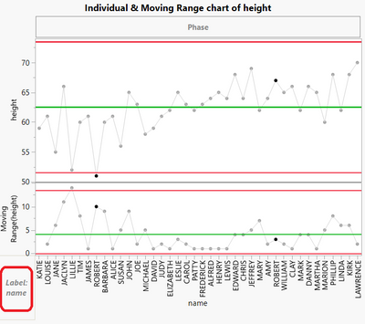
You want to create a control chart for height using name as the subgroup. Select Analyze->Quality and Process->Control Chart Builder. Drag name to Subgroup and height to Y. An XBar and R chart is created because there are two values for Robert. These two Roberts are not the same person. One Robert is 12, and the other Robert is 15. These values of height should be treated as unique values. You can do this by clicking the “Switch to IMR Chart” button at the bottom of the control panel.
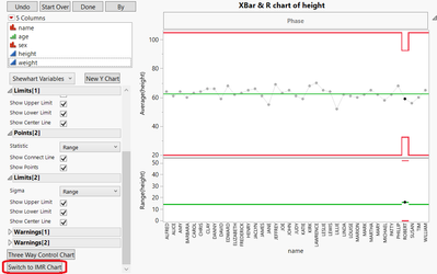
Figure 4Figure 4Figure 5Figure 5

The chart changes to an IMR chart.  Each height value for Robert is treated as a separate subgroup. The x-axis maintains data table row order rather than alphabetical order. This is accomplished by placing name into the Label role rather than the Subgroup role. Instead of using the Switch to IMR Chart button, we could have created this chart by dragging height to Y and name to the Label role in the bottom left of the control chart. The label role is useful when the x-axis variable is not unique but should be treated as unique.

N Subgroups in the saved limits table

The number of subgroups is now saved to limits tables. Click the red triangle next to Control Chart Builder and select Save Limits->in New Table. A new row for _N Subgroups contains the number of subgroups.
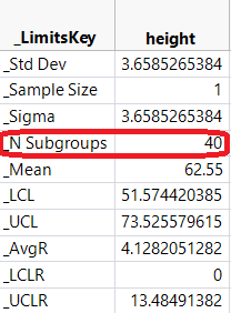
Figure 6Figure 6

K Sigma

A K Sigma option has been added. By default, K Sigma is 3. Suppose, for the example, above (Switch to IMR Chart/Label role), you wanted to use a K Sigma of 4. Click the red triangle next to Control Chart Builder and choose K Sigma. Enter 4 and click OK.
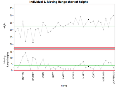
Figure 7Figure 7

 Notice the limits are now wider (compare to Figure 5 above).

Three Way Control Chart dialog

The Three Way Control Chart dialog has been updated so that you can define more options prior to creating a chart.
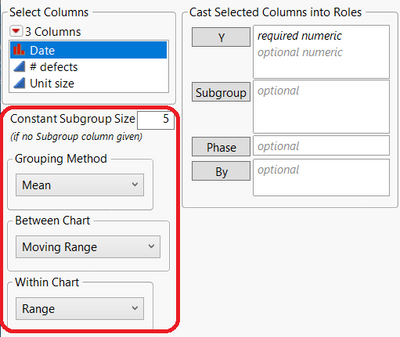
Figure 8Figure 8

Constant Subgroup Size is new and allows you to define a constant for the subgroup size. There are now three drop boxes available. The first drop box allows you to select the Grouping Method (Mean or Standard Deviation). The second drop box enables you to choose the Between Chart (Moving Range or Median Moving Range). The final drop box lets you define the Within Chart (Range or Standard Deviation).

Connect Thru Missing

A Connect Thru Missing option now allows you to connect observations when there are missing data points. For an example, run the following:

dt=Open("$SAMPLE_DATA/Quality Control/Pickles.jmp");
Column(dt, "Acid")[3]=.;
obj=dt<<Run Script("Individual Measurement Chart");

Notice the gap in the connect line between samples 2 and 4. Click the red triangle next to Control Chart Builder and select Connect Thru Missing.
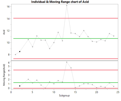
Figure 9Figure 9

Sample 2 is now connected to sample 4.

Row Legend

It is now possible to add a row legend to CCB. In the example above (Connect Thru Missing), right-click in the graph and select Row Legend. Choose Time from the Columns panel. Choose Alphanumeric for Markers. By default, you will have labels A, B, and C, but you can change these to X, Y, and Z to match what is found in the Time Marker column in the Pickles data table.Figure 10Figure 10
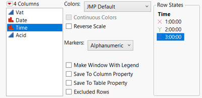
 

 Clicking OK results in the following:
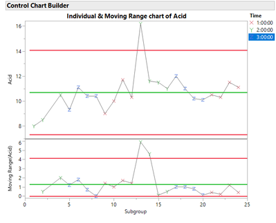
Figure 11Figure 11Note: The row legend option is only available when there is one row per subgroup.

Conclusion

JMP 17 offers many new features in CCB that give users more flexibility in monitoring their processes.

Last Modified: Mar 2, 2023 1:00 PM
Comments
andersonmj2
Level IV

Thanks Tonya!  Quick question to see if my understanding is correct:

- CCB is clear

- The Control Chart submenu uses a dialog to customize CCB in a specific manner.

- 'Legacy' Control Charts submenu uses the classic control charts in full with all of their individual quirks and subtle differences and so on.

Is that correct?

tonya_mauldin
Staff
  • Yes!  Control Chart Builder is the newer drag and drop interface for creating control charts.  This is the preferred method of generating control charts.
  • The first 12 options in the Control Chart submenu provide dialog entries into Control Chart Builder.  The last 3 options in the Control Chart submenu provide dialog entries into specialized control chart platforms that are not a part of Control Chart Builder.
  • The Legacy Control Chart submenu provides access to our older (legacy) control chart platforms that were created prior to the release of control chart builder.
Jehoul
Level II

Hi, when I'm using JMP17, the connect line is interrupted in my control chart. This is not the case when I use JMP16. In JMP16, I could exclude and hide rows and the connect line would connect the next row. But this is not working anymore in JMP17. Could this be caused by the new feature in JMP17 "connect thru missing"?

gail_massari
Community Manager

Hi @Jehoul  If you add the author handle (like  @tonya_mauldin) link to your question, the author will get it directly.  So, @tonya_mauldin :

Hi, when I'm using JMP17, the connect line is interrupted in my control chart. This is not the case when I use JMP16. In JMP16, I could exclude and hide rows and the connect line would connect the next row. But this is not working anymore in JMP17. Could this be caused by the new feature in JMP17 "connect thru missing"?

tonya_mauldin
Staff

@Jehoul, it's hard to say without seeing an example.  The connect thru missing option allows you to connect observations when there are missing data points.  By default, there will be breaks in your connect line if you have missing values. 

However, based on the description that you have provided to me, it sounds like what you are looking for is the Show Excluded Region option.  You don't mention any missing values, but you do mention excluded observations.  The Show Excluded Region option shows/hides the region of the chart where samples have been excluded.  You can read more about that option in the following blog post: Removing white space from control charts (jmp.com)

Jehoul
Level II

@tonya_mauldin, thanks for your prompt reply. Let me try to explain myself a bit better.


I would like JMP to draw a line between the 2 datapoints indicated with the blue arrow.

Jehoul_1-1684944186677.png


Below is the data table where I highlighted the rows/column that correspond to those 2 datapoints. As you can see there are rows in between which I have excluded/hidden, but there is no missing data and hence the "connect thru missing" feature doesn't work. As a side note, you can see in the screenshot above that I am also using the local data filter to select only certain conditions to be displayed on the graph.

Jehoul_2-1684944562787.png


When I open the exact same dataset in JMP16, I don't encounter this problem. In JMP16, all datapoints are connected.


Hope this is clear, looking forward to your reply.


tonya_mauldin
Staff

@Jehoul Did you try turning off Show Excluded Region?  The default for Show Excluded Region used to be off, but the default was changed to on.  Try turning this option off.

Jehoul
Level II

Hi @tonya_mauldin , yes I tried turning off the "Show Excluded Region" but that removes the "excluded only" datapoints from my graph. I only want to remove the datapoints that I have hidden in my datatable. The datapoints that I excluded I still want to display, but they should not be considered in the calculation of the control limits (which it does correctly).

I made a quick example script, which you can use to understand my case:

New Table( "Untitled",
	Add Rows( 20 ),
	New Script(
		"Control Chart",
		Control Chart Builder(
			Show Two Shewhart Charts( 0 ),
			Variables(
				Subgroup( :Year ),
				Subgroup( :Week, Position( 1 ) ),
				Subgroup( :Order, Position( 1 ) ),
				Y( :Data )
			),
			Chart(
				Points( Statistic( "Individual" ) ),
				Limits( Sigma( "Levey Jennings" ) )
			),
			Local Data Filter(
				Add Filter(
					columns( :Condition ),
					Where( :Condition == {"A", "B", "C"} ),
					Display( :Condition, N Items( 4 ) )
				)
			),
			SendToReport(
				Dispatch(
					{},
					"Data",
					ScaleBox,
					{Format( "Best", 12 ), Min( 0.894274709932513 ),
					Max( 1.1092654501963 ), Inc( 0.05 ), Minor Ticks( 1 )}
				)
			)
		)
	),
	New Column( "Order",
		Character,
		"Ordinal",
		Set Values(
			{"1", "2", "3", "4", "5", "6", "7", "8", "9", "10", "11", "12", "13",
			"14", "15", "16", "17", "18", "19", "20"}
		)
	),
	New Column( "Year",
		Character,
		"Nominal",
		Set Values(
			{"2022", "2022", "2022", "2022", "2022", "2022", "2022", "2022", "2022",
			"2022", "2023", "2023", "2023", "2023", "2023", "2023", "2023", "2023",
			"2023", "2023"}
		)
	),
	New Column( "Week",
		Character,
		"Nominal",
		Set Values(
			{"48", "48", "49", "49", "50", "50", "51", "51", "52", "52", "1", "1",
			"2", "2", "3", "3", "4", "4", "5", "5"}
		)
	),
	New Column( "Condition",
		Character,
		"Nominal",
		Set Values(
			{"A", "B", "A", "C", "B", "A", "B", "B", "D", "A", "C", "D", "A", "B",
			"D", "D", "C", "B", "A", "C"}
		)
	),
	New Column( "Data",
		Numeric,
		"Continuous",
		Format( "Best", 12 ),
		Set Values(
			[1.01, 1.02, 1.01, 0.98, 1.01, 1, 0.99, 0.97, 0.98, 1.03, 1.01, 0.99, 1,
			1.05, 1.04, 1.01, 1.03, 0.99, 1.02, 0.97]
		)
	),
	Set Row States( [0, 0, 0, 0, 0, 0, 0, 0, 0, 0, 2, 6, 0, 0, 0, 0, 0, 0, 0, 0] )
)

What I want to achieve in this dataset is to connect row 11 and 13 in the control chart that I made. You can also run this script in JMP16 and there you will see those 2 datapoints are connected.

Thanks a lot for your help.

Regards,

Hannes

Jehoul
Level II

hi @tonya_mauldin , yes I tried but this removes the excluded datapoints from the graph and I want to keep them like it does in JMP16.


JMP16:

Jehoul_0-1685018950206.png

JMP17:

Jehoul_1-1685019010601.png

Jehoul_0-1685019749728.png


tonya_mauldin
Staff

@Jehoul , yes you are correct that turning off show excluded region will remove excluded data points from the graph.  I understand what you are asking for now.  Thanks for the example and the clarification.  You want to see row 11 on the graph (which is excluded from the analysis) and have this row connected to row 13.  There is no way to get this using CCB in Version 17 of JMP.  Connect thru missing only applies to missing data points which is not what you have here.  While turning off show excluded region will connect all data points, it also removes row 11 from the graph because it has been excluded in the data table.  

I want to caution you because your example is giving JMP contradictory pieces of information.  In the data table, you have excluded row 11.  In the local data filter for the report, you tell JMP to include (which is the same as unexclude) row 11 in the report.  Regardless of this fact, I do see that version 16 is giving you the report that you desire.  Version 16 excludes row 11 from the calculation of the limits, shows row 11 on the data table, and connects the data point associated with row 11 to row 13.  I will open a request for a new option to connect all data points (regardless of whether they are missing nor not).

Jehoul
Level II

Hi @tonya_mauldin,

This is indeed what I was referring to. Thanks a lot for opening a request to connect all data points. And also thanks for highlighting the fact that I am giving JMP contradictory information, I will pay attention to that in the future.

Kind regards,

Hannes