Do you have excluded observations in your data? Are you using the Local Data Filter? Are there large white spaces in your control chart that you would like to remove for a cleaner look? If you have JMP 14 or later, you can use the “Show Excluded Region” command. This command shows or hides the regions of the chart where samples have been excluded.
Example
Open Socket Thickness.jmp found in the Quality Control sample data folder and run the script attached to the data table.
dt=Open("$SAMPLE_DATA/Quality Control/Socket Thickness.jmp");
dt<<run script("Control Chart Builder");

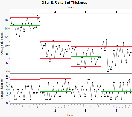
The result is a graph that shows how your process is doing overall. For each cavity and hour, Thickness measurements are plotted. Each cavity has its own set of control limits. This enables you to do easy comparisons across groups.
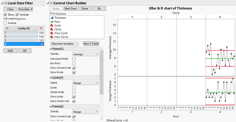
Suppose you are concerned only with Cavity 4. You think that Cavity 4 is not producing the results it should be. Rather than starting from scratch, you can add the Local Data Filter to the report. Click on the red triangle next to Control Chart Builder and select Local Data Filter. Select Cavity and click on +. Select 4.

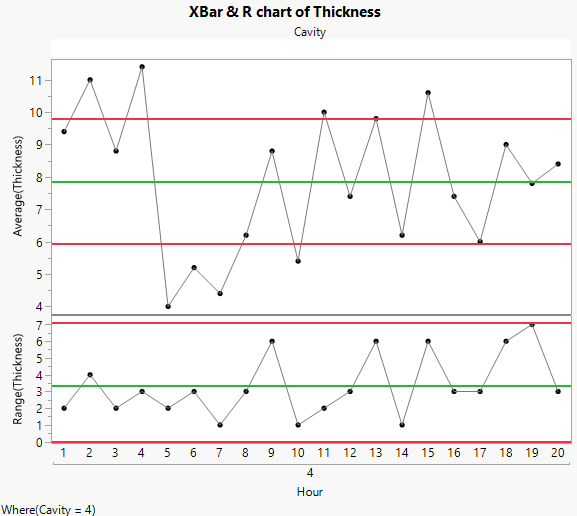
While this does give us what we want, the graph of interest is very small, and there is a lot of white space. To view only the data from Cavity 4 with no white space, from the red triangle next to Control Chart Builder, deselect “Show Excluded Region”.

This removes the white space from the graph. You get a cleaner look at the data from only Cavity 4 so that you can do further investigation.
Conclusion
“Show Excluded Region” shows or hides the region of the chart where samples have been excluded. This can be useful when you are using the Local Data Filter, as well as when there are excluded observations in your data. Use this option to remove white space from your graph.