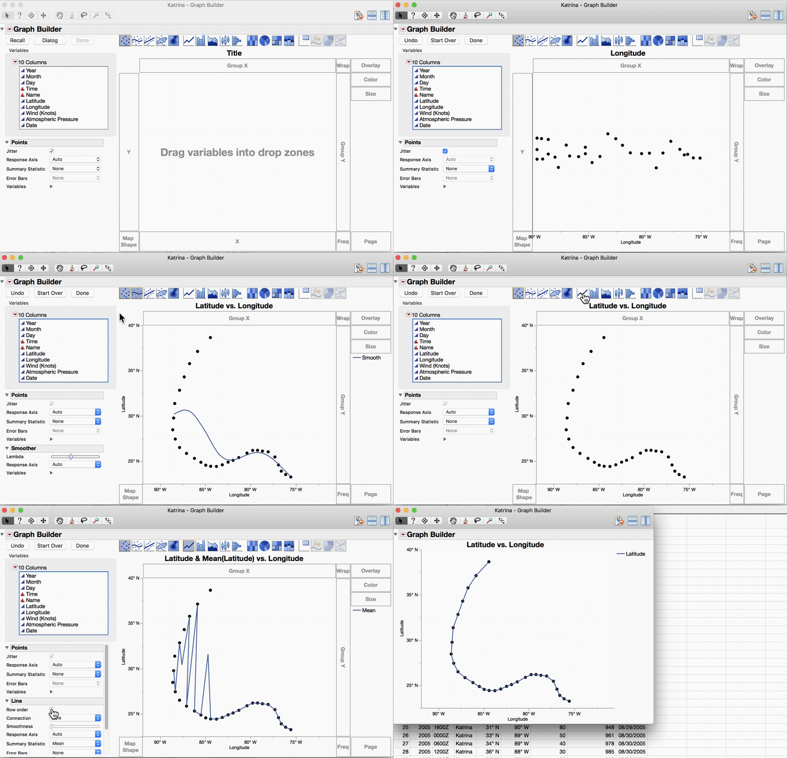
Plotting one symbol for each data value is a common graph technique with many variations and some variations have special names. This post includes animated GIFs showing how to make the five variations shown in these thumbnails.
1. Scatter Plot
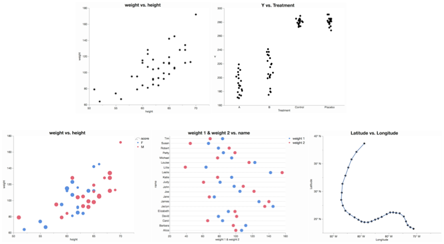
The classic scatter plot shows two continuous variables against each other. This is the default veiw in Graph Builder, and the only extra step is to turn off the default smoother.
2. Univariate Scatter Plot
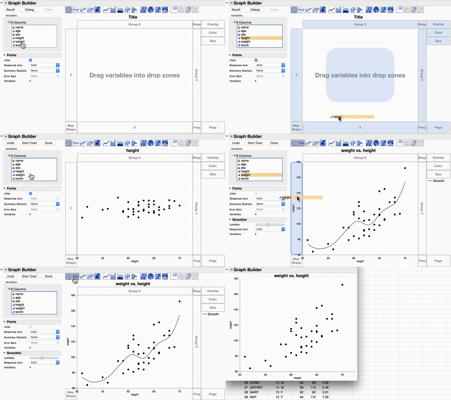
When there is only one continuous variable, looking at individual data points is still useful. Often there is random jitter added in the other (non-continuous) dimension to reduce overlapping points. Sometimes this is called a strip plot.
3. Bubble Plot
When the dots are sized by some other variable, the scatter plot is sometimes called a bubble plot. In Graph Builder, that means putting the third variable in the Size drop zone. The video also illustrates putting a variable in the color role, which could be done in the other scatter plots as well.
4. Dot Plot
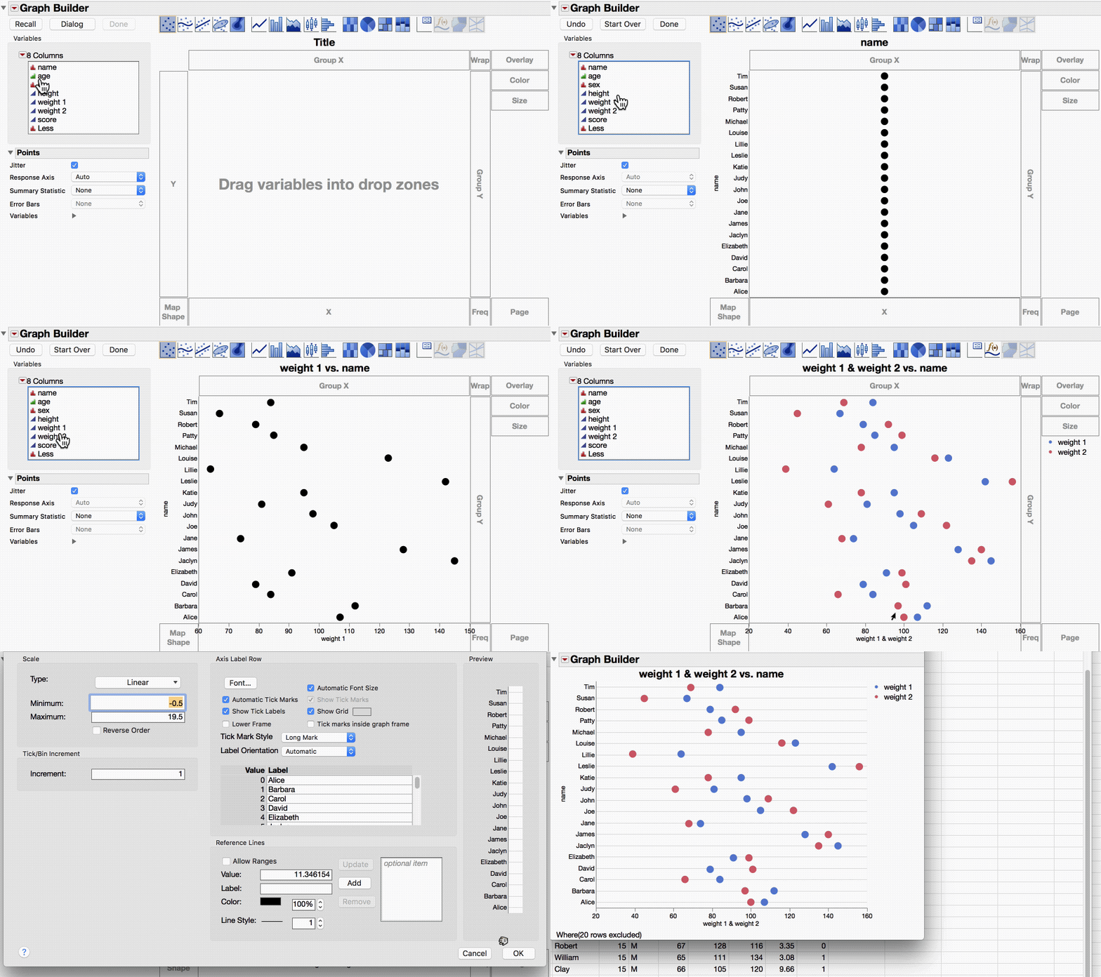
Out of context, dot plot can be ambiguous. Dot plot has a different meaning in a statistical setting where the Wilkinson dot plot is used to show data distributions. More broadly, a dot plot is a kind of scatter plot where each categorical value has one or two continuous values. In the video, I add one continuous variable and then a second one. I also turn on the gridlines for the categorical variable, which is also common for these kinds of dot plots.
5. Connected Scatter Plot
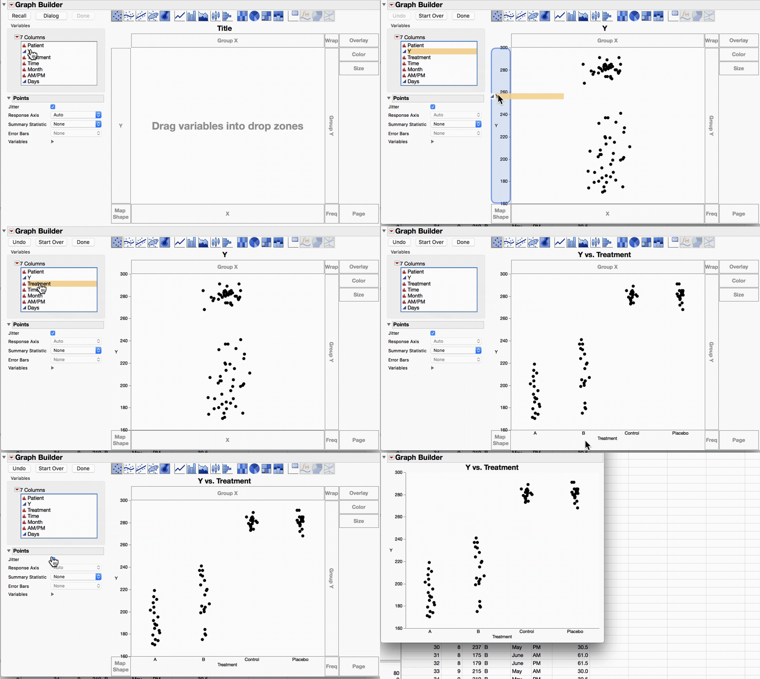
When there is a third continuous variable representing time, it can be informative to connect the dots of a scatter plot in that order. Here is the path of Hurricane Katrina. The trick is to turn on the Row Order option for the Line element.