Within Graph Builder, scatterplots, line charts and bar charts support four kinds of error bars, or you can add your own custom error bars. It's not a well-known feature, so I’m going to walk through the steps.
What Are Error Bars?
Error bars are graphical elements that represent uncertainty. There are many measures of uncertainty that can be represented, each with its own interpretation. Error bars can be useful to show:
- Context for a summary statistic.
- Degrees of overlap among uncertainty ranges.
- Inclusion of a particular value, such as if a parameter estimate's error bar contains 0.
Built-In Error Bars
When you make a summary chart in Graph Builder with points, bars or lines, there is an option in the Properties area for adding Error Bars in one of four ways:
- Range
- Standard Error
- Standard Deviation
- Confidence Interval
Choosing Confidence Interval uses the specified confidence level, which is 95% by default. Since there are many types of error bars, all error bar choices add a note to the bottom of the graph to indicate which option was chosen.
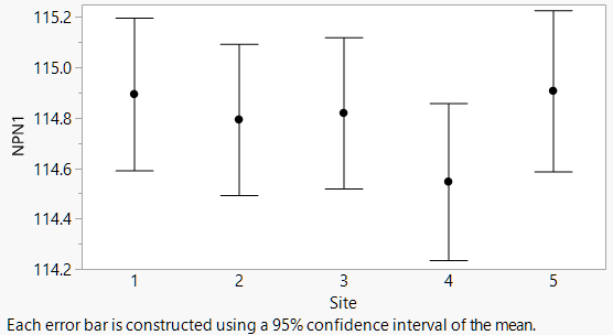
Custom Error Bars on Points
To make a dot chart with custom error bars, the trick is to think about it the other way around: Make a custom bar chart with points. The Bar element in Graph Builder has a style option for Interval bars. If you give it two variables, it draws an interval. If you give it three variables, it draws an interval with the first two and a circle with the third. Just what we want!
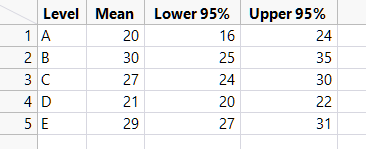
I'll demonstrate with this data table, which might have been produced by an analysis. You want a graph with error bars covering the Lower 95% and Upper 95% columns in the table.
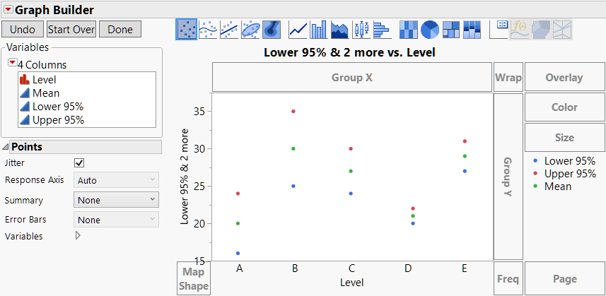
Open Graph Builder and put Term on the X axis and Lower 95%, Upper 95% and Mean on the common Y axis, in that order.
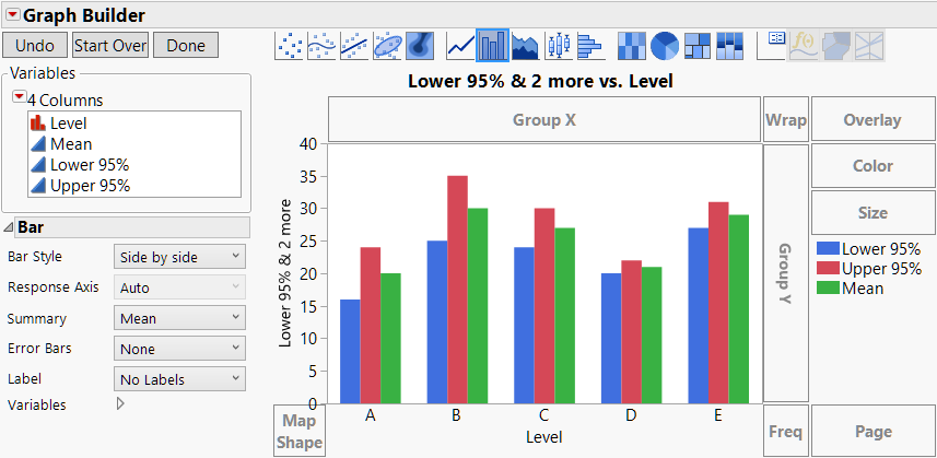
Choose the Bar element, and the default style is Side by Side.
In the Properties panel, change the Style option to Interval.
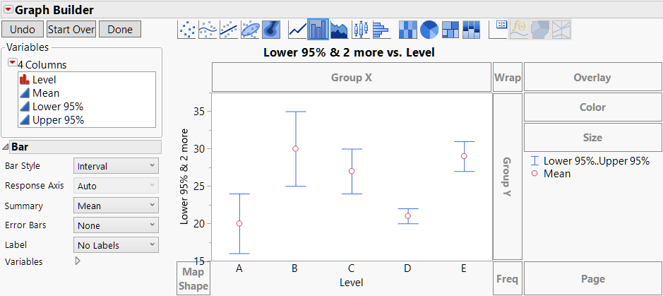
Then click Done, and customize the labels and styling as desired.
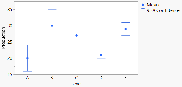
Custom Error Bars on Lines or Bars
The above technique is great for custom error bars with points, but what about with lines and bars? For those, you need to know two more things about Graph Builder:
- Multiple elements can be overlaid in the same graph.
- You can control which elements use which variables.
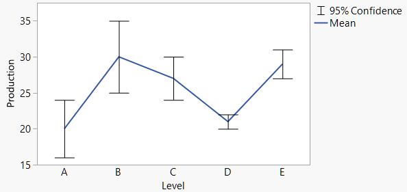
With that knowledge, the idea is to make a graph with both a Line element for the middle values and a Bar element in Interval mode for the interval bars.
The process starts from where we left off above. Next, click on the Line element and drag it into the graph to add lines without removing the interval bars. At this point, the Line element is showing all three variables, and so is the Bar element, which is only a starting point.
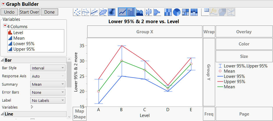
Go into the Variables section of the Line Properties and uncheck the Lower 95% and Upper 95% variables. Now the line only connects the middle values.

Go into the Variables section of the Bar Properties to uncheck the Mean variable to remove the circle.
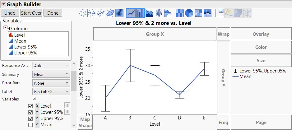
Click Done, and make styling changes in the legend (right-click or use the Legend Settings dialog) for color and line thickness.
Use the same sequence of steps for bars, dragging in the Bar element instead of the Line element at the start.
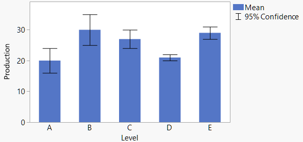
So, there you have it! Now you can make your error bars look just the way you want.