Here's a quick tour of many of the enhancements made to Graph Builder in JMP 15. Some of these will be explored in depth in upcoming blog posts.
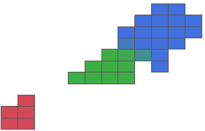 |
Heatmaps now support categorical coloring variables. It works best if all the values in a cell have the same category level. But blending can useful when there is some overlap, like the blue-green overlap in this heatmap of the familiar Iris data. |
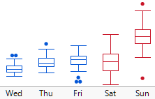 |
Previously, box plots could be colored individually. Now, they can be colored systematically with data by putting a variable in the Color role. Read more about box plots in color. |
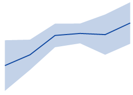 |
Shaded error intervals can be enabled directly in the Line and the Points elements, as an alternative of error bars, without the need to layer in a separate Area element. |
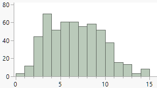 |
The Histogram element can show a choice of count or percentage on the response (or Y) axis. |
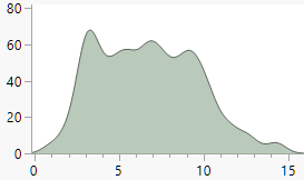 |
The Histogram element has three new drawing modes: frequency polygon, smooth kernel density (shown here) and shadowgram. |
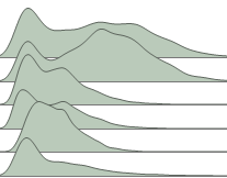 |
With many histograms in a single frame, the Histogram element has an overlap feature that can be used to create a "ridgeline" plot. |
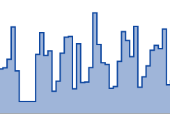 |
The Line and Area elements have had their options aligned to match each other. The Area element now has Line features like connection style (step is shown) and missing value treatment. The Line element now has Area features like stacking and filling. |
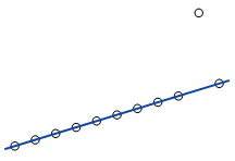 |
The Line of Fit element has a new mode called Robust Cauchy, which assumes the residuals follow a Cauchy distribution instead of a Gaussian distribution. As a result of the fatter tails of the Cauchy distribution, the fit is less affected by outliers. Here it is with the classic Anscombe quartet data. |
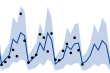 |
The Time Series analytics in JMP has been updated for JMP 15, and the basics are available in Graph Builder as another new mode for the Line of Fit element; this allows for seasonal fits with forecast regions. |
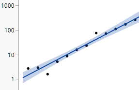 |
Line of Fit and other elements have an "Adapt to Axis Scale" option in their red triangle menus (also new!). This causes the fit to apply to the transformed (e.g., log) values instead of the raw values. It is on by default.
|
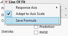 |
Several elements have a Save Formula command that will create a new column in the table with the results formula. For elements like Bar that summarize by category, this command enables you to extract the actual results of those summaries as formulas.
|
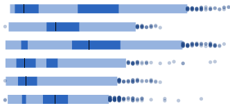 |
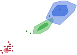
Univariate density contours can be shown as Highest Density Region (HDR) plots in addition to violin plots. HDR shows the 50% and 99% density levels plus the mode and outliers. As a result, it combines the quick overview of a box plot with the multimodality detection of a violin plot.
|
 |
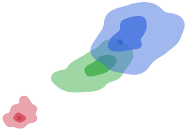
Bivariate density contours can be shown as "bag plots," meant to be an extension of box plots into two dimensions. The darker area shows the innermost 50% of the data. The lighter fill is equivalent to the tails or fenced region of a box plot.
|
 |
Bivariate density contours can be shown as 2-D HDR plots, useful for quick comparison of possibly-irregular bivariate distributions. The darker area shows the region with the highest density for 50% of the data, and the lighter area shows the 99% region. The regions need not be contiguous for bimodal data.
|
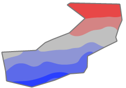 |
The contour element provides a choice of showing lines, fills or both for the contours, and a choice of showing the outer boundary line. And the outer boundary is no longer restricted to being convex by using alpha shapes (as shown here). Read more about contour plots.
|
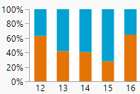 |
For summarizing elements, such as bar charts, the single summary statistic for percent has been replaced with three more specific options to control the basis for the percent calculations. This is useful when you have multiple Xs and Ys and overlay levels. And this makes it easier to construct 100% stacked bars.
|
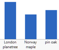 |
Axis tick labels can now wrap over multiple lines. This axis feature is available in all JMP graphs, not just those within Graph Builder. This is a great way to avoid having rotated text.
|