JMP 15 adds new ways to control box plot colors and sizes. The color role is now fully supported in Graph Builder, giving you the ability to create more expressive box plots. Color provides additional visual information to guide the data exploration process.
The only way to add color to a box plot in JMP 14 was to use the Customize… option from the right-click context menu on the graph.
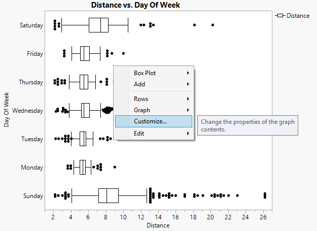 Customize Context Menu
The Customize Graph dialog contains an entry for each box and outlier in the graph. The line color and several other properties can be set as shown below. This process works well for highlighting a single box or a small set of boxes but can be tedious if there are lots of boxes. Also, mapping values to a continuous gradient is difficult, and if the data changes, the customizations can be incorrect or, in some cases, completely lost.
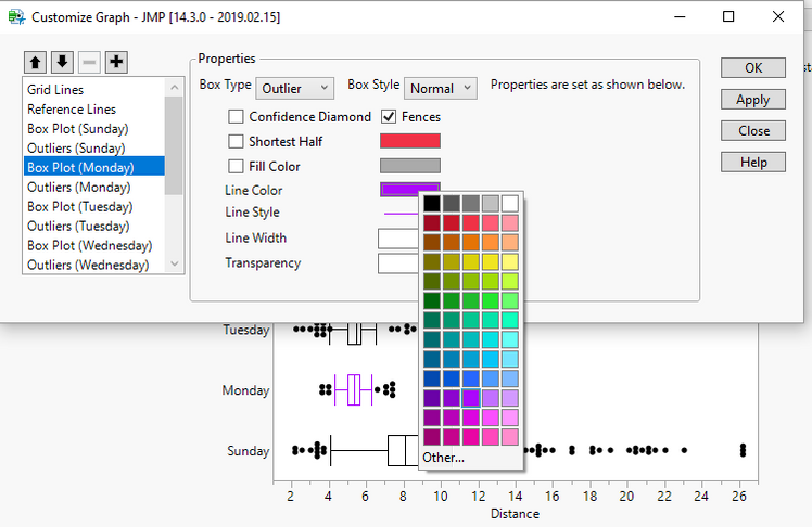 Customize Box Plot Line Color
JMP 15
With JMP 15, the Graph Builder box plot now supports the color role for both continuous and categorical variables. I downloaded some of my personal workout data to show off the new features.
The data includes information about when I exercised, the distance, pace, heart rate and weather. Here is a quick sample: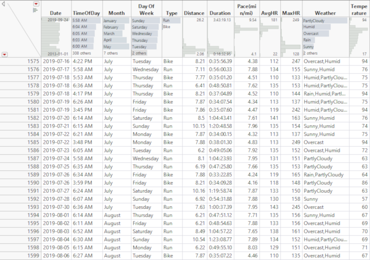 Exercise Data
Continuous Color
In this first example below, the box plot is showing the Distance by the Day of Week for my Run activities. It shows, as I would have expected, that Sunday is typically when I do my longer runs. By adding Pace as the color, some other relationships are also visible. My longer Sunday runs are also my slowest. Monday tends to be a slower day as well probably because I’m still tired from Sunday. My fastest day is typically Thursday, which is usually when I will try to do some speed work.
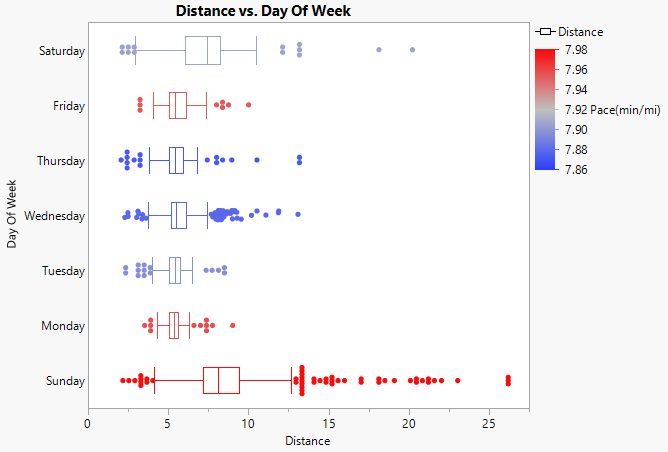 Distance by Day of Week with Pace as ColorIn the example above, the Pace(min/mi) variable is summarized using Median. The statistic could be changed by selecting any of the standard JMP summary statistics from the Summary Statistic item in the right-click context menu on the color role.
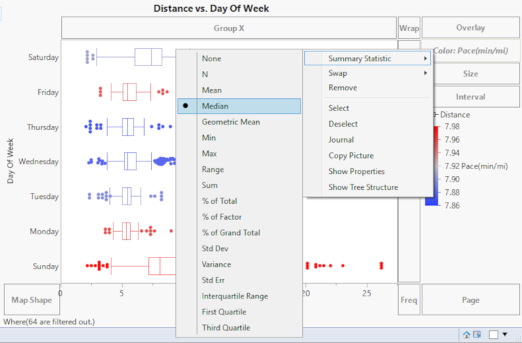 Selecting Summary Statistic for Color
Categorical Color
The color variable can also be categorical. One way this can be useful is for identifying boxes in a busy graph. Consider the example below from JMP 14. In this case, we are looking at Distance again, but now there is additional nesting on the y-axis by Month and by Day of Week.
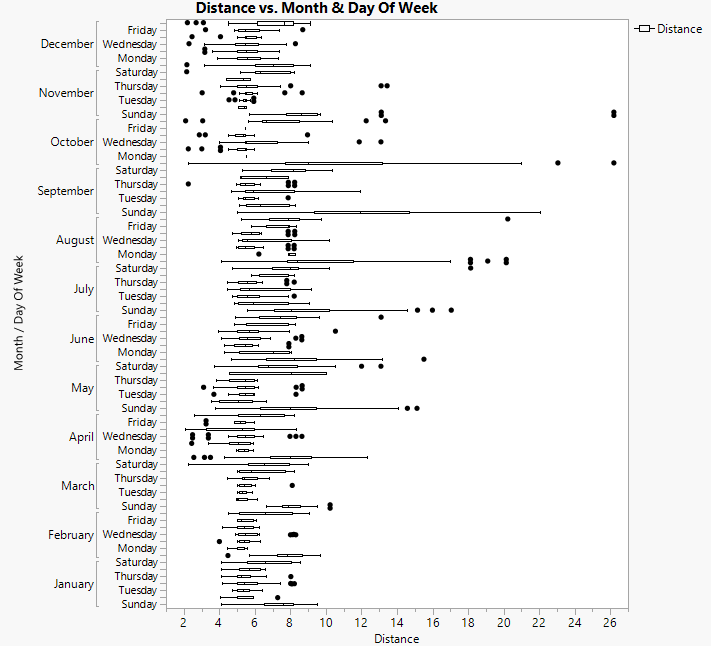 Nested Box Plot without Color
Matching a box up with the appropriate Day of Week is challenging because there are so many boxes and the axis is thinned. Your eye must try to create a straight line from the box back to the axis to determine the Day of Week and then the Month.
By adding Day of Week to the color variable in JMP 15, it is now very easy to identify which day the box represents. It also makes it much easier to compare the same Day of Week across the months because we can focus on a single color and don’t have to go back to the axis for reference. For example, by knowing that Sunday is blue, and that the Months are in order from bottom to top, it’s easy to identify and compare the Sunday in June to the Sunday in July without looking at the axis simply by locating the sixth and seventh blue boxes.
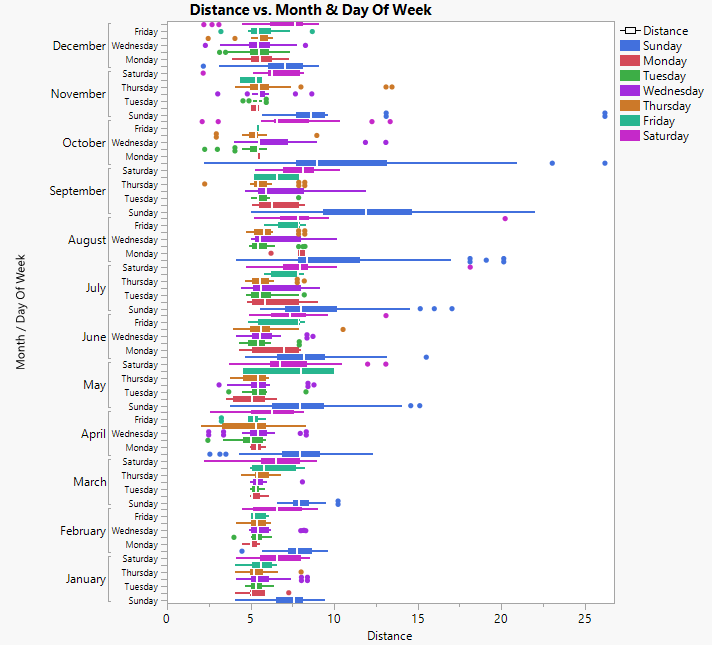 Box Plot with Categorical Color
Box Width
In addition to color, the width of the boxes is now adjustable. A new option on the box plot called Width Proportion specifies the width of the box relative to the available width. By default, the option is set to 0, which means that the automatic (pre-JMP 15) width will be used. To change that, you can specify a value between 0 and 1.
Here is an example with very thin boxes with the Width Proportion equal to 0.1.
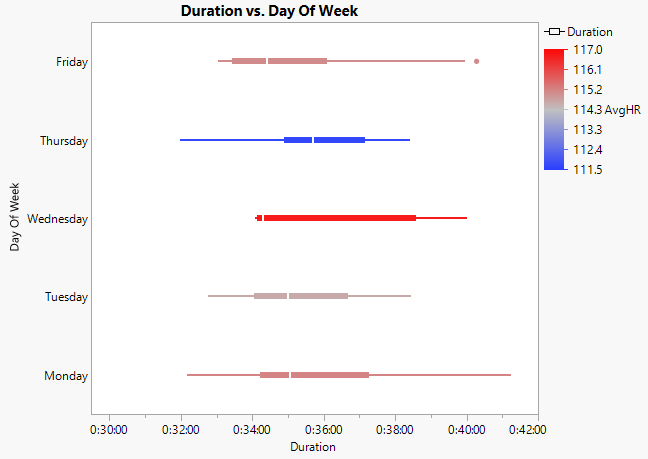 Width Proportion set to 0.1
Alternatively, for very large boxes with almost no space, the Width Proportion is set to 0.95.
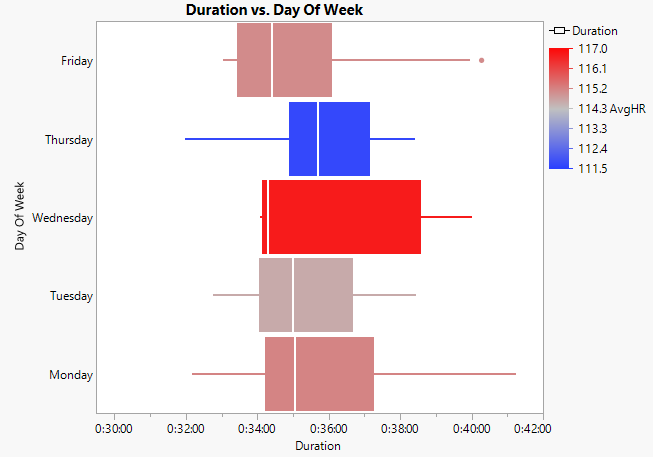 Width Proportion set to 0.95
This is simply an aesthetic change, but it is useful if you are trying to achieve a certain “look” for your box plots.
Summary
This has been a quick look at some new features in JMP 15 for box plots. There are lots of new features in Graph Builder that will be the subject of additional blog posts. Let us know what you think of JMP 15!
You must be a registered user to add a comment. If you've already registered, sign in. Otherwise, register and sign in.