- New to JMP? Let the Data Analysis Director guide you through selecting an analysis task, an analysis goal, and a data type. Available now in the JMP Marketplace!
- See how to install JMP Marketplace extensions to customize and enhance JMP.
JMPer Cable
A technical blog for JMP users of all levels, full of how-to's, tips and tricks, and detailed information on JMP features- JMP User Community
- :
- Blogs
- :
- JMPer Cable
- :
- Graph Builder contour plots in JMP 15
- Subscribe to RSS Feed
- Mark as New
- Mark as Read
- Bookmark
- Subscribe
- Printer Friendly Page
- Report Inappropriate Content
In a recent post, @XanGregg gave an overview of the changes for Graph Builder in JMP 15. Several of the updates are related to the contour element, so I thought it would be a good time to take a more in-depth look at the features of the contour element, new and old.
Contour plots are a common technique for visualizing functional data. Contours may take on different names for the various functions that they represent -- isotherms for curves of constant temperature, isobars for curves of constant pressure, and many more.
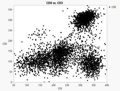
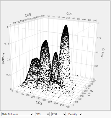
When data is collected or measured at discrete locations, it can be a challenge to make observations from the points themselves. In the examples below, consider a density function computed from the set of points. The density values could be mapped to color in a 2D plot, or a third axis for a 3D view, but these solutions do not really make it easier to answer some questions about the function. For example, where do the maxima / minima occur? Where is the function changing faster or slower? Contour plots are often shown using a series of curves computed for different isolevels. As shown in the lower-right image, the curves will be closer together at regions of high gradient, and farther apart at areas of low gradient.
 |
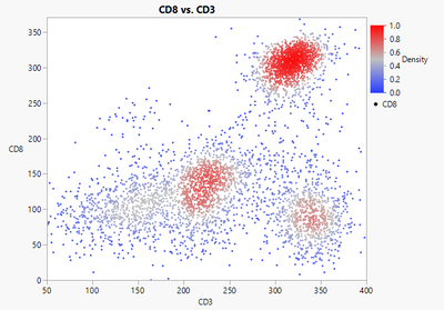 |
| Scatterplot of data | Scatterplot with density function shown by color |
 |
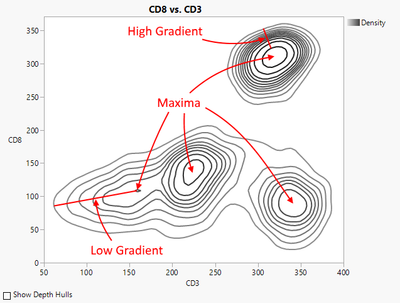 |
| 3D Scatterplot with density as function of two variables | Contour plot of density function |
In JMP, contours are used in several platforms, including Bivariate, Contour Plot, Contour Profiler, Graph Builder, and others. The Graph Builder contour element has several new features in JMP 15, including new display options as well as new contour techniques. This blog post includes a grand tour of the six different forms of contours that are available, comparing their use for different situations.
Contours in 1D
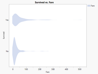
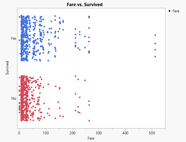
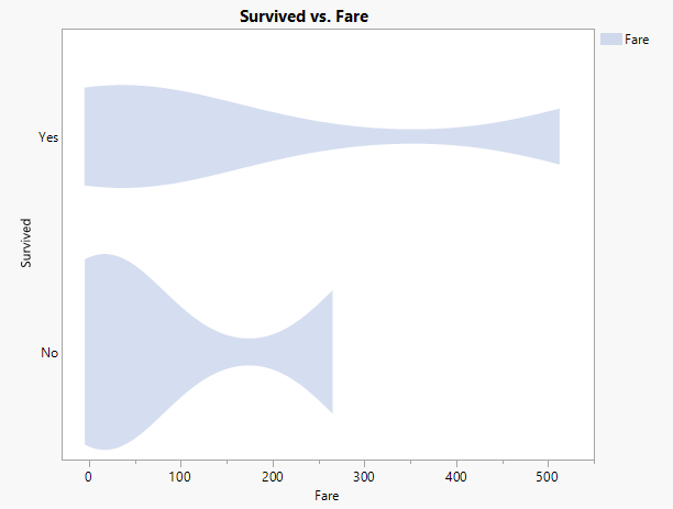
The scatterplot is a direct way to visualize continuous data and is often the default way to get a visual representation of continuous data. When the points are very dense, it becomes difficult to characterize the distribution of the points, and especially to make comparisons between multiple groups. In this example using the Titanic sample data in JMP, the fares paid by the survivors of the tragedy are compared to the fares paid by those that perished. Some observations can be made from the scatterplots, such as that the outliers in the survivor group paid roughly twice what the others (in either group) paid.
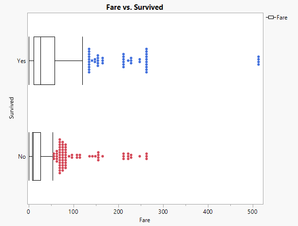
To compare these two groups further, some additional analysis is necessary to characterize the groups. One widely used technique for summarizing 1D data is the boxplot, shown below. Boxplots will be useful for comparison with the new contour techniques. There are several variations on the visual representation for a boxplot, but they are all based on quartiles. The box extends from the first quartile to the third quartile, so it contains 50% of the observations. A line is drawn at the median, giving additional detail. There are several variations on how to draw the whiskers – in this example they extend to the outermost point that lies within 1.5x the interquartile range from the box. Observations outside of this region are optionally shown as outliers.
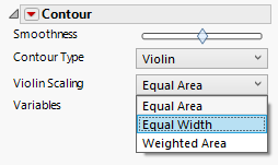
The Graph Builder Contour element uses a probability density function for a given kernel bandwidth to illustrate the shape of a 1D point distribution. The default view for 1D contours is the Violin plot, which plots the density function with symmetry about the axis. The magnitude of the curves is determined by a scaling option, with options for Equal Area, Equal Width, or Weighted Area. The different scaling options are helpful for comparing the functions in different ways. For example, Equal Width may be useful if your primary need is to compare the locations of the maximum densities for each population. Weighted Area scaling would be the best option if you want the relative areas of the contours to reflect the population sample sizes.
 |
 |
New in JMP 15 is the ability to control the kernel bandwidth via a smoothness parameter. The parameter a normalized value from [-1,1], with the default value of 0 leading to a default computed bandwidth based on the data characteristics. Negative smoothness values result in less smoothing, and positive smoothness values result in more smoothing, within computed limits.
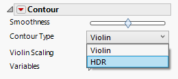
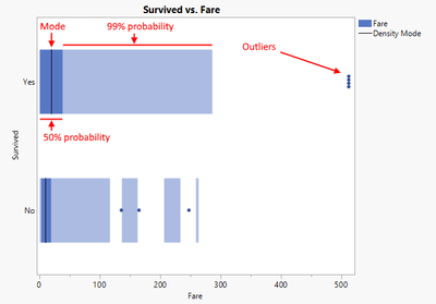
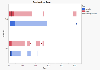
Also new in JMP 15 is a the HDR (Highest Density Region) plot, a new option for 1D contours. The HDR plot uses the same density function as the violin, but applies concepts similar to the boxplot to reduce the display to a few quantitative measures. A black line is drawn at the maximum point in the density function, and dark rectangles are drawn to represent the 50% highest cumulative probability. Lighter rectangles are drawn to represent the 99% cumulative probability, and any points outside of the 99% probability are considered outliers. The same smoothness parameter is available for the HDR plot and Violin plot.
 |
 |
The fill color or line color can be change from the legend, and colors are also used when adding columns to the Overlay or Color roles. The X Grouping and Y Grouping roles provide additional layout possibilities.
 |
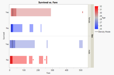 |
One distinction between box plots and HDR plots is that the 50% and 99% probability regions in an HDR plot are not necessarily continuous. When the underlying data is not unimodal, this can give a better picture of the distribution of the data. Compared to the Violin representation, the mode lines and outliers give a more quantitative, but summarized, presentation of the underlying density function.
Contours in 2D
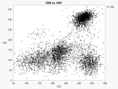
Scatterplots for two continuous variables have some of the same disadvantages as scatterplots in 1D. When the data is dense, it can be difficult to make observations about the distribution of the points. One common practice is to use transparency for the points in a 2D scatterplot. The regions with the most overstriking will appear darker in the resulting plot.
 |
 |
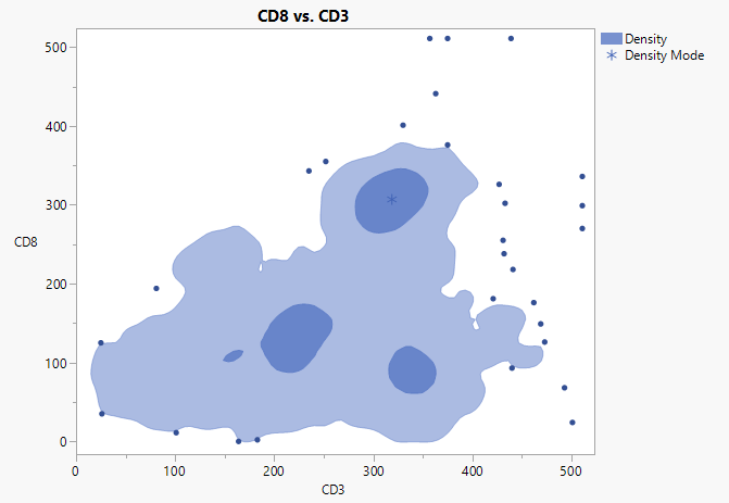
2D Density contours
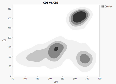
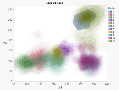
The Graph Builder contour element uses a bivariate nonparametric density function to extract density contours and directly display regions of various densities. On the left is the default view using four levels, with a darker color at high density fading to white at lower densities, in addition to transparency that fades the contours at low density. Transparency is very useful for contours when used with the Overlay role. In the image on the right, the K Means Cluster platform was used to segment the data into 11 groups based on four factors. The transparent contours show the overlap of these groups for two of the four factors.
 |
 |
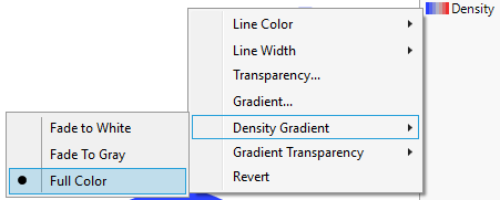
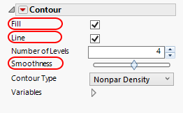
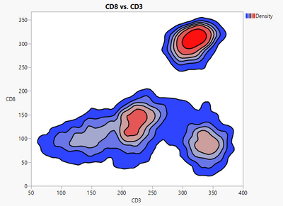
In JMP 15, Graph Builder adds several new options and styling attributes for 2D density contours, including line/fill options (from the property panel), density gradient and transparency gradient options (from the legend), and smoothness. As in the 1D case, there is a single normalized smoothness parameter ranging from [-1,1]. The default values of 0 represents a default kernel bandwidth in each dimension, negative values decrease the smoothing, and positive values increase the smoothing.
  |
 |
2D HDR contours
The concepts of HDR (Highest Density Region) plots for 2D density functions are directly analogous to the 1D case. Using the 2D bivariate density function, a marker (*) is drawn at the point of highest probability, a dark contour is drawn for the area of 50% cumulative probability, and a lighter contour is drawn at 99% cumulative probability. Points outside of the 99% region are optionally shown as outliers.
2D Bagplot
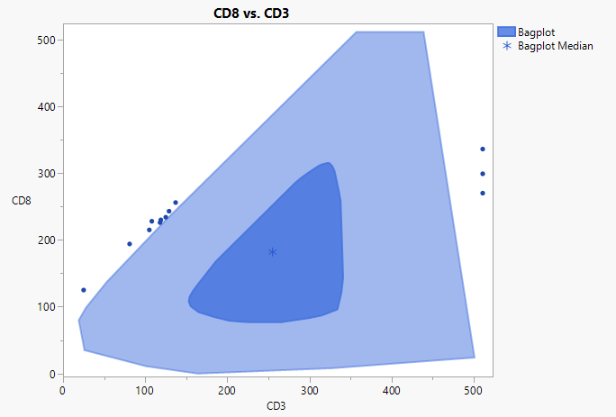
Another new representation in JMP 15 is the Bagplot. The Bagplot was designed as a 2D analog to the 1D Box Plot. In 2D the “order” of the points does not have a clear definition. The Bagplot was designed based on Tukey's location depth (Tukey 1975), which determines an integer depth value for each point, which results in a natural nesting of depth hulls from the outer convex hull (depth 0) to the inner hull at maximum depth.
Given these concepts, the bagplot consists of four elements. A marker (*) is shown at the median of the highest depth points. The two depth hulls that separate the points in half are interpolated to determine a 50% probability region, which is shown in the dark color. This is referred to as the bag. The bag is inflated by 3x relative to the median to determine the loop, which is not shown. The convex hull of all points inside the loop is shown in a lighter color and is called the fence. All points outside the loop are considered outliers.
The bagplot is a very close 2D analog of the 1D box plot, and similar distinctions can be made when comparing the bag plot to the 2D HDR plot. The bagplot is better suited to summarizing the distribution of unimodal data, while the 2D HDR plot has an advantage when giving a summary view of multimodal data.
Value Contours
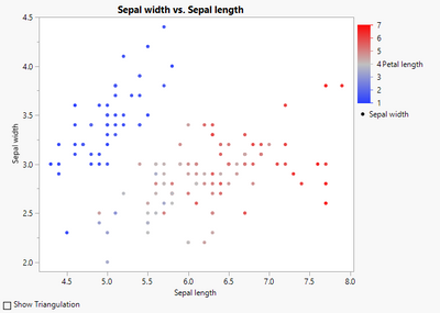
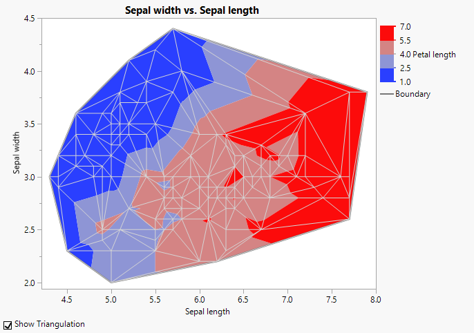
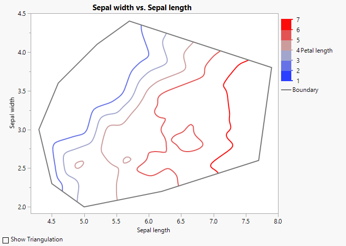
When an additional color role is specified in addition to two continuous columns for X and Y, the Graph Builder contour element shows value contours, like the Contour Plot platform.
 |
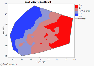 |
Contours in this case are computed using a piecewise linear interpolation of the input data based on a Delaunay triangulation. The triangulation is not shown within the Graph Builder platform – in the example below the triangulation was added via JSL.
JMP 15 adds new options for showing the boundary, filled contours, and line contours. For value contours, smoothing is done by interpolating the triangular data to a fixed grid and applying gaussian smoothing to the grid. The smoothed contours are then clipped to the boundary of the triangulation.
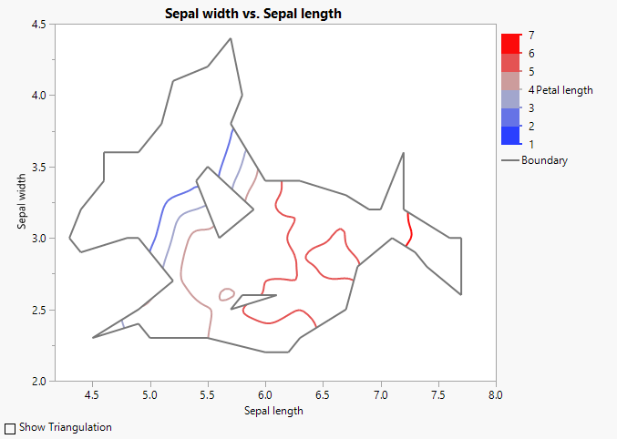
A Delaunay triangulation always results in a convex region. If the points are not uniformly distributed, this can lead to interpolation between points that are spread over large areas. The Alpha Shape is a subset of the Delaunay triangulation that filters triangles that are very large or very long and skinny. The filter looks at the radius of the circumscribing circle for each triangle, removing those that are larger than some limit. The resulting subset could have holes or multiple components.
Summary
The new HDR methods provide a quantitative view of density-based contours for both one and two continuous variables. All Graph Builder density contours now support a smoothing parameter, and the bagplot extends boxplot concepts to 2D. Alpha shapes control the shape of the domain for triangulation-based contours. All of the contour types have new controls for drawing lines or filled contours, and 2D density contours also have additional control of the color palette and transparency.
If you would like to reproduce these plots in JMP 15, download the file JMP15Contour.jmpapp from recent JMP Discovery talk in Tucson and it will launch the data that you can experiment with:
References
H. Edelsbrunner, D. Kirkpatrick, R. Seidel, On the shape of a set of points in the plane, IEEE Transactions on Information Theory, Vol. 29, Issue 4 (July 1983), 551-559.
Rob J. Hyndman, Computing and Graphing Highest Density Regions, The American Statistician, Vol. 50, No. 2 (May 1996), 120-126.
Peter J. Rousseeux, Ida Ruts, John W. Tukey, The Bagplot: A Bivariate Boxplot, The American Statistician, Vol. 53 (1999), 382-387.
J.W. Tukey, Mathematics and the Picturing of Data, Proceedings of the International Congress of Mathematicians, Vancouver, 1975, 523-531.
- © 2026 JMP Statistical Discovery LLC. All Rights Reserved.
- Terms of Use
- Privacy Statement
- Contact Us

You must be a registered user to add a comment. If you've already registered, sign in. Otherwise, register and sign in.