JMPer Cable
A technical blog for JMP users of all levels, full of how-to's, tips and tricks, and detailed information on JMP features- JMP User Community
- :
- Blogs
- :
- JMPer Cable
- :
- Getting high-quality graphics out of JMP
- Subscribe to RSS Feed
- Mark as New
- Mark as Read
- Bookmark
- Subscribe
- Printer Friendly Page
- Report Inappropriate Content
Welcome to the second of two posts on creating publication-quality data visualizations in JMP. This post focuses on getting graphs out of JMP as high-quality images. If you’re interested in how to customize your graph’s appearance to get it looking just right, check out the previous post.
As in that post, I’ll work with a customized line graph constructed from the Corn Wheat Soybean Production sample data in the Sample Data Library. This graph was made in Graph Builder, but everything I discuss here applies equally well to graphs produced by JMP’s analysis platforms. Getting graphs out of analysis reports does introduce one special consideration with respect to exporting image files, which I’ll call out when relevant.
Avoid screenshots
Imagine you’ve got your line graph looking just how you like it, and it’s time to put it into a slide deck you’re working on. The first instinct is to take a screenshot, mainly because it’s easy and familiar. This produces an image file (let’s say a PNG file) that you drop into your deck. After resizing the image to fill the slide, this is what you get:
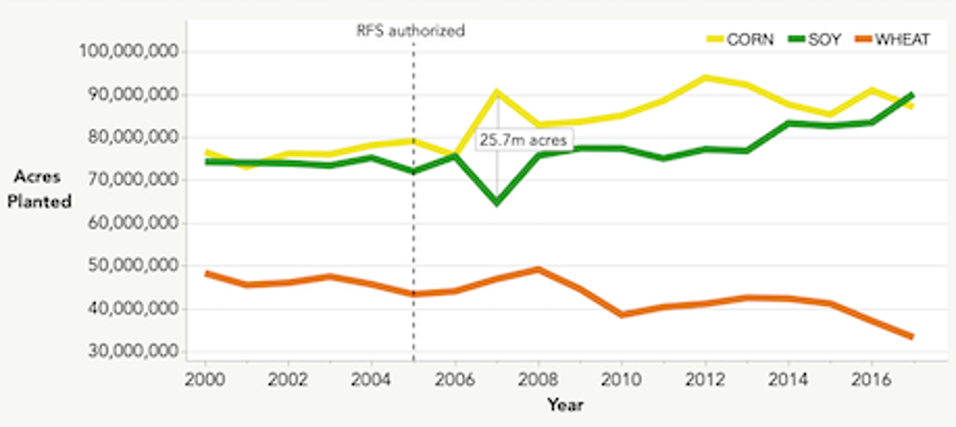
Eeesh. We’ve all seen this kind of blurry image fail before and maybe even have perpetrated one ourselves. (I’m certainly not innocent here.) This image is pixelated due to the combination of the screenshot’s image format and the resizing. Screenshots are typically captured as raster graphics, which include the common PNG, JPG and BMP formats. Raster graphics represent images as grids of pixels, and therein lies the problem. When an image is resized to occupy more pixels than the file specifies, the result is a blurry image like the one above.
To avoid pixelation, the graph needs to be captured as a vector graphic. Vector graphics represent images as collections of objects like points, lines and curves instead of as pixels. Because of this, they can be resized infinitely without pixelation; the objects are simply drawn to fill however many pixels they need to. JMP can produce vector graphics in a number of common formats listed below, and vector graphics should be used whenever possible.
Check out this video that compares resizing raster versus vector graphics. The difference is clear. (Bad pun, I know. You’re welcome.)
Getting vector graphics out of JMP
Let’s look at two ways to get vector graphics out of JMP. For a standalone image file, use JMP’s export functionality to export a vector graphic. To put a graph directly into a document or slide, use copy and “paste special” to paste a vector graphic.
Exporting to an image file
Going to File > Export reveals the option to export a stand-alone image file (among other export types) of the current JMP window, with a drop-down menu of the file type options. Vector formats available in JMP include PDF, SVG, EPS and EMF (Windows only).
When exporting a Graph Builder graph, click the Done button before exporting to ensure the element ribbon isn’t included in the image. After that, it’s as simple as going to File > Export and choosing a vector format.
When exporting graphs in analysis reports with multiple sections, File > Export will create an image containing all open sections in the report, along with their section titles. One option to get only the desired graph is to close any unwanted report sections using the little gray triangles and to delete the section titles of any open sections, and then export the window. Take a look at the Oneway Analysis report below. If I’d like to export just the graph at the top, but I leave all the other report sections open, the resulting image includes the entire report:
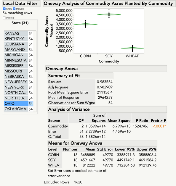
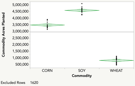
Ultimately, it might be preferable not to muck with an analysis report just to export one of its graphs. As an alternative, you can use the selection tool to highlight whatever you want to export, send the selection to a journal, and then export the journal. It’s efficient and foolproof. Here’s a quick demo.
Alongside the image export options under File > Export, there are also options to export to PowerPoint or Word. These options will place all open report sections as vector graphics (and editable tables, for any report tables) directly into a PowerPoint deck or Word document. This feature provides a nice option for getting all report content directly into a slide or document. But if you’re trying to get just one graph out of JMP and into an existing slide or document, copy-paste is a more straightforward way to go. Speaking of which...
Copy and ‘paste special’
To drop a graph directly into a document or slide – no image file needed – you can copy and “paste special” in a vector format. Standard paste options typically use raster graphics, so using the paste special command is a must. Copying a graph and its legend is as simple as right-clicking in the graph area and selecting Edit > Copy Graph. From there, select the paste special option in whatever word processor or slide editor you’re using to view a list of available graphic formats in which to paste the image. Simply select an available vector format and the image will be dropped into your document or slide.
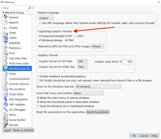
The formats that JMP makes available when copying a graph are set in JMP’s Windows Specific or Mac Specific preferences groups. When copying a graph in JMP, JMP places all the formats specified in those preferences onto the operating system’s clipboard; using paste special tells the application on the receiving end to allow you to select among the formats that are both available on the clipboard and compatible with the receiving application. If a format you’ve chosen in JMP for inclusion on the clipboard is not included in the receiving app’s paste special options’ format list, it’s a safe bet that the format isn’t compatible with the receiving app.
On Mac, PDF is a good option and is always included on the clipboard. On Windows, EMF is a good option; it is enabled by default, but if it doesn’t appear as an option under paste special, make sure that enhanced metafile is checked in the Windows Specific preferences (see below).
But what if I have to use raster graphics?
Occasionally, using a vector graphic may not be possible. A journal may accept image submissions only in PNG or JPG formats, for example. There are a couple options here. First, Windows users can set the DPI (dots per inch) for exported graphics. Larger DPI values produce higher-resolution graphics. Mac users might consider another route: export a vector graphic, open it in Preview, and then export the graphic in a raster format while upping the pixels per inch setting as needed. It’s possible to take a similar approach in Windows, albeit with something other than Mac’s Preview application. This approach has the benefit of producing a vector graphic as the “main” graphic file for possible future use, while also producing the high-resolution raster graphic needed at the moment.
One more thing: Transparent backgrounds
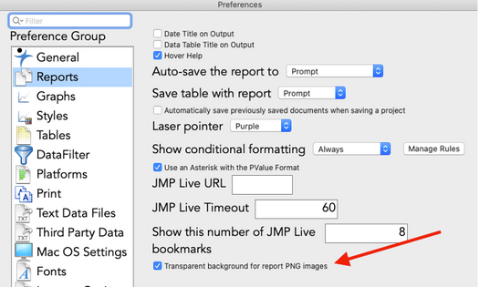
Whether exporting or copy-pasting, you may not want JMP’s default cream background color included in your graph. To get a transparent background, go to the Preferences, select the Reports group on the left, and then check the transparent background option at the bottom of the list. Now all the graphs you get out of JMP will not include a filled background surrounding the graph area. Check out the graphs in the next section to see the result.
An added benefit of vector graphics: Infinite customization
As discussed in the previous post, JMP’s graph customization options are extensive. But sometimes there may be a fine-grained change that can’t be achieved in JMP. For example, maybe you’d like to move the “RFS authorized” reference line label a little further down in the graph area but the option isn’t available in JMP. Luckily, vector graphics can be edited outside of JMP using any vector graphics editor. I’ve used the freely available Inkscape to edit my graph, but many other vector graphics editors are out there. (This is not an official Inkscape endorsement.) In the two graphs below, the first one was produced exclusively in JMP and the second graph was produced after further editing in Inkscape. See if you can spot all the differences between them. There are a handful in addition to the position of the “RFS authorized” label.
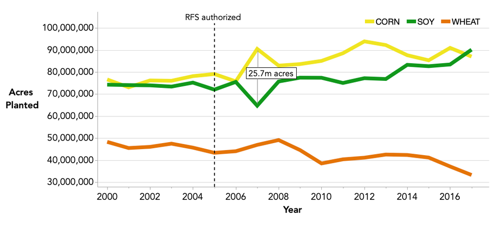
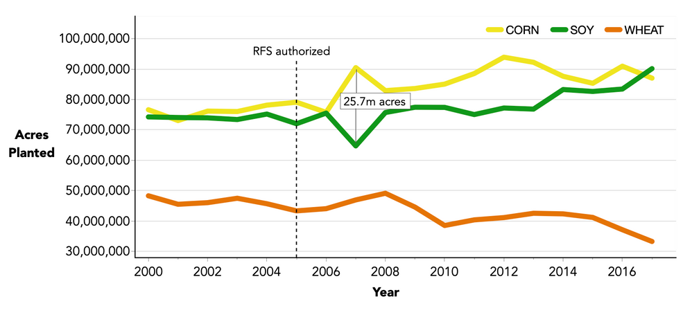
Give up? Or maybe you just never liked playing Spot the Difference. I also moved both axis titles slightly, lightened the box around “27.5m acres,” darkened the left and bottom borders, and rounded off the ends of the colored lines in both the graph and the legend. These differences might seem minute, and that’s the point: extremely fine-grained customization is possible when working with a vector graphic editor, so you can get your graph looking exactly how you like.
If using Windows (sorry, Mac users), you can even edit your vector graphic right inside PowerPoint or Word. It’s as simple as pasting a vector graphic, selecting the Edit Picture and Ungroup options to break out all the individual objects in the graphic, and then using the built-in shape and text editing tools. The video below presents a quick example.
Getting high-quality graphics out of JMP
It’s easy to ensure your JMP graphs look their best in your presentations and publications: set the transparent backgrounds preference; export or copy-paste in vector graphics formats like EMF or PDF; if necessary, fine-tune your graphs outside of JMP as needed with a vector graphics editor. By combining these best practices with JMP’s outstanding graphing capabilities and myriad graph customization options, your graphs are bound to impress.
Thanks for reading. Now get to it.
You must be a registered user to add a comment. If you've already registered, sign in. Otherwise, register and sign in.
- © 2026 JMP Statistical Discovery LLC. All Rights Reserved.
- Terms of Use
- Privacy Statement
- Contact Us
