JMPer Cable
A technical blog for JMP users of all levels, full of how-to's, tips and tricks, and detailed information on JMP features- JMP User Community
- :
- Blogs
- :
- JMPer Cable
- :
- Customizing JMP graphs
- Subscribe to RSS Feed
- Mark as New
- Mark as Read
- Bookmark
- Subscribe
- Printer Friendly Page
- Report Inappropriate Content
JMP is a powerful data visualization tool, helping you visually explore and understand your data, as well as enabling you to effectively communicate your findings to others. For the most important reports and presentations, JMP graphs need to look great: customized and presented in high resolution.
This is the first of two blog posts on creating publication-quality graphs in JMP. The focus in this post is on customizing a graph’s appearance to meet specific aesthetic or technical needs; the second post covers getting graphics out of JMP in high-quality image formats.
Note that I’m not going to cover the specifics of making graphs in Graph Builder here. That’s a topic worthy of separate treatment and is covered extensively elsewhere (for example, in this Mastering JMP webinar). Instead, I’m going to focus on customizing a graph’s appearance beyond the default settings applied by JMP, whether in Graph Builder or an analysis platform. I won’t cover every possible customization option, of course, but I will highlight some of the most useful ones. And while the example is taken from Graph Builder, the discussion also applies to graphs produced in analysis reports.
JMP’s graphs may be more customizable than you think
Graphs throughout JMP are highly customizable. Each graph is produced according to default settings (a number of which are themselves customizable in the Preferences), but many customization options are available to help you get the graph looking just how you want it.
Consider the line graph below, which was made in Graph Builder from the Corn Wheat Soybean Production sample data in the Sample Data Library. It shows acres planted across time for three U.S. crops, with a reference line and annotation to show the authorization of the Renewable Fuel Standard (RFS) program in 2005. Two years later, there is a 25.7 million acre difference between corn and soy that many have attributed to increased ethanol demand triggered by the RFS program.
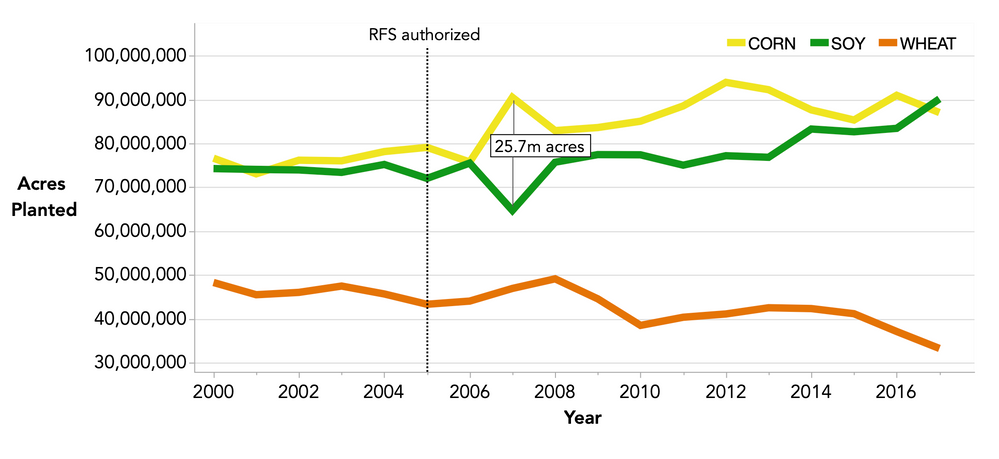
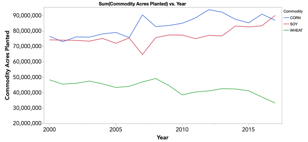
This graph has had a number of customizations to get it looking like this. It began as the graph below, produced by Graph Builder’s default settings. Both graphs show the same trends, but the customized version above better communicates the message. For example, the line colors align conceptually to the crops (e.g., yellow for corn, amber for wheat), the reference line indicates the timing of the RFS authorization, and an annotation makes explicit the size of the corn-soy difference in 2007. The customized graph arguably looks a little better aesthetically, thanks to increased line weights, the addition of horizontal grid lines and the placement of the legend inside the graph area. All these customizations – and many more – are possible in JMP.
Customizing the graph elements and area
Each of JMP’s graphs contains one or more elements (lines, points, bars, etc.) that populate the graph. In Graph Builder, many element properties are set with the properties areas on the left side of the Graph Builder window. However, these element properties specify what the elements represent (e.g., Should the line represent the mean or the sum?) rather than how the elements should look (e.g., What color should the lines be?). The latter options are available by right-clicking inside the graph and choosing Customize. By doing so, the Customize Graph window is displayed, listing each element and, upon selection, that element’s customization options.
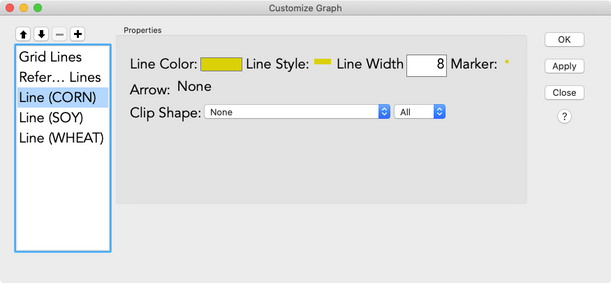
Below I’ve selected the corn crop’s line element and set its color to yellow and width to eight. Note that the ordering of elements in the left list dictates the order in which elements are drawn, determining which element will appear on top of or beneath another when multiple elements overlap. This order can be changed using the up and down arrows above the list.
Element customization options are also available via the graph legend. For example, right-clicking on a line element in the legend brings up options to set color, style, width and transparency. This is a nice way to make a quick change to one element without navigating the full Customize Graph window. The legend is also the place to go for customizing color schemes or gradients, which is particularly useful when setting a color gradient for a heatmap or contour element.
The graph area is the region in which all the individual elements are drawn, and it has its own customization options. You may wish, for example, to change the graph background color from white to gray or to remove the border. In my line graph, I’ve removed the graph area’s top and right borders. Graph area options are found under the Graph submenu available upon right-clicking in the graph area. You will find background and border settings there, as well as some other options, such as marker size settings and scaling options.
TL;DR: A graph’s lines, points, colors schemes, borders, background, and more are all customizable. Right-click inside the graph or on the legend, and you’re bound to find the option you’re looking for.
Customizing legends
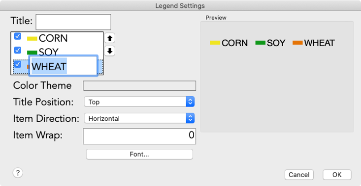
In Graph Builder or analysis reports, graph legends can be customized via right-clicking on the legend title and selecting Legend Settings or by double-clicking on the legend itself. In my customized line graph, the legend has been oriented horizontally inside the graph area and the title has been removed. The horizontal orientation was set using the Item Direction setting, and the title was removed by deleting the text in the Title field. Note that the labels of the individual legend entries are editable via double-clicking on the label text, but I haven’t edited them here. This feature is handy if you want to enter something more readable or informative to your audience than the default labels that have populated the legend. Below I’ve double-clicked on “WHEAT” to enable editing of that label.
In Graph Builder, the positioning of the legend relative to the graph area is an option under the red triangle. Options include placing the legend to the right or bottom of the graph area or overlaid inside the right or left side of the graph area; I chose inside right for my graph.
Customizing axes
JMP is quite good at choosing default axis settings when making graphs, but you might not always want to stick with the defaults. In my custom graph, I changed the Y-axis range and the X-axis increments and added horizontal gridlines. Changing axis ranges can be done interactively simply by hovering the pointer over the axis labels until the arrow changes to the grabber, which is shaped like the gloved hand of a certain beloved cartoon rodent (albeit with an extra finger). Once you see the grabber, click and drag to scroll or scale the axis, as in the video below. Note that hovering over the middle of the axis reveals a horizontal grabber that scrolls the axis, while hovering over the ends of the axis reveals a vertical grabber that scales the axis.
My customized graph also contains horizontal grid lines on the Y-axis and a reference line on the X-axis, which are two of many options available by double-clicking on an axis. The Axis Settings window contains options for axis scale and increments, tick marks and grid lines, axis label font and orientation, and reference lines. The Axis Settings window also includes a preview of the axis’ appearance, so you can make sure it looks just how you want before applying the settings. The image below is of my X-axis settings. Note that the Label Position and Label Axis Side options for my reference line are new in JMP 16, coming March 2021.
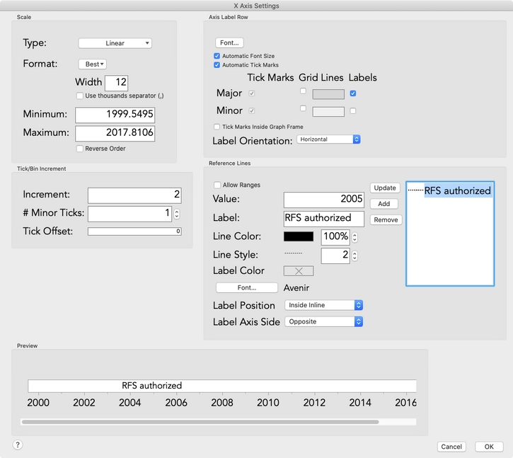
Finally, what about axis titles? You may have noticed that the default Y-axis title read “Commodity Acres Planted” and was oriented vertically, but my customized Y-axis title reads “Acres Planted” and is oriented horizontally. Axis titles can be edited simply by clicking on the title and entering new text, and the rotation option (as well as font options) are found by right-clicking on the title.
Adding annotations
On my graph, I note that 2007 – two years after RFS authorization – saw a 25.7 million acre difference between corn and soy production. I used the annotation and shape tools to add the text and lines to my graph, respectively. After adding the annotation and line shapes and dragging them into position, right-clicking on each revealed further options, allowing me to fill the text box with white with the Filled option and to change the color of the two connector lines to gray.
Now that my graph is ready…
Everything above is only a taste of all that’s possible with JMP’s graph customization options. Hopefully this has boosted your intuition for what other options may be available for getting graphs looking just right. JMP’s online documentation explains many more customization options; here’s a good place to start if you’re interested in learning more. When in doubt, right-click on the thing you want to customize, and there’s a good chance you’ll find just what you’re looking for. And failing that, the JMP User Community is always ready to help.
Now that my graph is ready, it’s time to get it out of JMP and into a document or slide as a high-resolution image. That’s what the next post is all about. It also returns to the topic of customization at the end, where you can see that if you export the graph in the right format, it’s editable outside of JMP, opening up virtually infinite customization options.
Follow me, dear reader, to the next post.
You must be a registered user to add a comment. If you've already registered, sign in. Otherwise, register and sign in.
- © 2026 JMP Statistical Discovery LLC. All Rights Reserved.
- Terms of Use
- Privacy Statement
- Contact Us
