Cumulative sums can be useful when working with a data set of measures that grow over a standard period of time and that repeat regularly. An example of this is measurements taken monthly that repeat yearly, such as home electricity usage.
While raw measurements can be informative, cumulative sums can help us to see whether measurements are on track, trending up, or trending down over the course of the year. Creating cumulative sum columns is easy to do in JMP using the New Formula Column functionality (available through right-click) in the data table.
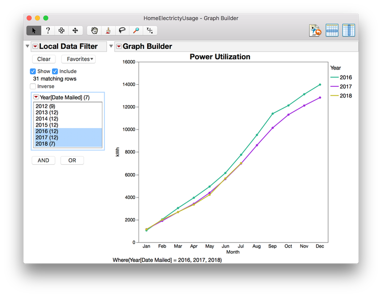
This is the graph we will be creating:

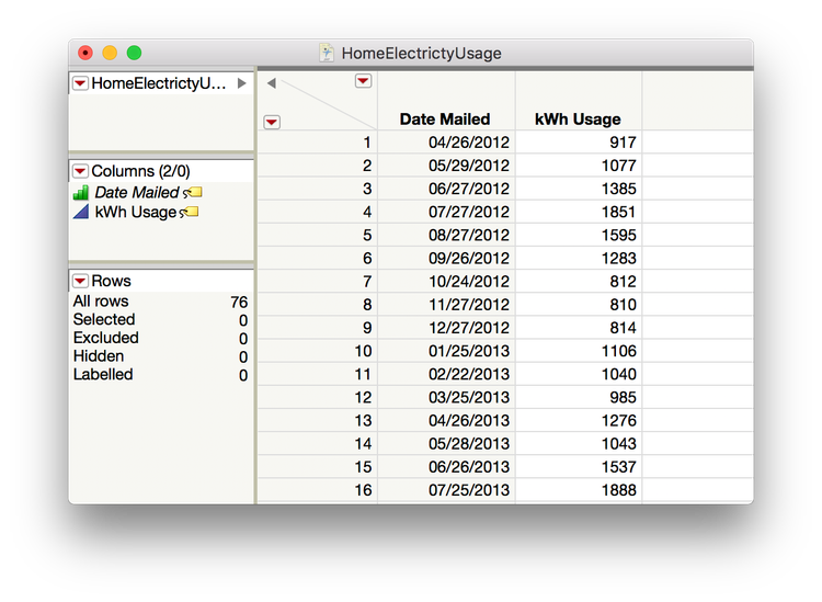
Consider the following example. We have data on electricity use in a home, which is reported on a monthly basis. In order to create our proper grouping (year), we can take the Date Mailed column, right click -> New Formula Column -> Date Time -> Year.
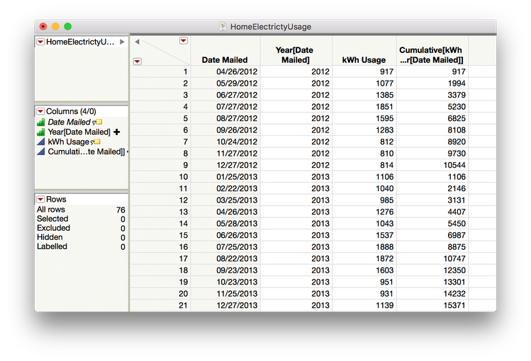
This creates a new column automatically with just the year. I do want to change from a continuous year to an ordinal year in order to group by year properly. That can be done from the columns list of the data table by right-clicking on the blue triangle of Year[Date Mailed] and changing it from Continuous to Ordinal.
To build our cumulative sum column, we will first right-click on the Year[Date Mailed] column -> New Formula Column -> Group By.
Now that we’ve identified the grouping column, we can right-click on the kWh Usage column -> right click -> New Formula Column -> Row -> Cumulative Sum. We now have our brand new column with the measure we need for visualization.
Since we want to visualize our data on a relative time scale (month) vs. an absolute time scale, we can again go to the Date Mailed column -> New Formula Column -> Date Time -> Month Abbr.
At this point, we are almost ready to build our graph. But first we will add a column property to our Year column in order to keep consistent colors in our graph when using a data filter. Right-click on that column -> Column Property -> Value Coloring. Then click apply.
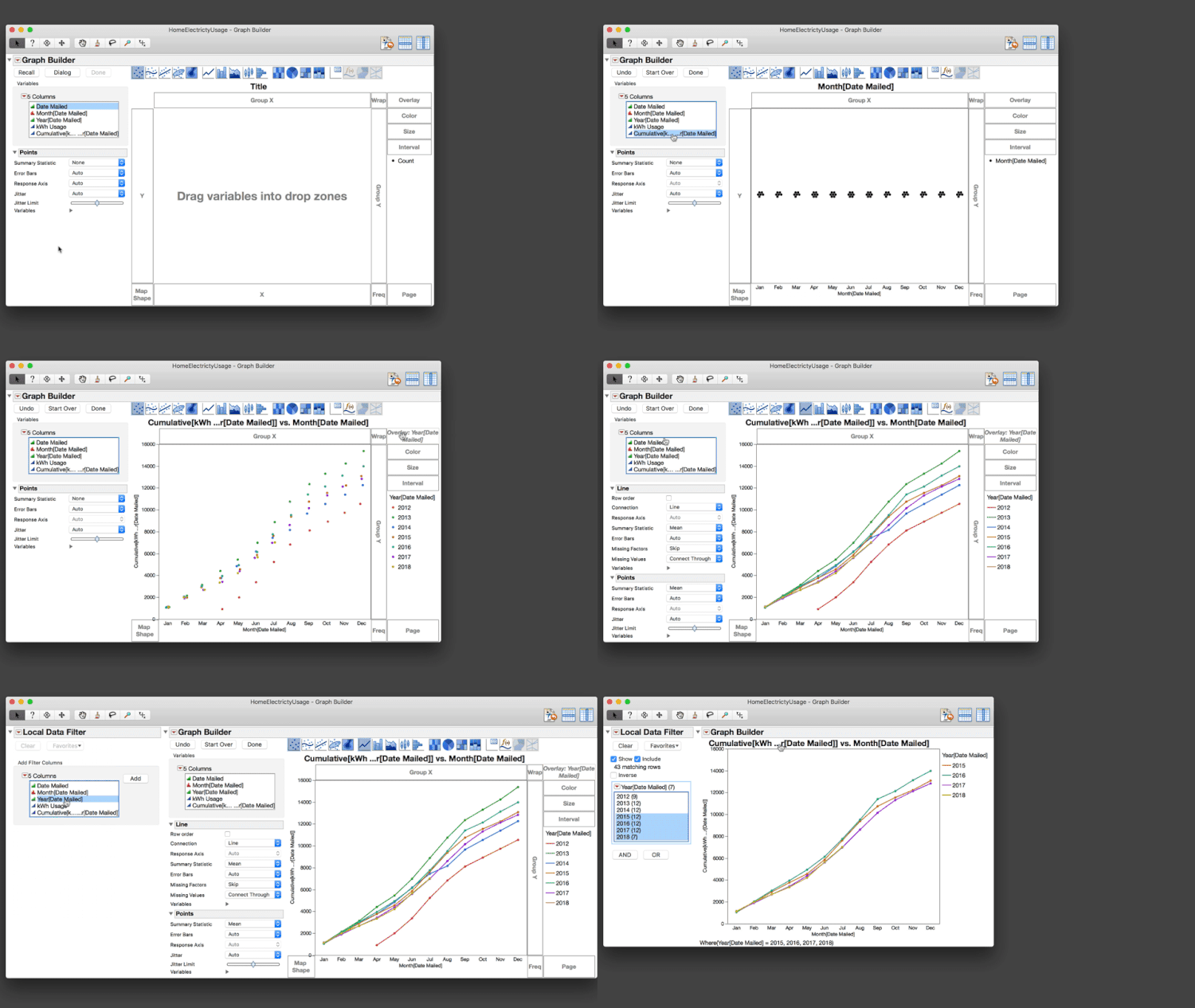
Now we can go to Graph Builder and build our cumulative sum graph. Drag month to the X axis and cumulative sum to the Y axis. Drag Year to the Overlay and then drag the line element to the graph to maintain the data points as well. Changing the points’ summary statistics from None to Mean will line the points up with the lines.
In order to add a filter to this graph, click on the red triangle of Graph Builder and then click Local Data Filter. Add Year as a filter.
Click Done on Graph Builder.
Using the Local Data Filter, we can focus on just the most recent three years. We’ll now want to make this graph presentation-ready. We can edit the title of the graph, the Y axis labels and X axis labels by double-clicking.
Now we have a graph that we can share with others. It gives a sense of how our power utilization is tracking this year vs. historical years and enables us to make any interventions necessary to keep our power utilization on target.
Here is how to build the graph, in real time.

P.S. Cumulative Density Functions and CDF plots are a corresponding way that statisticians “smooth” out bumps in histograms to compare a distribution to a reference distribution or compare two distributions. I'll explore this a bit more in a future post.