cancel
Showing results for 
Show  only  | Search instead for 
Did you mean: 
Choose Language Hide Translation Bar

Multiple plot and variable crosshairs or new hairline tool

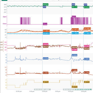
For time series data a hairline tool is a common way to show values across many charts at once.  In the screenshot below two static hairlines were placed on the chart and the third one moves with the mouse.  When activated in graph builder, or maybe in all open charts sharing a single dimension, put a line through all charts corresponding to the mouse position on a shared axis, and allow the user to drop or remove hairlines.  The user would choose an active hairline column in each table (likely a time or a sample number) and then all open charts using that dimension on an X or Y axis would display a hairline a that position and show corresponding values for all other variables intersecting that line. 
 

hairline.PNG


I am not sure if this could be a modification to the crosshairs tool or a new tool entirely.


Implementing this for a single graph builder report would be an acceptable compromise if accessing all charts is time consuming.

5 Comments
Ressel
Level VI

Implementing this for the Fity Y by X platform (mean, confidence & prediction intervals) is welcome also.

ih
Super User (Alumni)
Super User (Alumni)

Ideally this would be across all platforms that have a shared axis, so when enabled, you would pick an axis or variable, and on mouseover of any chart that includes that variable on an axis would cause all other charts with that axis to display a line at the current mouse position, or on mouse down/click it would display a static line.  Starting with just graph builder and fit y by x would be a huge step.

Status changed to: Acknowledged

Hi @ih, thank you for your suggestion! We have captured your request and will take it under consideration.

Status changed to: Investigating
 
ih
Super User (Alumni)
Super User (Alumni)

I haven't been keeping track but I recall seeing several requests in the forum itself asking for this!