cancel
Showing results for 
Show  only  | Search instead for 
Did you mean: 
Choose Language Hide Translation Bar
View Original Published Thread


Heatmap - option: fixed Tick spacing (aggregation area)

☐ cool new feature
☑ could help many users!

☑ fixes something that feels like a „bug“

☐ nice to have

☐ nobody needs it


#myTop10_2022

#myTop10_2023

#myTop10_2024


short:

hogi_0-1720725022449.png

against issue like this one:

hogi_0-1671182368626.png


long:

View more...

What inspired this wish list request? 

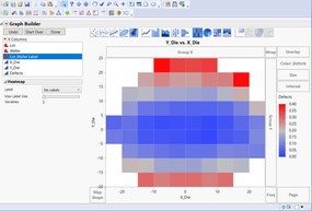
Heatmaps are great to display variations of a value depending on 2 input variables.

prominent use case: measured values vs. x/y position (e.g. chips on a wafer)


Unfortunately, Heatmaps use the minor Tick spacing to determine the size of the individual "tiles".

This leads to a which actually feels like a bug for many Jmp users - the issue:

The tick settings (and with them: the Heatmap tile size!) are automatically adjusted whenever the user changes the axis range by dragging the axis or by zooming with the magnifier tool:
Some problem using Heatmap 


Concerning axis adjustments by dragging, @julian 's suggestion helps: hold down SHift while changing the axis scaling.
But it just helps when you drag one end of the axis - if you want to zoom out by grabbing the axis and moving it away from the plot, you will ruin you plot - with and without pressing Shift. Same issue 
with the magnifier tool:
https://community.jmp.com/t5/Discussions/Some-problem-using-Heatmap/m-p/571751/highlight/true#M78136


What is the improvement you would like to see? 

An option for GraphBuilder/Heatmap to forces JMP to set the tick spacing fixed.

This will allow users to keep the tick spacing exactly as it was defined by the user.

Why is this idea important? 

Under the line: tiny change of the program - tremendous improvement for the users.

maybe there are some users who don't need it - or: some users who don't know yet that they need it


No longer destroyed plots after adjusting the axis range/zoom


  • most important use case: "1x1"
    (for chip wafer maps in Semiconductor Industry)

    error 1) Jmp clusters multiple chips into one cell by increasing minot tick step size to > 0 -> individual outliers get averaged out!
    hogi_0-1671182368626.png

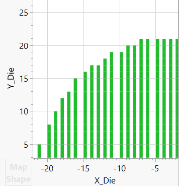
    error 2) Jmp invents empty "sub-Chips" by automatically changing minor tick step size to < 1:
    hogi_3-1705504742260.png


    To be on the safe side, cautious users abandon the Heatmap style and plot wafermaps as Points:
    either with mainly white area around the "points" - which makes it hard to get the actual info:

    hogi_1-1705504483439.png

    or with overlapping points -> dangerous, almost as bad as the clustering issue (#1) (!)

    hogi_2-1705504611740.png


more wishes submitted by  hogi_2-1702196401638.png

13 Comments
Sarah-Sylvestre
Staff
Status changed to: Acknowledged

Hi @hogi, thank you for your suggestion! We have captured your request and will take it under consideration.

hogi
Level XII

I just realized that Bar charts have the same issue with the self-adjusting increment.


Live example: @julian optimizes the tick spacing -  adjusts the x axis zoom - and has to re-set the tick spacing again
https://community.jmp.com/t5/JMP-On-Air/Episode-13-Friday-May-1-2020/ta-p/261558 @ 7:30min.


With the propose option to keep the tick spacing fixed, the user could optimize the spacing once, fix the spacing and enjoy a nice graph without any auto-changes of the tick spacing.


Axis_AutoAdjust.mp4
Video Player is loading.
Current Time 0:00
Duration 0:54
Loaded: 0%
Stream Type LIVE
Remaining Time 0:54
 
1x
    • Chapters
    • descriptions off, selected
    • captions off, selected
    • en (Main), selected
    (view in My Videos)


    hogi
    Level XII

    Will this bug be fixed in a future releaase of Jmp?

    hogi
    Level XII

    Other use case with time on the axis
    https://community.jmp.com/t5/Discussions/Plot-time-dependent-nominal-character-data-with-graph-build... 

    The plot starts showing each month on the X axis, after zooming out and in again, the plot shows ticks at every trimester:


    2024-06-07_22-40-29.mp4
    Video Player is loading.
    Current Time 0:00
    Duration 0:00
    Loaded: 0%
    Stream Type LIVE
    Remaining Time 0:00
     
    1x
      • Chapters
      • descriptions off, selected
      • captions off, selected
        (view in My Videos)


        Concerning the fix that  @julian ' shows here: hold down Shift while changing the axis scaling.

        It just works if the user presses shift BEFORE he starts dragging the axis.


        My (add-on or replacement) wish:


        if the user drags an axis and then notices that Jmp destroyed his axis setting, the user can press Shift and Jmp will keep the Tick settings fixed
        (i.e.  as if the user pressed Shift before dragging the axis)


        hogi
        Level XII

        Hi @Sarah-Sylvestre 
        according to all jmp user I talked to this will be an essential improvement

        tiny, easy to implement , but essential for daily work.


         Will this be implemented in v18?

        Sarah-Sylvestre
        Staff

        @hogi Not at this time, but it is currently under consideration for a future version of JMP. We will update the status if there is a change. 

        hogi
        Level XII

        Tracking number from Jmp support:

        TS-00053507

        hogi
        Level XII

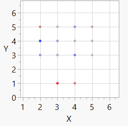
        Simple example which can be used to optimize the behavior in a future version:


        dt = New Table( "wafermap",
        	Add Rows( 14 ),
        	Compress File When Saved( 1 ),
        	New Column( "X",
        		Set Values( [3, 3, 3, 3, 4, 4, 4, 4, 2, 2, 2, 5, 5, 5] )
        	),
        	New Column( "Y",
        		Set Values( [1, 3, 4, 5, 1, 3, 4, 5, 3, 4, 5, 3, 4, 5] )
        	),
        	New Column( "value",
        		Formula( Random Normal( 15 ) ),
        	)
        );
        dt << Graph Builder(
        	Size( 244, 281 ),
        	Show Control Panel( 0 ),
        
        	Variables( X( :X ), Y( :Y ), Color( :value ) ),
        	Elements( Heatmap( X, Y, Legend( 5 ) ) ),
        
        );
        hogi
        Level XII
        hogi
        Level XII

        Feedback from Jmp Support:
        However, many people use the {Heatmap] functionality and expect it to work as it does currently.

        It has been designed to produce the results it is producing. So, the behavior you are seeing is not a bug in the software.


        The suggestion
        define your columns as ordinal


        Concerning the issue withe the sparse grid (like in https://community.jmp.com/t5/JMP-Wish-List/Heatmap-option-fixed-Tick-spacing-aggregation-area/idc-p/...) :
        ... you can add rows to your data table for each and every level of your plotted columns and then utilize Frequency column [with] a frequency of zero, while the others have a frequency of one. ...

        Zooming now retains the 'cells'.


        Hm. Definitely a creative workaround ...