Hi JMP Users and JMP team,
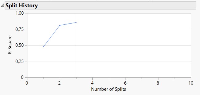
I had an old idea looking at the visual "Split history" from the Decision Tree platform (see image "Split_history" attached), and thinking about this visualisation for DoE models created by the "Fit Model" or "Fit Stepwise" platforms.
Would it be possible and feasible to add in these platform (or in one of these platforms) a similar graph showing the evolution of different models metrics (like R², R² adjusted, RMSE, p-value of the model, ... perhaps to be chosen/selected by the user) in order to help the user define the best possible model (perhaps as an option in the red triangle like "Split history") ?
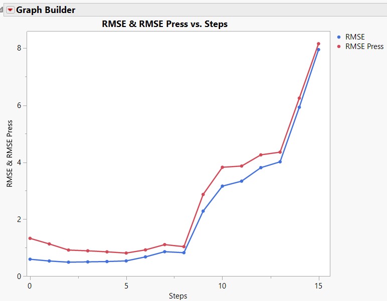
It could be a sort of graph, that updates each time the user deletes a term from the model or add one, and that shows the result of this step on different metrics compared to previous models/steps, in order for the user to have an overview about how big the change may be for the model depending on the term removed/added (see for example image "DoE-Model_selection-help").
Maybe this idea would be easier to implement on the Fit Stepwise platform, as this platform already shows the step history and various metrics linked to each model (see image "DoE-Stepwise").
I share with you a datatable with an example of DoE, with various noise level on the response. In the various scripts "Table models parameters and selection ...", I saved the different metrics for each model steps, and created a profiler with various functions and desirabilities (R², R² PRESS, RMSE, etc...). The goal was to use the profiler in order to find the best possible model step.
I hope this does not sound too crazy or over-complex, as I see this new feature as a good opportunity for models creator to quickly look at how terms impact their models in a simple way. The Generalized Regression platform also has a similar visualization ("Solution Path") that helps a lot decide about the model.
I would be interested to get some feedback about this,
DoE-Test-5factorswithinteractions_Taguchi-loss-for-predictive-model-selection.jmp