cancel
Showing results for 
Show  only  | Search instead for 
Did you mean: 
Choose Language Hide Translation Bar
0 Kudos

Graphical Depiction of the Structure of Data Collection - FRD / Sampling Trees

Our students/coworkers typically find themselves with specific needs related to the graphical depiction of the STRUCTURE of data.  We would like JMP to either improve or modify the existing capability for Ishikawa / Fishbone diagrams to enable the creation of "trees" depicting a data collection, or to ignore the Diagram platform to provide a new way to take a list of variables in a data collection, and display the structure of the data easily in tree format.


A) Depiction of the data present in existing files/DBs, including the presence of confounding in that data - independent variables that are NOT tracked or present in the existing data, but are confounded with fields that are (Example:  Age and Height might not be tracked in a database that DOES have a field for WEIGHT) - so the tree might show that we have five patients, and each has a WEIGHT in the database, but we each also has an Age and Height NOT present in the data.  We show this because in the analysis we want to indicate where an effect might be INCORRECTLY attributed to a variable present, when in fact it could be due in part or total to some other variable we did not collect.


B) Depiction of NEW data collected passively (sampling plans).  The need here is essentially the same as A, but is listed separately as this data would not exist at the time the plan is created.


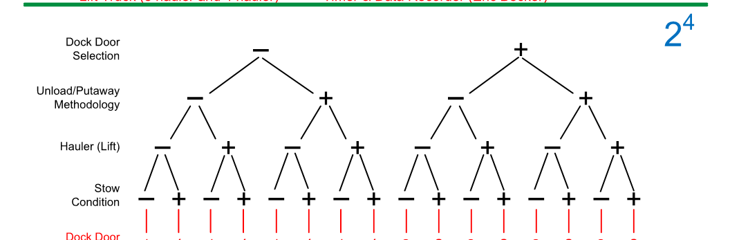
C) Factor Relationship Diagrams (FRDs).  Essentially the depiction of a DOE created by JMP, with design structure based on the chosen design parameters, but then also the capability of placing within each combination a tree for the unmanipulated variables (unit structure)..For example, for the combination - + + - we would also want to know / show that within this combination, there were two machines examined, and within each we took two material samples.  Ideally Design Structure would be BLACK, and Unit Structure RED.


To attempt to do this via the Diagram platform is awkward, and we are in particular interested in C, as JMP is typically where we choose our design, so it would be nice to have it just translate that into a diagram.  Later enhancements would increase flexibility of unit structure capability, including the ability to add CONDITIONS at the top of any diagram (noises/variables constant throughout).

4 Comments
gzmorgan0
Super User (Alumni)

This comment is not meant to diminish your wish list item. It is meant as an fyi about something you likely can do today. The JMP variability chart is quite useful to look at data structure and relationships, if there are not too many factors and levels. In fact, it is my "goto" graph for the raw data to look for anomalies or to see if there are any results quite different from each other.


The Variability plot allows the user to drag the order of the "factor" variables. Below is a simple concept script and the resulting "picture".  The 3rd picture I made horizontal, th eusual view, once there are response values to plot.  Note for your example with two entities/tools and 2 samples, I'd use a legend color and/or symbol to show that there were 2 entities, and each value has its own point on the graph.


You might aready know all of this, sorry if I am preaching to the choir. I am just adding this note as an FYI.


Names Default to Here(1);

dt = current data table();  //the DOE table
cnames = dt << get column names("string");

clst = {};

For(i=1, i<=nitems(cnames), i++, 
	If(cnames[i]=="Pattern", Continue());
	prop = (Column(cnames[i])<< get properties list());
	if(Contains(prop, Expr(Design Role)), insert into(clst, cnames[i])  )
);

If( nitems(clst) > 0,
__dt = dt << Subset(Columns(EvalList(clst)), Invisible, OutputTableName( (dt << get name) || "- Layout") );

__dt <<select rows(1::nrow(__dt));
__dt << Hide(1);
__dt << clear select;
__dt << new Column("Y", continuous, <<set each value(0));

vc = __dt << Variability Chart(
	Y( :Y ),
	X( Eval List(clst) ),
	Vertical Charts( 1 ),
	Std Dev Chart( 0 ),
	SendToReport(
		Dispatch(
			{"Variability Chart for Y"},
			"1",
			ScaleBox,
			{Min( 0.123391170101054 ), Max( 0.940740039529616 ), Inc( 1 ),
			Minor Ticks( 0 ), Label Row(
				{Show Major Labels( 0 ), Show Major Ticks( 0 ),
				Show Minor Ticks( 0 )}
			)}
		),
		Dispatch(
			{"Variability Chart for Y"},
			"Variability Chart",
			FrameBox,
			{Frame Size( 121, 338 )}
		),
		Dispatch(
			{"Variability Chart for Y"},
			"",
			DropBox( 5 ),
			{Horizontal Alignment( "Center" )}
		)
	)
);
);

image.pngimage.png

XanGregg
Staff

You can also get a similar view, without the direct labeling, with nested axes in Graph Builder.

Ryan_Gilmore
Community Manager
Status changed to: Archived
We are archiving this request. If this is still important please comment with additional details and we will reopen. Thank you!
statman
Super User

I think you (gzmorgan, Ryan and XanGregg) are missing the point.  The suggested items (sampling trees and FRD's) would be a fantastic added feature to JMP.  It does not exist in any statistical software.  I use (and teach) sampling plans/trees to visualize how data will be collected (data collection plan), why the data will be collected in such a way (what hypotheses are being studied), and lastly, what X’s are separated, confounded and are not in the study (inference space).  The trees also help organize data for analysis and distinguish between nested, systematic and crossed studies (which each require different analyses).  For experimental design, I use Factor Relationship Diagrams (FRD). Similarly the FRD is a visual tool that help the experimenter plan their experiment.  The FRD most importantly keeps track of the noise and the relationship of the noise to the design structure (factors/level setting). Since statistical tests are a comparison of the design factor effects to the noise, I think it important for the engineers to understand what the noise actually consists of.  There is really no where to input noise into JMP, yet it is essential for any statistical test.  The FRD also keeps track of the inference space to help assess confidence in extrapolating the results and indicates where any restrictions on randomization are in the study to appropriately analyze.  None of these planning tools are available in JMP.  It would be incredible for engineers and scientists to visualize their data collection plan, and then have JMP create the data table for data entry automatically.