I want to demystify design of experiments (DoE) with a series of posts with simple explanations of some of the terms and concepts that can be confusing for people when they are starting out. In my last post, we were immersed in the vast scale of the possibility space for a multivariate process optimisation problem. Remember that the objective in this case is to ensure that we can reliably detect low levels of contaminants in water samples using GC-MS analysis. We need to find settings of the Large Volume Injector (LVI) that maximise the signal. We introduced a designed experiment for tackling this challenge.
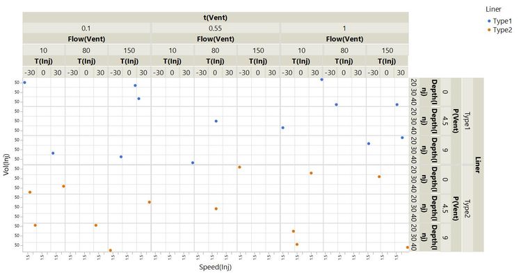
In this post, you will see how we can learn about any setting within our possibility space – not just the ones that we have tried. With DoE, we can understand our processes and systems using models that we build from the data. We are going to start by looking at the rich information we can get from the 4374-run full factorial experiment that we saw last time. We will learn about the system through both visual and statistical models.
Visual Models of Your Process or System
Here are the first 10 runs of that experiment, that is, the first 10 of the 4374 possible combinations of each factor at either lowest, mid-point or highest (L, M or H) settings.
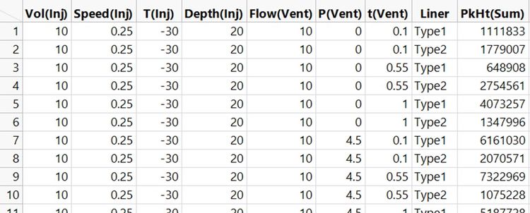
You can see that we have the results now. I instructed my large team of minions to run a standard sample using every one of the 4374 different settings and record the chromatogram [1]. There are lots more columns in the raw data table because we recorded the height for every peak in the chromatogram. The response variable, PkHt(Sum), in the table above is the sum of all these peak heights. That is, it is the sum of peak heights for all of the substances in the standard sample. We want to find settings that maximise PkHt(Sum).
With all of this data, we have a very thorough coverage of the possibility space. I’ve visualised every run in the experiment as before but with each point coloured by PkHt(Sum). The best results are in green.
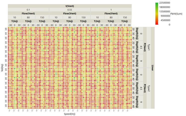
Even with all of the response data, this visualisation is not useful for understanding what is going on. But, looking at this, would you fancy your chances of finding the best settings just by randomly exploring the possibility space?
The driving factors are more easily seen in this distribution plot where the runs with the highest PkHt(Sum) value have been highlighted.
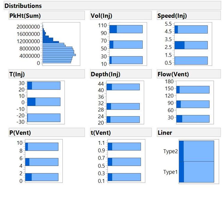
This shows that factors from the injection step are most important: The best runs typically have high Vol(Inj) and medium-to-high Speed(Inj) and T(Inj). Other factors look much less important. For example, there is little difference in liner types amongst the best runs.
We can understand some of the important behaviours from a simple scatterplot of the response against a factor:
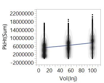 Plot of PkHt(Sum) versus Vol(Inj). Here, we have augmented the scatterplot with density contours to show the distribution of values and a smoothing fit.
A smoothing line connects the average PkHt(Sum) value at each level of the factor, Vol(Inj). From the overall trend, we can see that we should expect the peak heights to increase as we increase the volume of sample that we inject – makes sense. Notice that we can also see the expected value of the response for any value of the factor. We learn a lot more about our system with DoE – with the right data, we can interpolate between the data points that we have to tell us about settings that we haven't actually tried.
Scatterplots of the response against all factors again show that the most important factors are related to injection. Other factors have very little effect; we could set the factor anywhere in the range, and it would have little effect on the response. We can also see that there are curvilinear behaviours for some of the factors – for Speed(Inj) and T(Inj), the sweet spot appears to be somewhere in the middle of the range. We are able to see this because we tested each factor at three levels:
 There are curvilinear behaviours for Speed(Inj) and T(Inj).
Understanding Your System or Process
You can see that we can get a lot of insight from visual models. To get the richest understanding of a complex multivariate system, we need to fit a statistical model. We will talk more about fitting models in later posts. For now, let’s see the end-result. This next plot is a visualisation of a model fit to the data from the full factorial experiment.

This plot captures a lot. You can see that for starters, it tells us the same things we got from the earlier scatterplots:
- How changing each factor would affect the response.
- Which factors have the big effects, and which have very little effect.
- Where there are curvilinear relationships.
This plot is also dynamic, so we can see what response to expect for any setting of the factors. We can use this to find settings that will give us the best response:
 Plot of the model showing settings that maximise PkHt(Sum)
We haven't actually tested these settings. We have collected data that enables us to create a model of our system to tells us what we can expect at these settings. A sensible next step would be to run these settings to validate the model.
We can also understand more complex behaviours that we didn't see from our simple scatterplots. Watch what happens to the effect of P(Vent) when we change the setting of Vol(Inj) from 100 to 10:
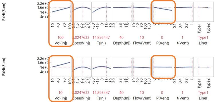
As Vol(Inj) is changed from 100 to 10, P(Vent) goes from having a strong negative effect to having very little effect at all. We say there is an interaction effect of Vol(Inj) and P(Vent). Interactions are common in physical, chemical and biological systems, and understanding them is often key to successful development of complex technologies. It is only possible to do this when you have a useful model of the system, which relies on having useful data.
You can explore a dynamic version of this profiler plot (I recommend something bigger than a smartphone screen for this):
Click and drag the broken red lines in the plot to see what happens when you change factor settings. This interactive visual was published on JMP Public along with some more related to this blog post.
Understanding Without Waste
We got a lot of useful know-how from the huge experiment that my minions carried out. By thoroughly covering the possibility space, we learnt about the important behaviours of the system and were able to use models to tell us about settings that we didn't test. However, it was very expensive! What if you can’t afford to run such a large experiment?
It turns out that we can build a similar model using the data from the much more economical 26-run experiment [2] we saw at the top of this post:

This model captures the same important factor effects and suggests very similar settings to maximise peak height. An obvious difference is in the wider confidence intervals that represent more uncertainty about the behaviours.
The fact that we can fit this model begins to explain why these 26 runs out of the 4374 possible combinations make for such a useful experiment. You could easily out-compete me and my team of minions with this efficient strategy. In my next post, I talk more about how we build models from data and how a smart choice of experimental runs can give you the most useful models and the best understanding for minimum effort.
Notes
[1] Not really. These are simulated results.
[2] Here, we have used real data from Camilla Liscio and Jonathan Dunscombe at Anatune.
Missed the previous posts? You can read the full Why DoE series.