- New to JMP? Let the Data Analysis Director guide you through selecting an analysis task, an analysis goal, and a data type. Available now in the JMP Marketplace!
- See how to install JMP Marketplace extensions to customize and enhance JMP.
JMP Blog
A blog for anyone curious about data visualization, design of experiments, statistics, predictive modeling, and more- JMP User Community
- :
- Blogs
- :
- JMP Blog
- :
- Why design experiments? Reason 3: Efficiency
- Subscribe to RSS Feed
- Mark as New
- Mark as Read
- Bookmark
- Subscribe
- Printer Friendly Page
- Report Inappropriate Content

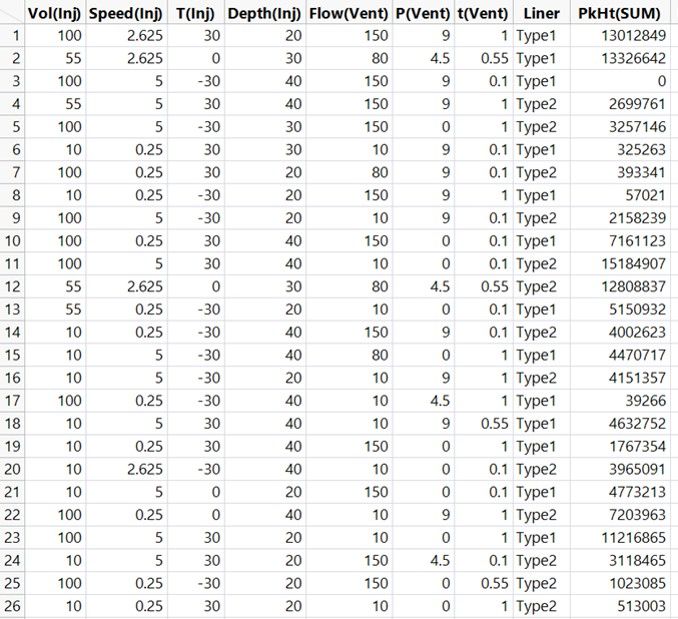
I want to demystify DoE (design of experiments) in a series of posts with simple explanations of some of the terms and concepts that can be confusing for people when they are starting out. In my first post in this series, I explained how DoE helps overcome the challenge of having too many possibilities to explore with no wasted time or effort. If you read that post, you may recall that we are using a case study where the objective is to understand how to set the Large Volume Injector (LVI) in a GC-MS analysis system. Our goal is to maximise the signal for detecting low levels of contaminants in water.
In my previous post, we saw how you can learn about the important behaviours of a process or system using visual and statistical models when you have data that thoroughly covers the multifactor possibility space. This allows you to understand any setting in the possibility space – even ones that you haven’t tested. This is the understanding you need to design the best processes and products.
In this post, we will see how we build statistical models from our experimental data, and we will begin to understand how the smaller 26-run design enables you to learn about your process in the most efficient way. Just to warn you – we will feature a few small equations, but nothing that should be too scary.

Straight lines and curved lines
In high school physics, I remember we spent quite a lot of time manually fitting lines of best fit on graphs of things like voltage versus current. My physics teacher once asked the class how many points you need on a graph for a line of best fit. I was pretty sure that there was no right answer to this. With this teacher, you didn’t want to risk answering out loud unless you were totally certain. Everyone stayed quiet, so he told us the answer: “Six for a straight line and 12 for a curved line.”
Hmmm. He was a great teacher, but now I feel confident enough to say that he was wrong on that one. A better answer would be: at least two for a straight line and at least three for a curved line. Of course, if there is “noise” in your data – in real-life experiments, there almost always is – you will want more points. You will also want more points if the “signal” in your data is weak. The best answer is to choose the number of data points based on your best estimate of the signal-to-noise ratio. I think six and 12 were rules of thumb that were about right for the signal and noise you might get in school demonstration experiments.
Using signal and noise to work out the amount of data to collect is called power analysis. We are not going to talk about that here. Instead, we are going to talk about fitting lines to build useful and efficient models of our processes and systems.
Straight lines: Main effects
We have carried out our 26-run experiment and collected the data on the sum of all peak heights, PkHt(SUM), for each combination.
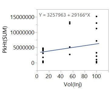
We now want to use this data to build useful models. A straight-line fit is one of the simplest statistical models that we can create. It can also be a very useful model. So let’s start simple by fitting a straight line to PkHt(SUM) versus Vol(Inj):
We don’t use graph paper, a ruler and our judgment to fit the line, as we did back in my high school physics class. Software like JMP will find the line of best fit using a method call least squares regression. The simple linear regression model that we are given is represented by the equation,
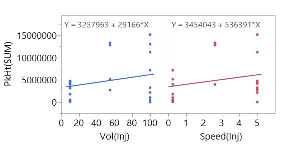
Y = 3257963 + 29166*Vol(Inj).
It has two parts:
- The intercept parameter tells us that we can expect a PkHt(SUM) of 3257963 when the injection volume is 0 microlitres.
- The slope parameter tells us that we can expect PkHt(SUM) to increase by 29166 for every microlitre increase in Vol(Inj).
In DoE, we call this the main effect (ME) or main linear effect (MLE) of Vol(Inj). It is a useful because it enables us to understand the effect of injection volume on the peak heights on our chromatogram, assuming the linear relationship is a good enough model.
It happens that we need only two data points to be able estimate this main effect model: One at the lowest setting of Vol(Inj) and one at the highest setting would suffice. More generally, you need, at a minimum, as many data points as you have parameters in the model. Here, we have a just an intercept and a slope parameter.
So why do we have all these other data points? With the other data, we can add to our model. We can separately model the main effect of both Vol(Inj) and Speed(Inj), for example.
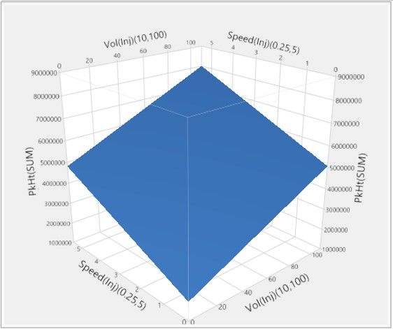
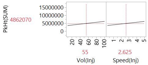
Even better, we can simultaneously fit the main effects of Vol(Inj) and Speed(Inj) in the same model.
Now instead of a line, we are fitting a plane. We can also visualise this model using the Profiler plot that we used in the previous post in this series.
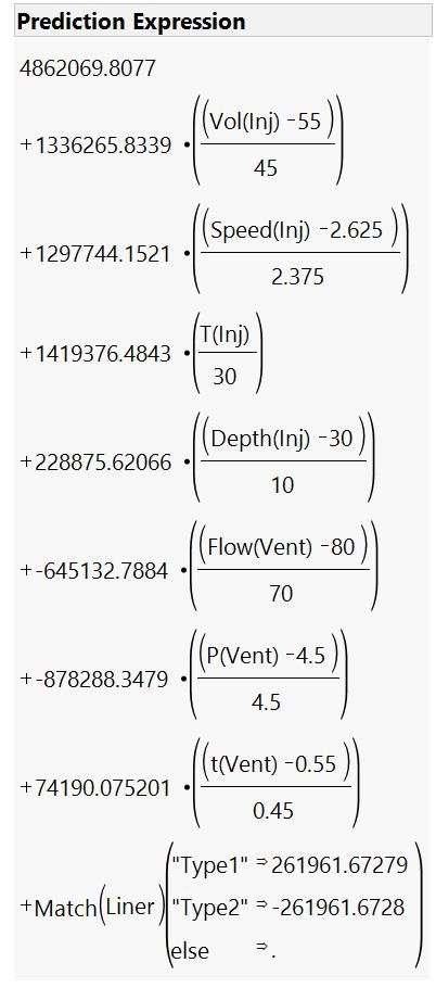
When we fit the effects of two or more factors, we call this multiple linear regression (MLR). We can extend this to our other factors to give us the full main effects model. The Profiler plot is useful here because the equations for MLR models can be quite difficult to interpret [1], and it is a challenge to imagine a plane in eight dimensions!
With this model, we have a lot of information about our system that will be useful for finding settings that maximise our signal and our ability to detect impurities at low concentrations.
Going back to question of the number of points we need to fit a line – do we really need 26 data points to fit this model? In fact, an experiment with just nine runs would be enough to build this model because we have one intercept and eight slope parameters to fit. With the additional data from our 26-run experiment, we can build a model to understand more about the process.
Curved lines: Quadratics
Remember that we experimented at three levels of the settings for every factor (apart from the categorial factor, Liner)? I said there was a good reason for this. With points in the middle, we can fit a curved line. In many situations in science and engineering, a main effects model is not enough. The intercept of the main effect model for Vol(Inj) that we looked at earlier told us to expect reasonably high peaks with zero injected sample volume.
This doesn't make sense and is an example of the limitations of main effect models (although, to be fair, this is also because we are extrapolating outside of the range of experimentation). Behaviours can deviate from simple linear trends, and there will often be maxima or minima in the middle of the factor range.
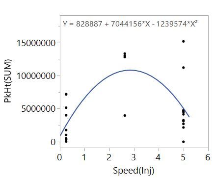
Hopefully, you recall quadratic functions from high school. These functions feature X^2 terms and can describe curvilinear behaviours. Essentially, these models allow the slope effect to change as the factor, X, changes. For example, just looking at PkHt(SUM) versus Speed(Inj):
The data tells us that the slope of the relationship between PkHt(SUM) and Speed(Inj) is changing with Speed(Inj) and there is a maximum near the centre of the range. The quadratic model,
Y = intercept + a*X + b*X^2,
contains:
- The intercept
- The main effect, a*X
- The quadratic effect, b*X^2
This model can describe the curvilinear behaviour and so gives us better information to understand the effect of changing injection speed compared with the simple main effect model. There is a bit more terminology that is useful to know: We say that the main and quadratic are both effects of the factor, and the quadratic is a second-order effect of the factor.
With the data from our 26-run experiment, we can fit a main and quadratic effects model for all continuous factors (with just the main effect of Liner).
We can see that this is telling us some very different things from our main effects models. These are things that we need to know to meet our objective of optimising the LVI set-up.
Beyond straight lines and curved lines
This experiment and model give us an efficient way to get important understanding, especially when you consider the total number of possibilities, as we did in the first post. Could we have been more efficient?
This main and quadratic effects model contains 16 effects:
- One intercept
- Eight main effects
- Seven quadratic effects (no quadratic for Liner)
This means that 16 runs might have been enough. So why does our experiment have 26 runs? Well, there are other important behaviours that we would like to be able to model. Remember interactions? Before we talk about that though, we need to talk about confounding, which we can cover in my next post.
[1] As an example of what a multiple linear regression model looks like in mathematical notation, below is the expression for our full main effects model. This is why we like the Profiler plot!
You must be a registered user to add a comment. If you've already registered, sign in. Otherwise, register and sign in.
- © 2026 JMP Statistical Discovery LLC. All Rights Reserved.
- Terms of Use
- Privacy Statement
- Contact Us

