cancel
Showing results for 
Show  only  | Search instead for 
Did you mean: 
JMP is taking Discovery online, April 16 and 18. Register today and join us for interactive sessions featuring popular presentation topics, networking, and discussions with the experts.
Choose Language Hide Translation Bar
Three-way charts, an evolution of the Presummarize Control Chart

Many years ago, we added the Presummarized control charts to JMP version 5 at the request of folks in the semiconductor industry. While there are many types of Presummarized control charts, one of the most common is the chart called, “Individuals on Group Means,” which plots the subgroup average just like an XBar chart, but uses the overall moving range between each consecutive average for sigma when computing the limits.

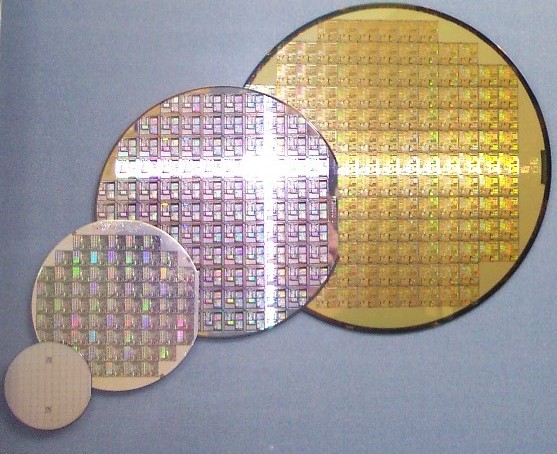
The typical wafer manufacturing process involves multiple steps, many of which are in a nested, split-plot like structure. For example, a wafer (pictured above) is typically sliced from a cylindrical silicon ingot. Then several processes are applied to the wafer before it is diced into individual die pieces, which become the integrated circuit. From this, we can see that if an impurity occurred in the original cylinder, it would affect all wafers sliced from that cylinder, and subsequently all individual circuits sliced from each of the wafers associated with that cylinder. However, if an error occurred in a layer across one wafer, while it would affect each resulting circuit coming from that particular wafer, we would not expect it to affect any other wafers or die cut from those wafers. In environments where effects can be seen on varying granularity levels, such as in the semiconductor manufacturing process, a Presummarize or three-way chart can be quite useful.

Using the old Control Chart platform in JMP, we can compare the results of running an XBar/R chart combination to a Presummarize group of control charts on the same data. The same subgroup average points are plotted in each chart, and each chart has the same mean. While Test 1 is selected for both charts, we see out of control points appearing only in the XBar chart because the sigma used to compute the limits is different for each chart (range versus moving range). The sigma used for the XBar chart is based on the average range within for each wafer subgroup, while the Individual on Group Means ignores the variation on each wafer/lot subgroup combination and looks only at the moving range between each wafer/lot subgroup.

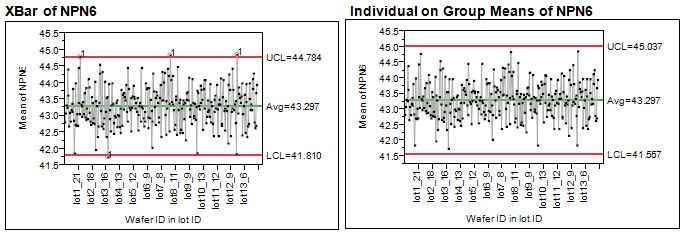
In Figure 1, I show only the first chart on the output, what might be called the “Location” chart. The second chart typically displayed, or “Dispersion” chart, is the associated chart (Range or Moving Range) used to compute the sigma for the location chart.

Partitioning the variance to actually see all the sources of variation enables you to both spot high-noise areas and apply limits that are the appropriate width. Previously, the only way you could do this in JMP was either to run two types of control charts – the R chart from the XBar/R charts and the Presummarize charts – or to write a script that ran them both and then concatenated them together.

In JMP 10, we’ve added an option to do this for you. Here’s how:

  • Open Semiconductor Capability.jmp from the Sample Data files in JMP 10
  • Choose Analyze->Quality and Process->Control Chart Builder
  • Drag NPN6 to the Y drop zone
  • Drag lot_id to the X drop zone, then drag wafer above lot_id to nest wafer within lot_id
  • Right-click on the graph and choose Add Dispersion chart
  •  

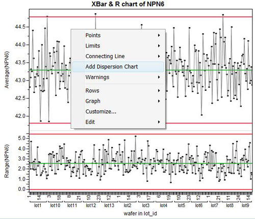
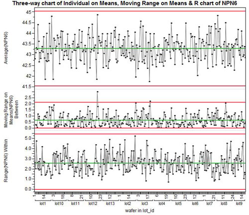
    By default, the Control Chart Builder will insert a Moving Range on the Means chart between the XBar and R charts to show the variation between wafers within lot. Plus, it changes the limits on the location chart to use the Moving Range, thus changing it to the Presummarized, Individual on Group Means chart.

    Now, presummarized three-way control charts in JMP are built-in and easy to use. Let me know what you think of them.

    Last Modified: Apr 11, 2012 12:03 AM
    Comments
    WP_Comment
    Visitor

    Mike Clayton wrote:

    In semiconductor industry, we have used a European approach to capability assessment AND control charting, Camline SPACE product (Lineworks is another of their names) from Germany.

    That system has many choices of LIMITS methods, and many choices of RULES which are more robust given underlying variance components, nesting, and lack of independence issues.

    We have subgoups that are only for diagnostic purposes (3 to 9 sites on each wafer, for example) not for setting chart limits...as they are highly correlated UNLESS a few are deformed or radial distribution changes due to chamber conditioning.

    We have no random sampling...but plot every lot and sometimes every wafer as it is produced for CONTAINMENT and machine FAULT DETECTION use, not for simple adjustment....and yet we ALSO pull sensor-based data that is used to declare that tool is OK and then allows the trend chart from metrology data (EWMA for example) to CORRECT the recipe settings (adaptive process control).

    This MIX is the problem, and JMP is only used for Planning and Checking (offline mode) these realtime tools. Another example, another industry, is use of Umetrics for realtime monitoring in mulitvariate mode (oil refineries, paper mills, any continuous process industry. And JMP is again used offline for planning, checking, DOE's etc, not for process control purposes.

    So the charting utility in JMP could add some ROBUST rules (N of M point > 2 sigma, N of M points on one side of centerline, etc instead of Shewhart or Nelson numbers.

    And limits could be set by percentiles of the raw data distribution for example, rather than a sigma multiple. Economic limits using robust stats. We have discussed these issues with many people already, and that is why Camline has so many options....they had to satisfy Infineon as its first partner (Europe, automotive chips), then others, over many years.

    It was based on Q-DAS an automotive supply chain quality software tool, still around, but had to be highly customized for chip makers.

    The other issues is WAFER MAPS..for which we use contour plots by wafer for BIT data (good vs bad) as well as PARAMETER data, real values, real contours. And also for BIN fail numbers (fail bin code is used as label at each die site). And we often have STACKED maps that use medians (eng can pick stat type) for parametric data across many wafers and lots to visualize chronic spatial patterns.

    One of the other issues, is how to load SPEC LIMITS (not control limits) to COLUMN PROPERTIES from a spec file (try to SEARCH on that in your many tutorials and books and user group entities) so that capability can be run across 200 or more test parameters, and PLOTS can have limits shown like they do in Distribution plots (Graph Builder, for example, and Fit Y numeric by X nominal). Now we write custom scripts to do that for each platform and sometime each version of JMP.

    AnnieDudley
    Staff

    Annie Dudley Zangi wrote:

    Thanks for the suggestions, and for sharing some of your challenges. Do you write a blog? If so, I think you should consider discussing these in more detail in a blog post. I believe many readers would find your experience and any JSL tips you could lend helpful.