- User Community
- :
- Blogs
- :
- JMP Blog
- :
- Three-way charts, an evolution of the Presummarize Control Chart
The Discovery Summit 2025 Call for Content is open! Submit an abstract today to present at our premier analytics conference.
Get the free JMP Student Edition for qualified students and instructors at degree granting institutions.

Staff
Three-way charts, an evolution of the Presummarize Control Chart
Apr 11, 2012 12:03 PM
Last Modified: Apr 11, 2012 12:03 AM
Many years ago, we added the Presummarized control charts to JMP version 5 at the request of folks in the semiconductor industry. While there are many types of Presummarized control charts, one of the most common is the chart called, “Individuals on Group Means,” which plots the subgroup average just like an XBar chart, but uses the overall moving range between each consecutive average for sigma when computing the limits.
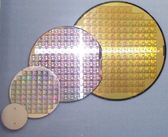
The typical wafer manufacturing process involves multiple steps, many of which are in a nested, split-plot like structure. For example, a wafer (pictured above) is typically sliced from a cylindrical silicon ingot. Then several processes are applied to the wafer before it is diced into individual die pieces, which become the integrated circuit. From this, we can see that if an impurity occurred in the original cylinder, it would affect all wafers sliced from that cylinder, and subsequently all individual circuits sliced from each of the wafers associated with that cylinder. However, if an error occurred in a layer across one wafer, while it would affect each resulting circuit coming from that particular wafer, we would not expect it to affect any other wafers or die cut from those wafers. In environments where effects can be seen on varying granularity levels, such as in the semiconductor manufacturing process, a Presummarize or three-way chart can be quite useful.
Using the old Control Chart platform in JMP, we can compare the results of running an XBar/R chart combination to a Presummarize group of control charts on the same data. The same subgroup average points are plotted in each chart, and each chart has the same mean. While Test 1 is selected for both charts, we see out of control points appearing only in the XBar chart because the sigma used to compute the limits is different for each chart (range versus moving range). The sigma used for the XBar chart is based on the average range within for each wafer subgroup, while the Individual on Group Means ignores the variation on each wafer/lot subgroup combination and looks only at the moving range between each wafer/lot subgroup.
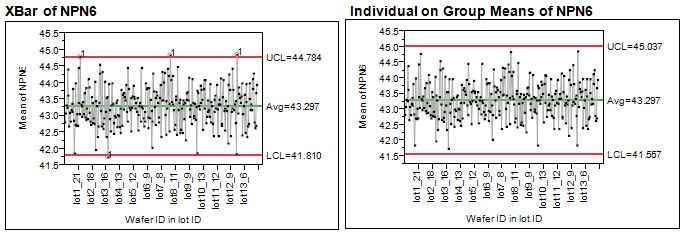
In Figure 1, I show only the first chart on the output, what might be called the “Location” chart. The second chart typically displayed, or “Dispersion” chart, is the associated chart (Range or Moving Range) used to compute the sigma for the location chart.
Partitioning the variance to actually see all the sources of variation enables you to both spot high-noise areas and apply limits that are the appropriate width. Previously, the only way you could do this in JMP was either to run two types of control charts – the R chart from the XBar/R charts and the Presummarize charts – or to write a script that ran them both and then concatenated them together.
In JMP 10, we’ve added an option to do this for you. Here’s how:
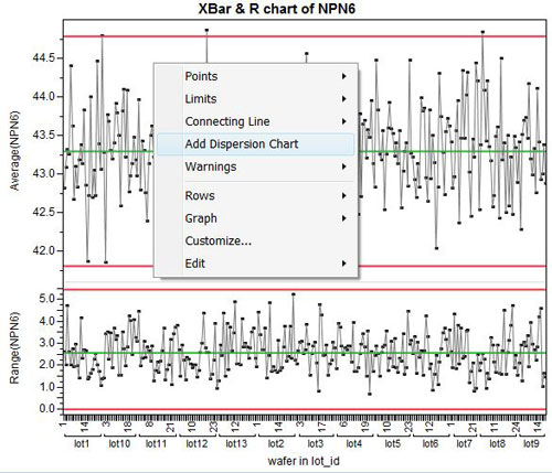
By default, the Control Chart Builder will insert a Moving Range on the Means chart between the XBar and R charts to show the variation between wafers within lot. Plus, it changes the limits on the location chart to use the Moving Range, thus changing it to the Presummarized, Individual on Group Means chart.
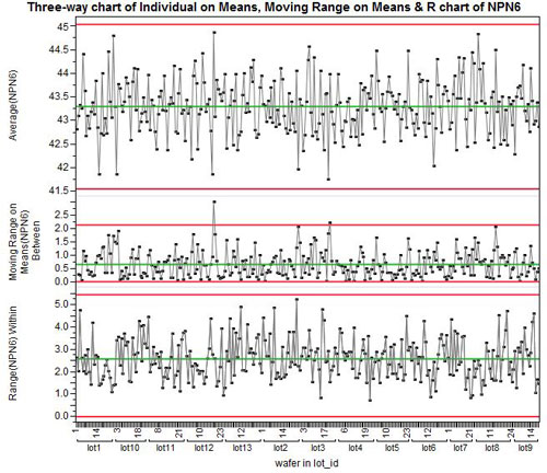
Now, presummarized three-way control charts in JMP are built-in and easy to use. Let me know what you think of them.
Comments
You must be a registered user to add a comment. If you've already registered, sign in. Otherwise, register and sign in.
Article Options
- Subscribe to RSS Feed
- Mark as New
- Mark as Read
- Bookmark
- Subscribe
- Printer Friendly Page
- Report Inappropriate Content
- © 2025 JMP Statistical Discovery LLC. All Rights Reserved.
- Cookie Preferences
- Terms of Use
- Privacy Statement
- Contact Us
This site uses cookies and related technologies for site operation, analytics, and third-party advertising purposes, as described in our Privacy Statement. You may consent to our use of these technologies, reject non-essential technologies, or further manage your preferences. To opt out of JMP making information relating to cookies and similar technologies available to third parties for advertising purposes, select "Reject All". To exercise other rights you may have related to cookies, select "Manage cookies".