When I was growing up in the Midwest (Columbia, MO, to be precise), flavored potato chips were a favorite of mine. Though I preferred sour cream and onion, barbecue would do in a pinch. Imagine my delight, then, when my colleague Ryan Lekivetz informed me that our neighbors to the North had an entire new range of chip flavors to try!
And imagine my disappointment when I found out that two of the most popular flavors were ketchup and dill pickle.
“Blech,” I told Ryan.
“You’re just saying that because of the name,” he replied.

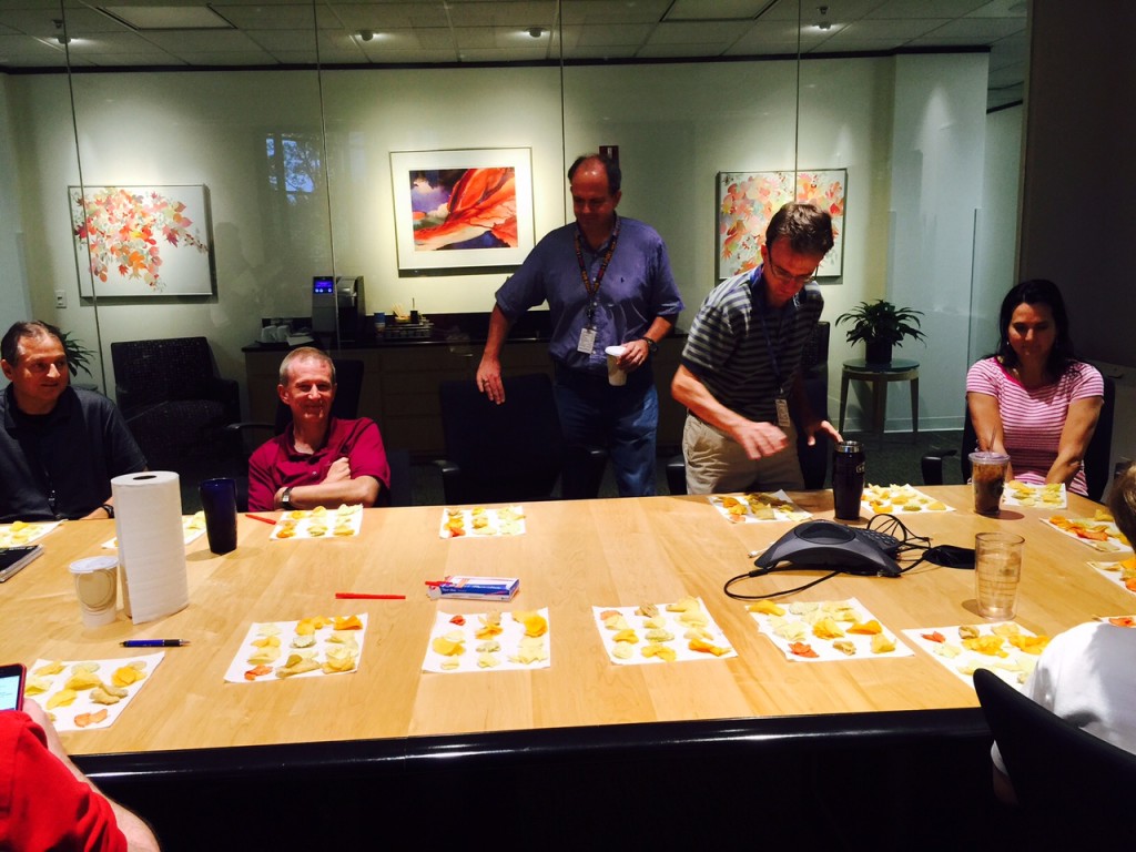
JMP staff volunteered to taste 10 different potato chip flavors in our choice experiment.
So, as statisticians will, we agreed to find out the answer based on a designed experiment.
We selected 10 potato chip flavors, including Canadian Dill Pickle and Canadian Ketchup, and asked people to compare them. Because we were working with volunteers from the US, we decided we’d mix in a few US favorites like barbecue and my beloved sour cream and onion, but we’d also use the Lay’s Do Us a Flavor chips to see how the Canadian chips would fare against other unfamiliar flavors. In the end, we had 10 different types of chips for our volunteers to taste:
New York Reuben
Southern Biscuits and Gravy
West Coast Truffle Fries
Greektown Gyro
Ketchup
All Dressed
Dill Pickle
Southern Heat Barbecue
Barbecue
Sour Cream and OnionLike with the chocolate smackdown, we felt that asking people to taste 10 chips and rank them best to worst would be too difficult. Instead, we needed a designed experiment to break the 10 chips into manageable groups. The twist here would be that we’d not only ask for the “best” or “favorite” in each group, but we’d also ask for the “worst” or “least favorite” in each group. This would allow us to perform a MaxDiff (or Maximum Difference Analysis), another type of Choice analysis that would enable us to get more information from each choice task.
Ryan explains how he developed the experimental design in his blog post: Potato Chip Smackdown: US vs. Canada. Ryan’s design gave us four sets of potato chips, each with three chips to taste. As before, there were three different surveys, giving us a larger total number of comparisons. We gathered 30 volunteers to do the tasting (which took more coaxing than our last experiment, where we asked our volunteers to taste chocolate). Then, it was time to analyze.
The analysis
The MaxDiff model can be analyzed as if the respondents are making two choices. First, they pick the best of the offered choices. Second they pick the worst. Each one is treated like a separate choice. Each respondent, then, makes two choices for every group of chips he or she is shown. In the data, we represent this with two sets of entries for each choice set:

If we focus on Choice Set ID 1, we see that there are three rows for the best choice and three rows for the worst choice. We use indicator variables to tell JMP which chips were in the set. For the rows that represent the best choice, the indicators are coded with a 1. For the rows that represent the worst choice, the indicators are coded with a -1. Each of the indicator columns is entered as a continuous variable in the choice model, so JMP is forced to make the parameters associated with the “Worst Choice” rows equal to the negative of the parameters associated with the “Best Choice” rows.
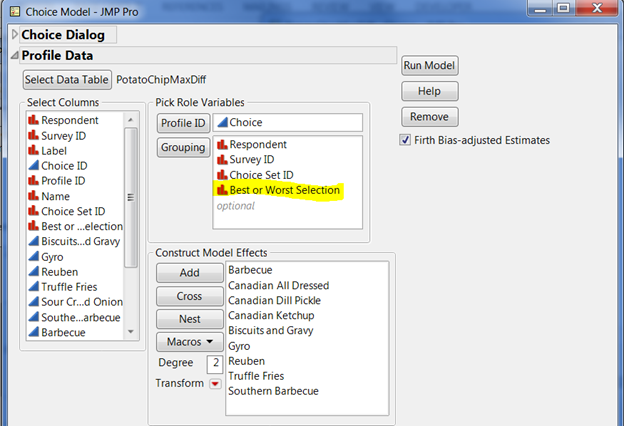
In the model dialog, we make sure that the “Best or Worst Selection” column (the column that tells whether the rows are associated with the best choice or the worst choice) is added to the grouping columns:

We also have to select one flavor as our comparison flavor and leave its indicator out of the model (just like you would with any set of dummy-coded columns). In this case, I made sour cream and onion our comparison.
In order to get a ranking of best flavors to worst flavors, I sorted the resulting report (right-click and select “Sort by column”). Barbecue and Southern Barbecue are near the top. The Likelihood ratio tests are testing whether the parameters are significantly different from 0, so in this case, whether flavors are significantly different from sour cream and onion. It looks like the two familiar barbecue flavors are favorites, while Gyro definitely trails the others.
Visualizing the results
I also created a graph of the results (Right-click the estimates table and select “Make into Data Table." Then I opened Graph Builder and followed the steps described in this blog post.

If we just use the graph, Truffle Fries is the next most popular after the barbecue flavors, followed by Biscuits and Gravy. The Canadian flavors are near the bottom, but the statistical tests tell us that if we’d sampled different people (or the same people on a different day), those flavors might sort higher.
So, who's right?
Maybe we were both right. Maybe I was just reacting to the name “ketchup chips." Maybe if I tasted one of them in a blind test, I’d like them just as much as sour cream and onion. Maybe if I’d grown up in Canada, I’d like them better than barbecue.
I’d be really surprised, though, if Gyro won the “Do Us a Flavor” challenge.